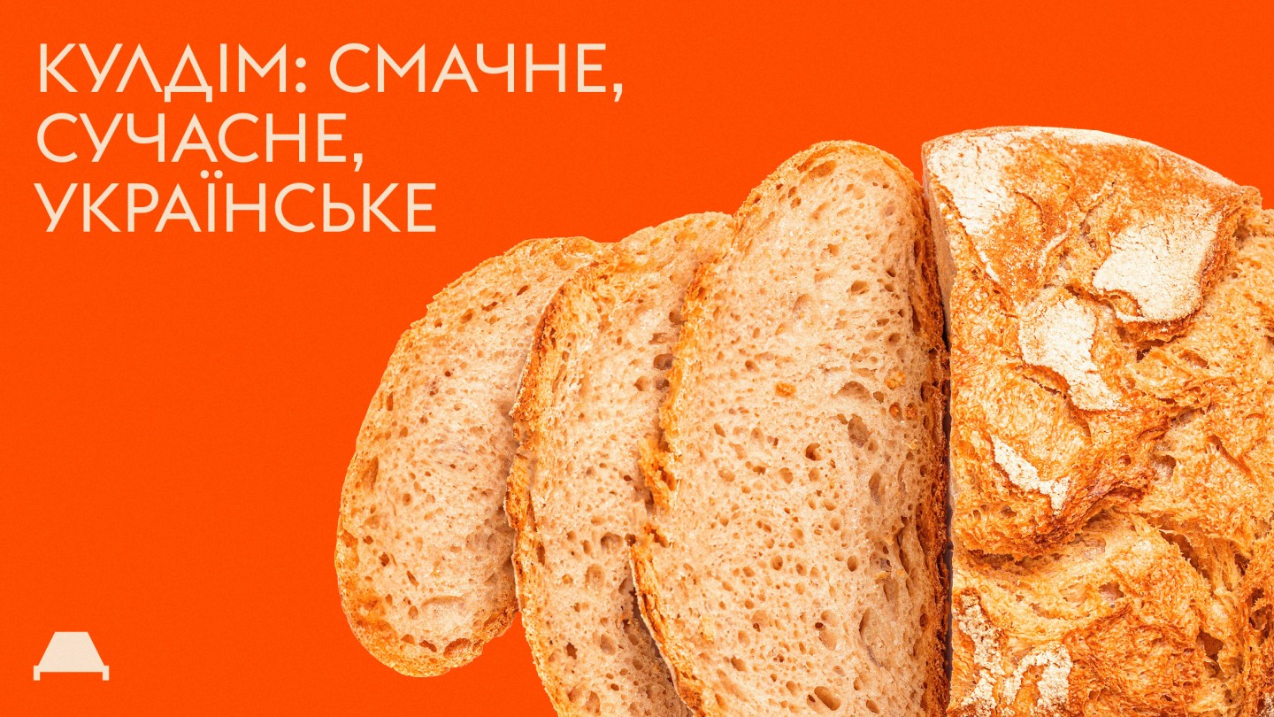
Kuldim
Rebranding of the catering establishment: strategy, logo, identity
Ukrainians are friendly people who also appreciate good food.
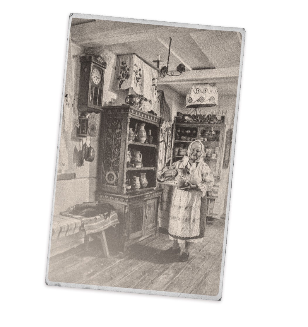
Traditionally, our food culture was built on the principle: "Eat hearty and high-calorie food, then return and work hard." These dishes had a simple purpose — to provide energy for manual work. They were quite nourishing but not exactly healthy.
Fortunately, over the centuries of our history, the lifestyle and eating habits of Ukrainians have evolved. With urbanization, people now engage more with their minds than their hands. So, the focus of dietary habits shifted from "eating for strength" to "eating to think and feel good."
Today, Ukrainian cities boast numerous establishments serving Ukrainian cuisine. Among them are plenty of Ukrainian fast-food joints, neo-eateries of various kinds, and sophisticated restaurants offering a new wave of Ukrainian cuisine. However, in the realm of comfortable yet traditional dining, there's still a noticeable gap.
But Kyiv residents are in luck. They already have a place where they can enjoy modern Ukrainian dishes daily. Moreover, these tasty culinary delights can be conveniently ordered for home delivery, saving time and simplifying life.
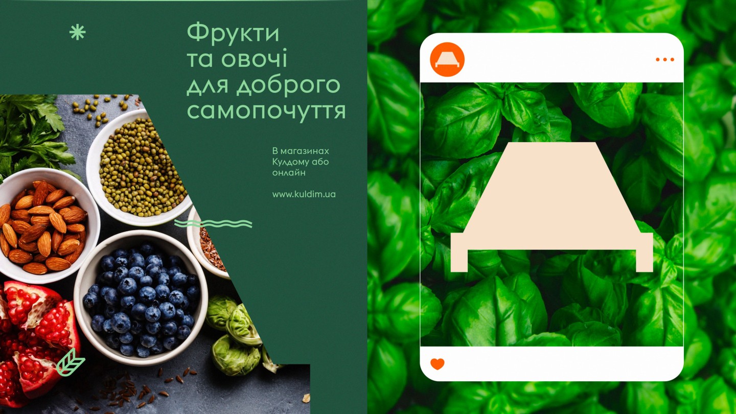
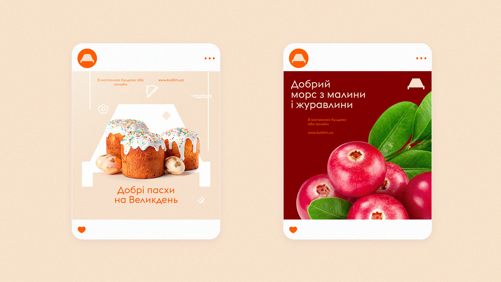
For the busiest individuals, there's an option to stock up on kitchen essentials that are always missing at the right moment: fruits, alcohol, pre-cooked products, tea, and a variety of other items that make life tastier and moods brighter.
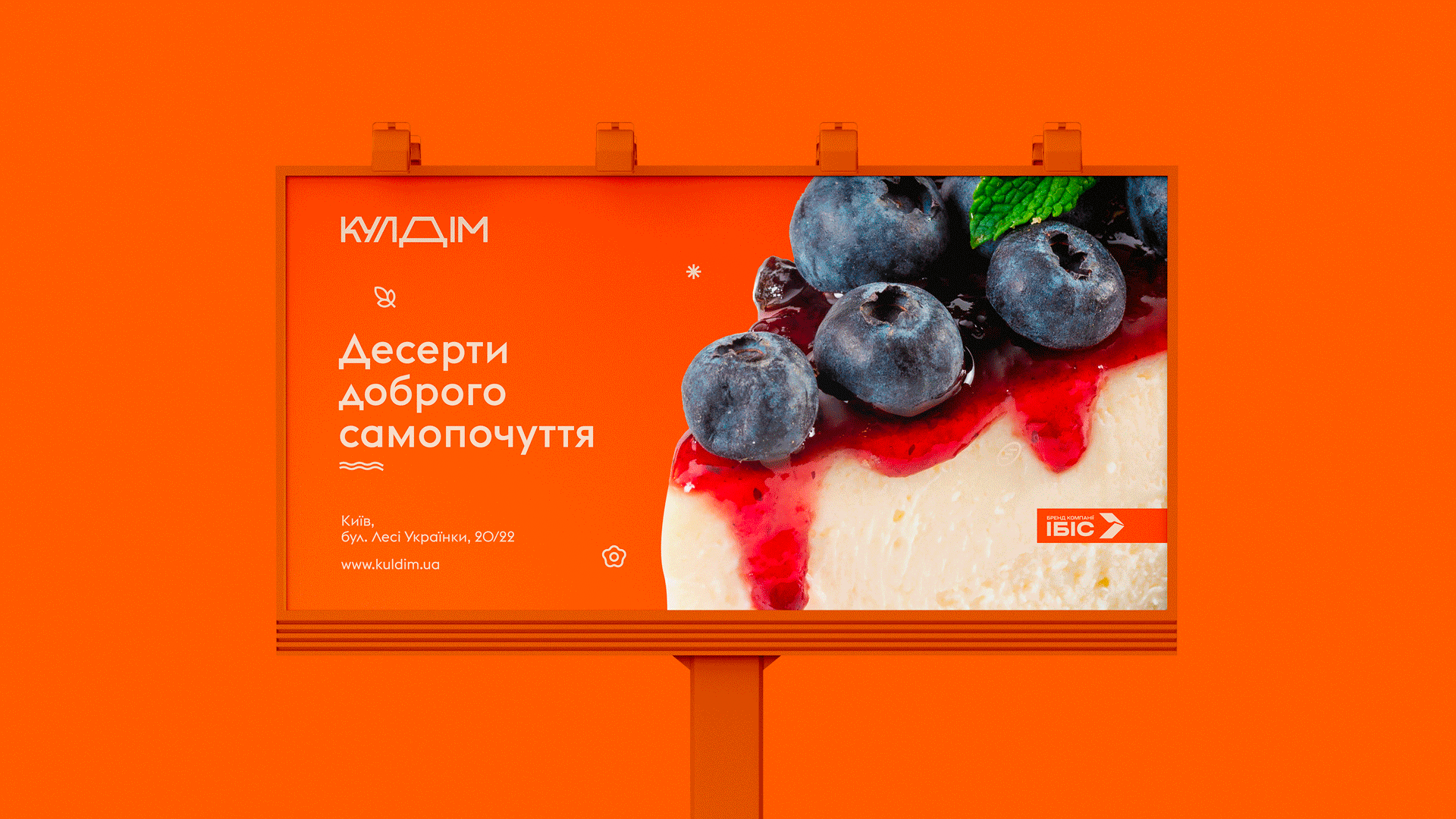
So, meet Kuldim — food that makes you feel good!
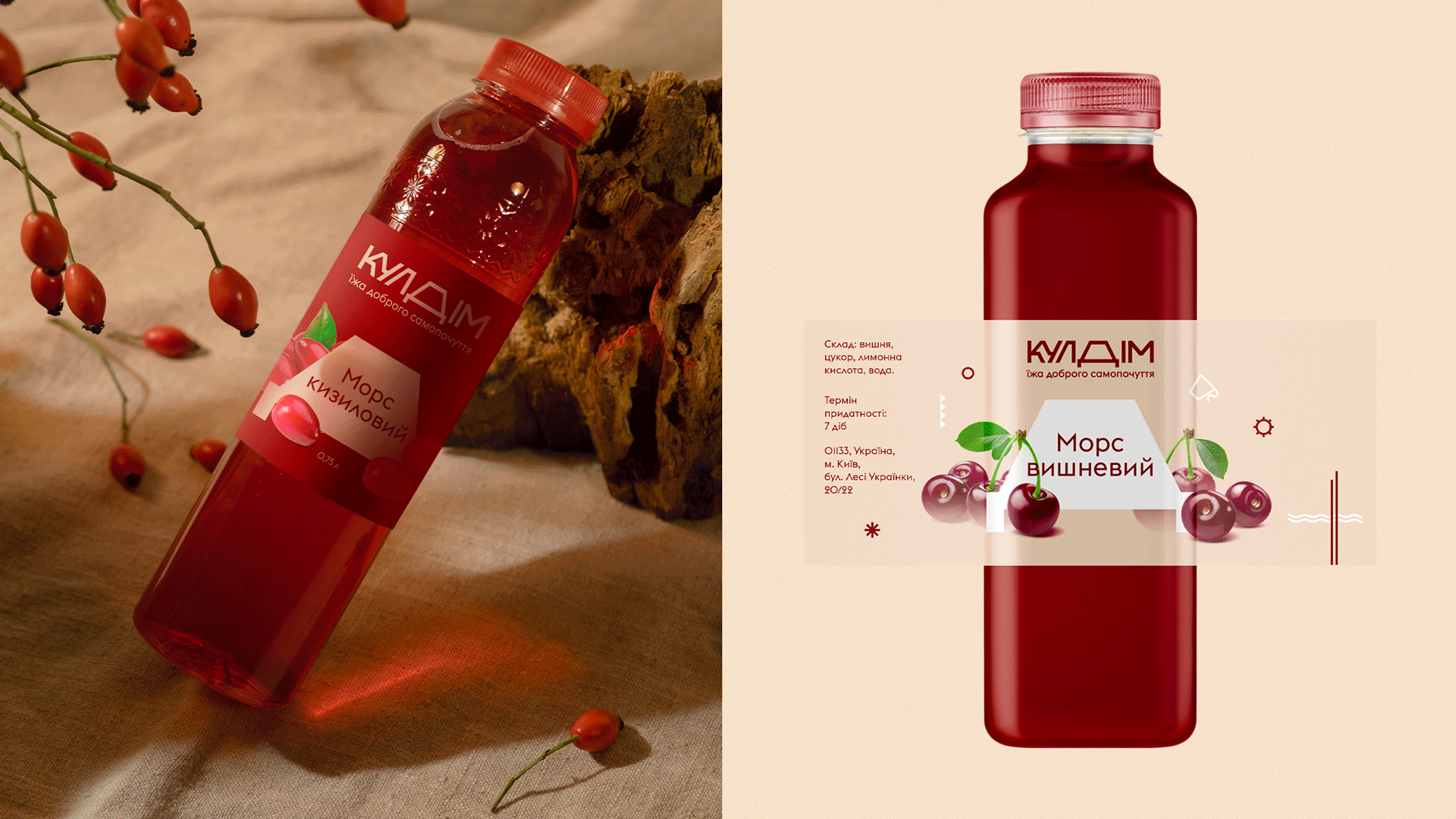
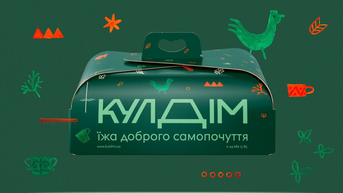
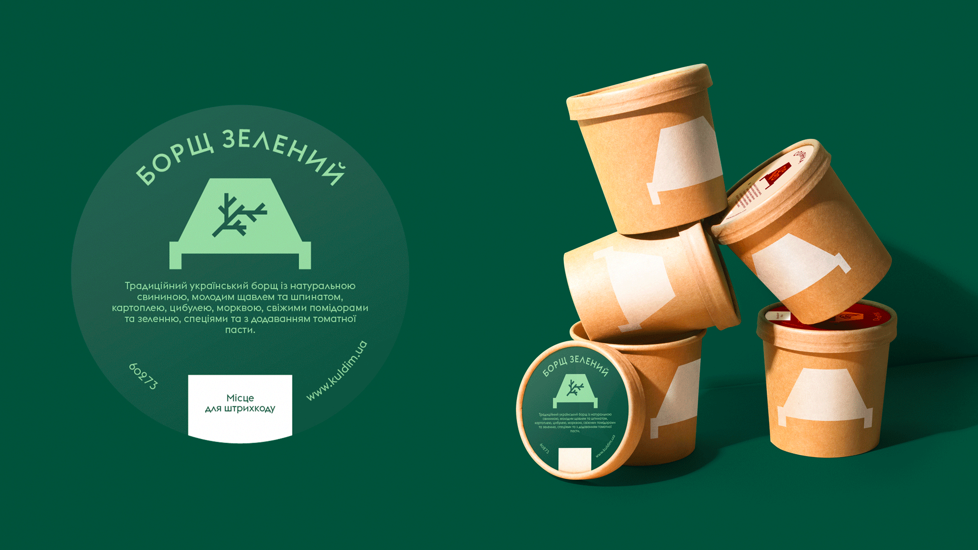
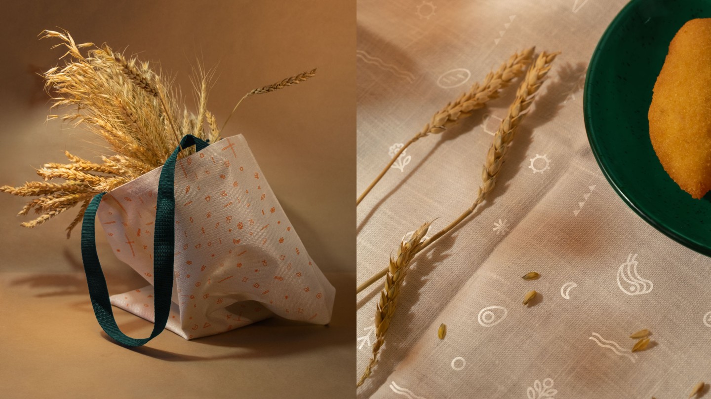
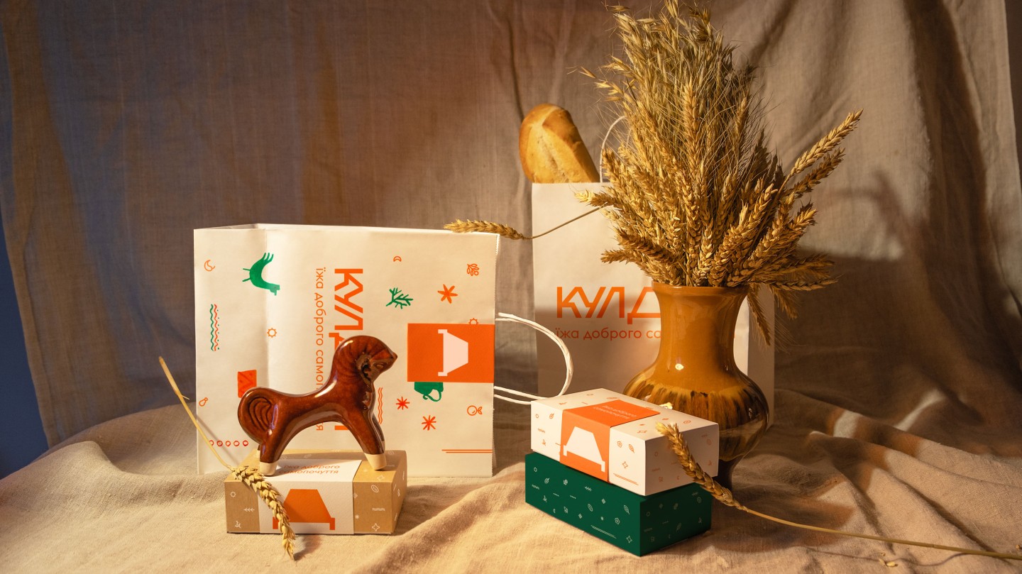
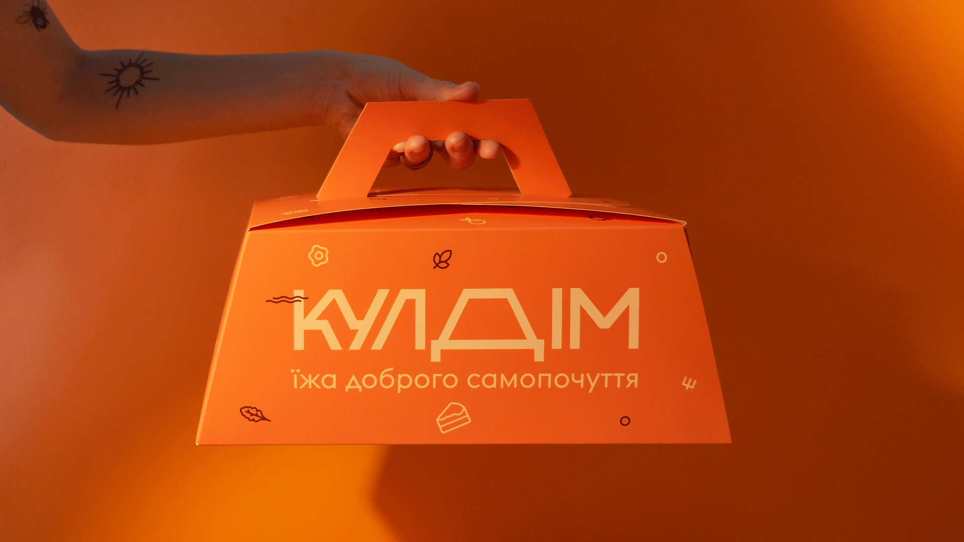
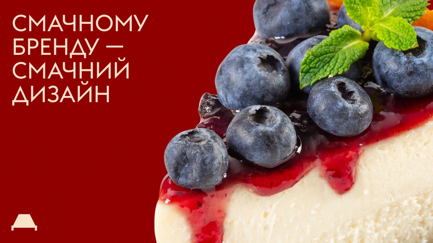
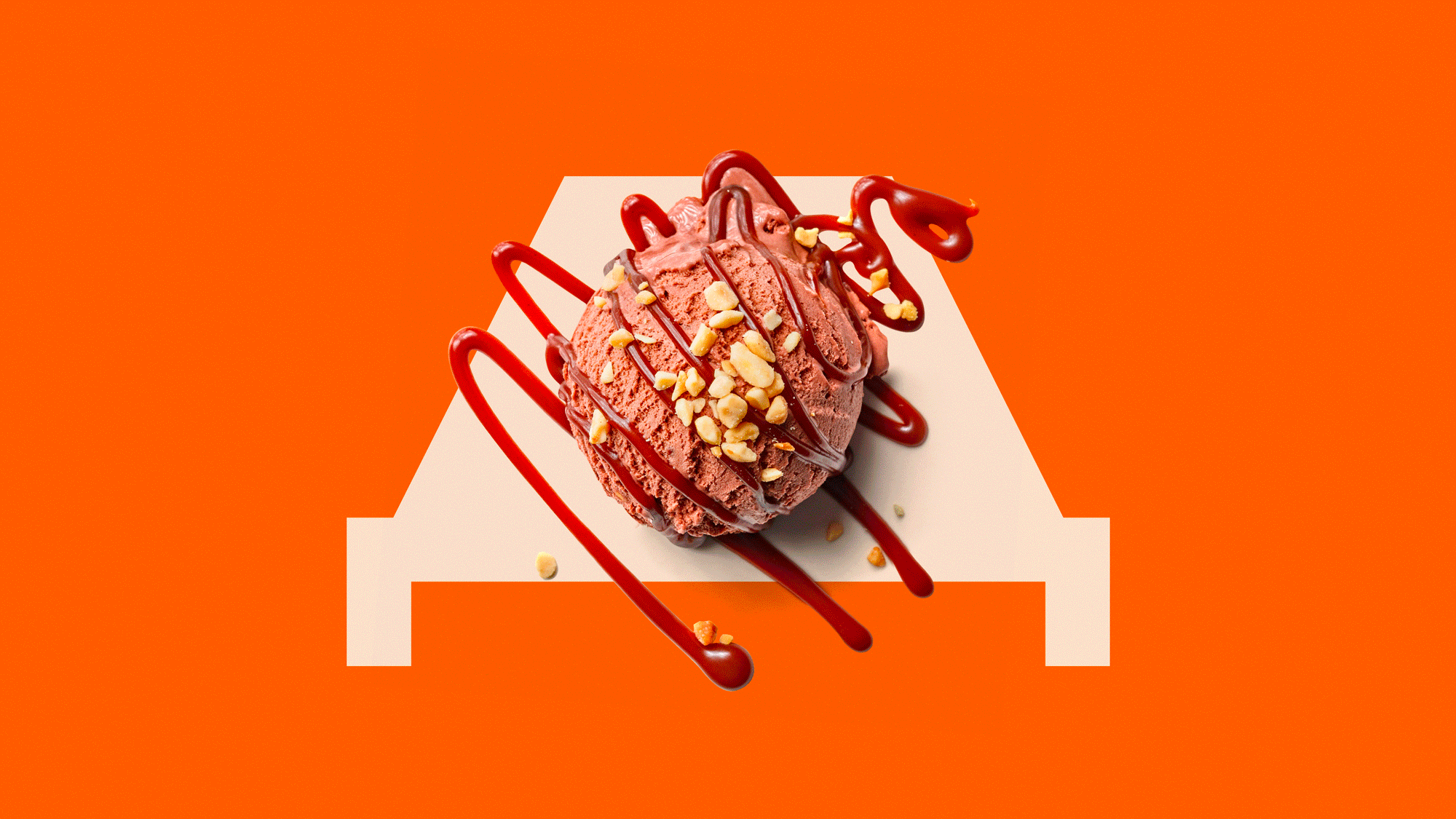
A tasty brand deserves an equally appetizing design that seamlessly blends traditional hospitality with a modern character.
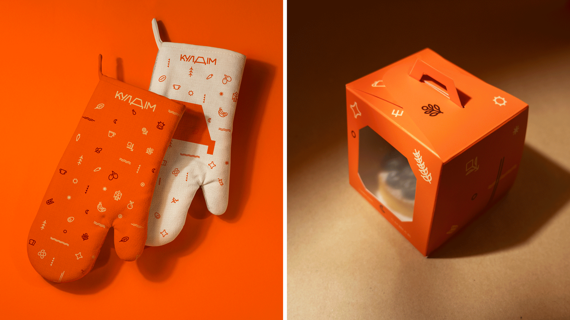
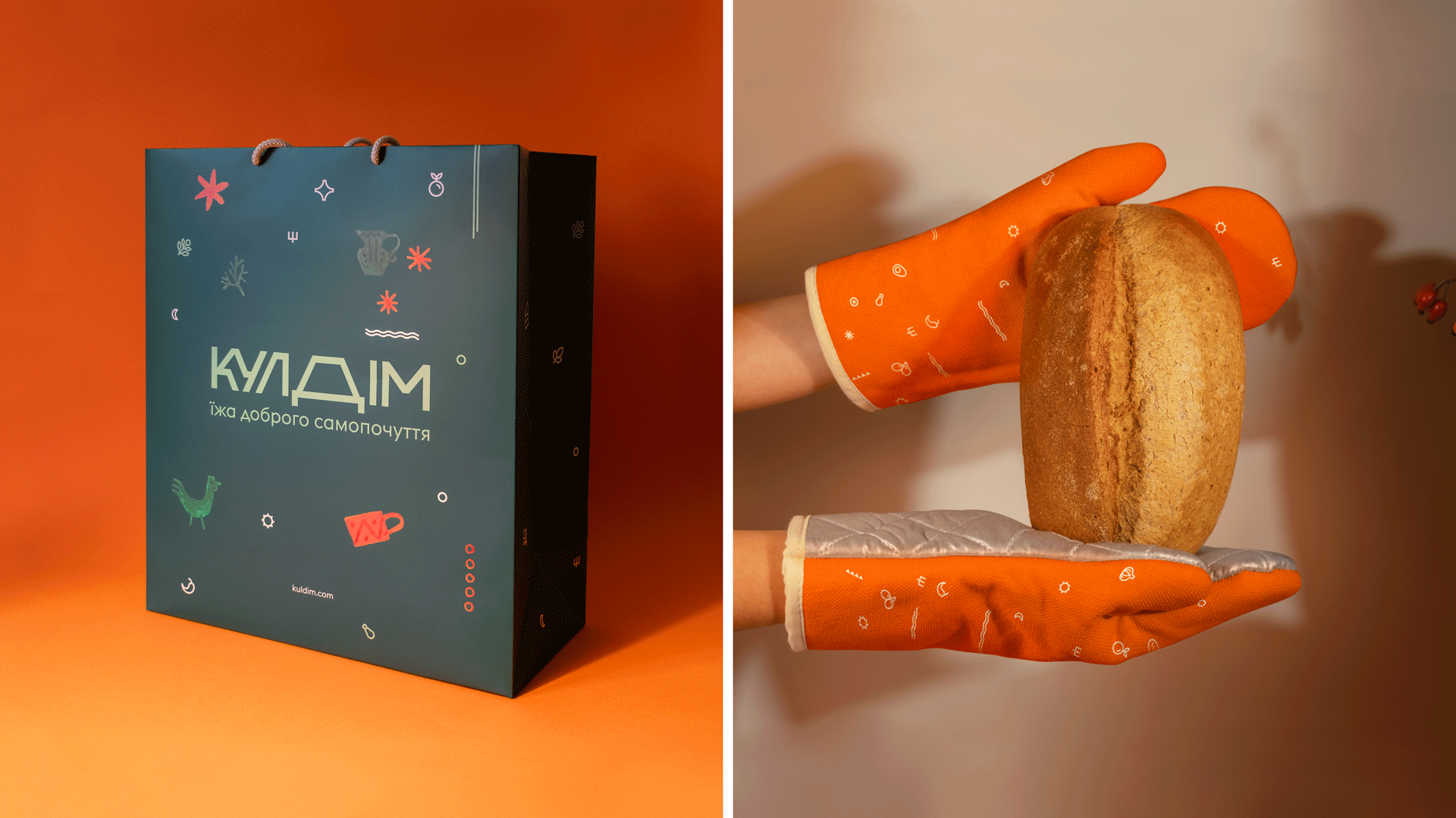
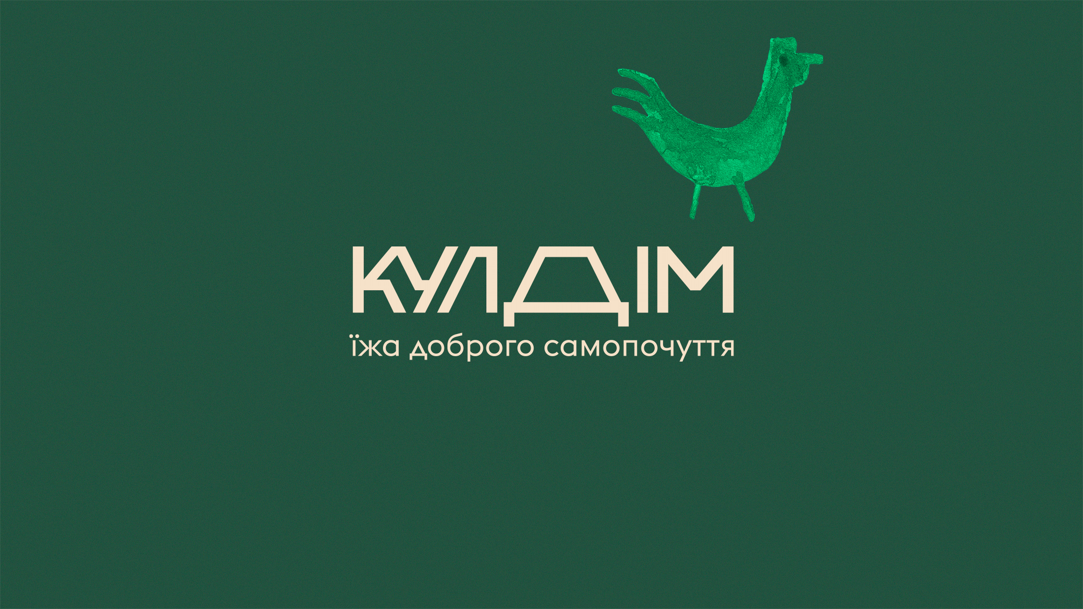
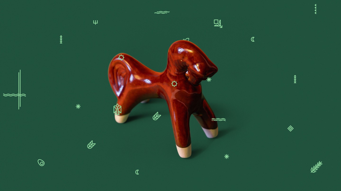
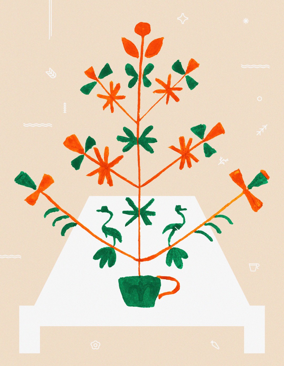
Watercolor illustrations draw inspiration from Ukrainian visual authenticity: inspired by Ukrainian wall paintings, incorporating plant elements, and symbols of hospitality.
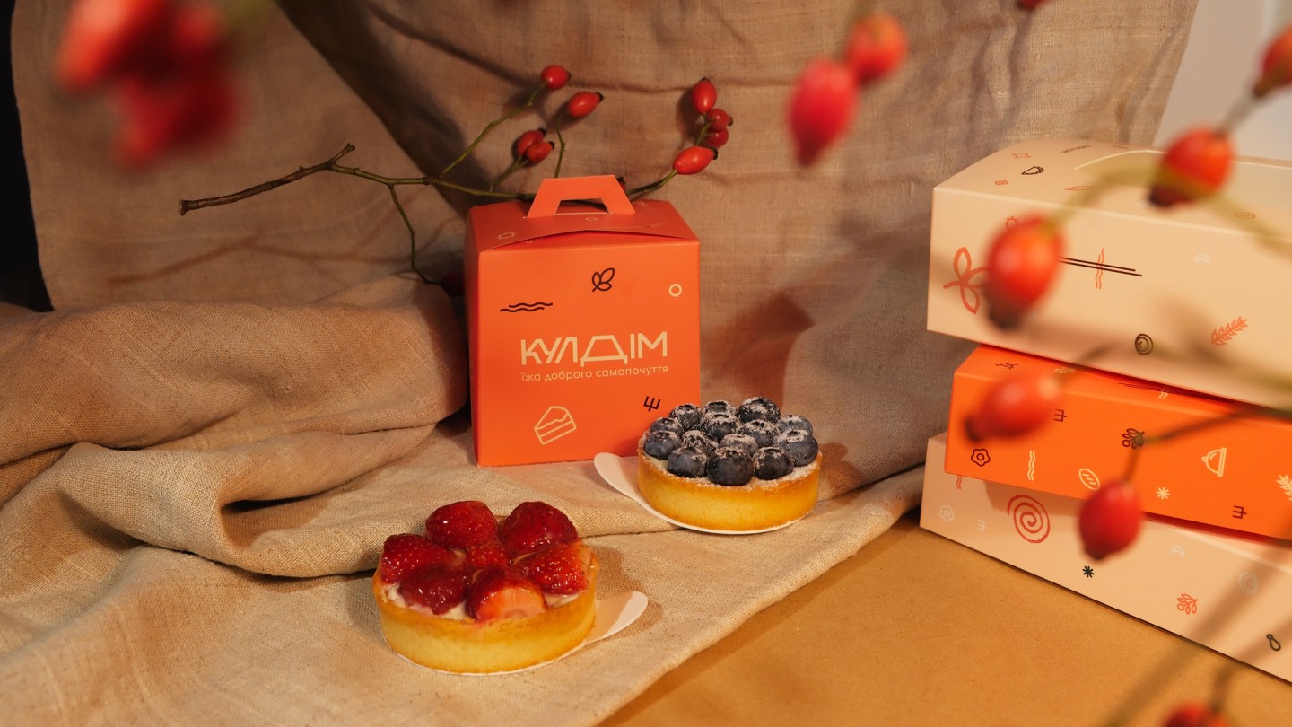
Hence, the Kuldim logo became a vibrant letter "D," cleverly conveying the metaphor of a traditionally generous Ukrainian table. Additionally, the logo acts as a "visual container" for appetizing food photos.
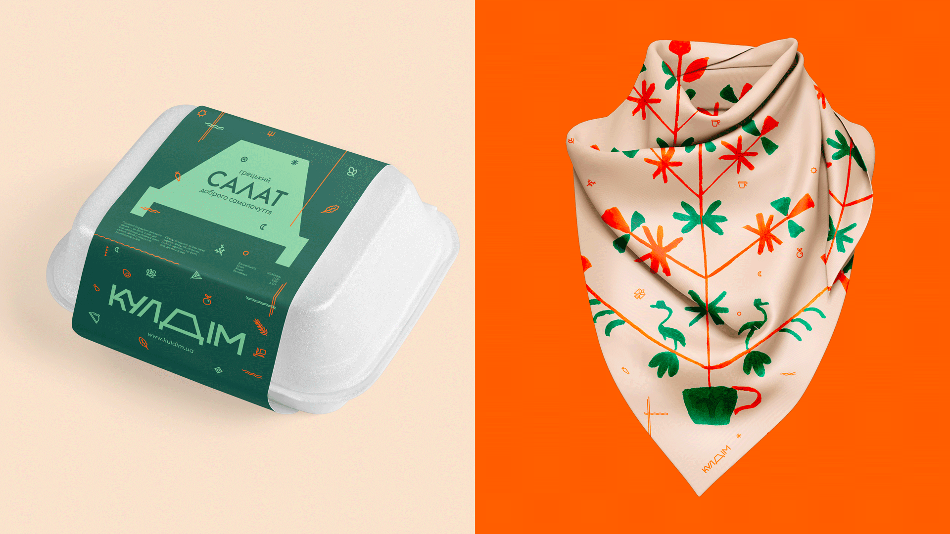
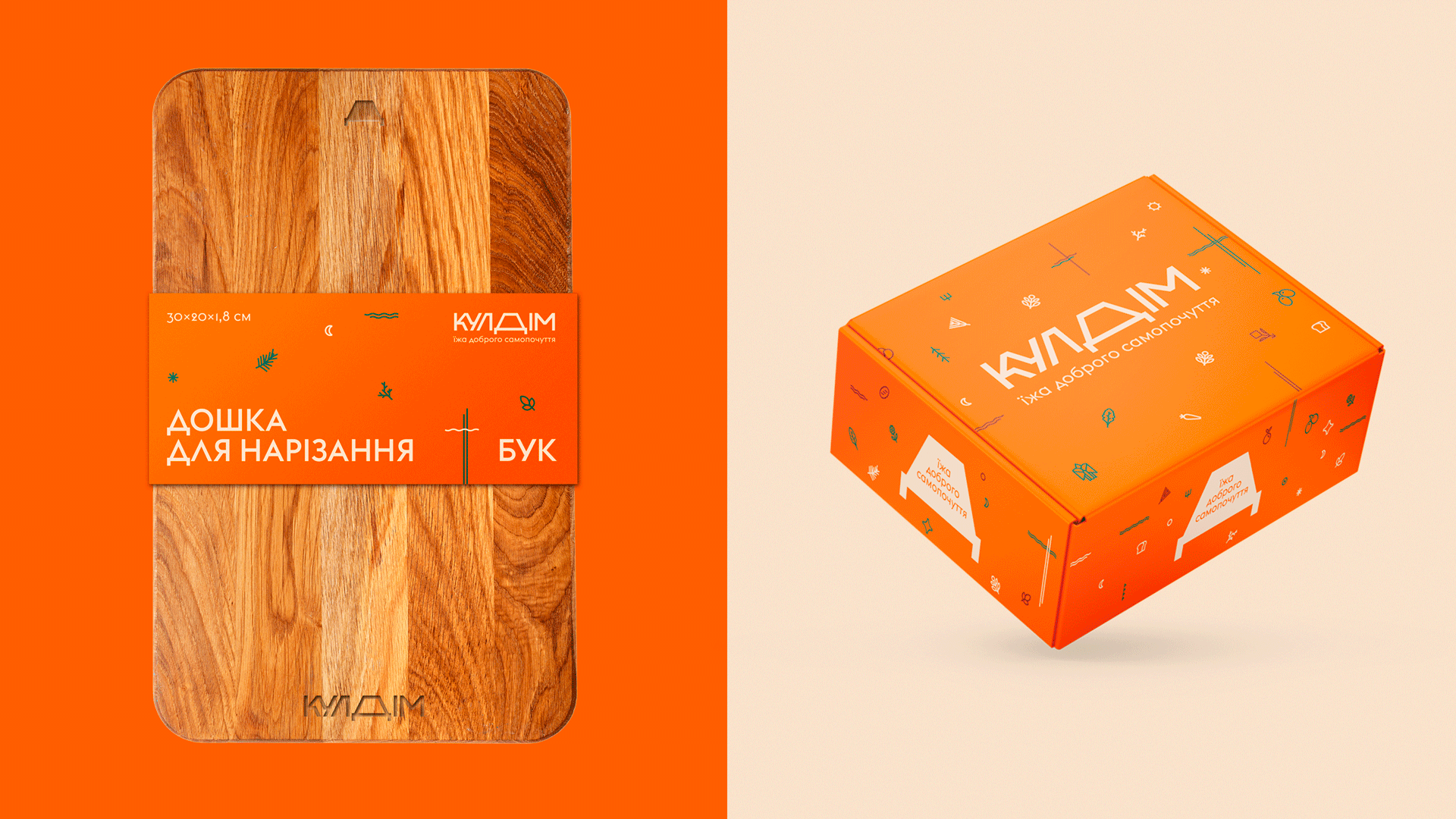
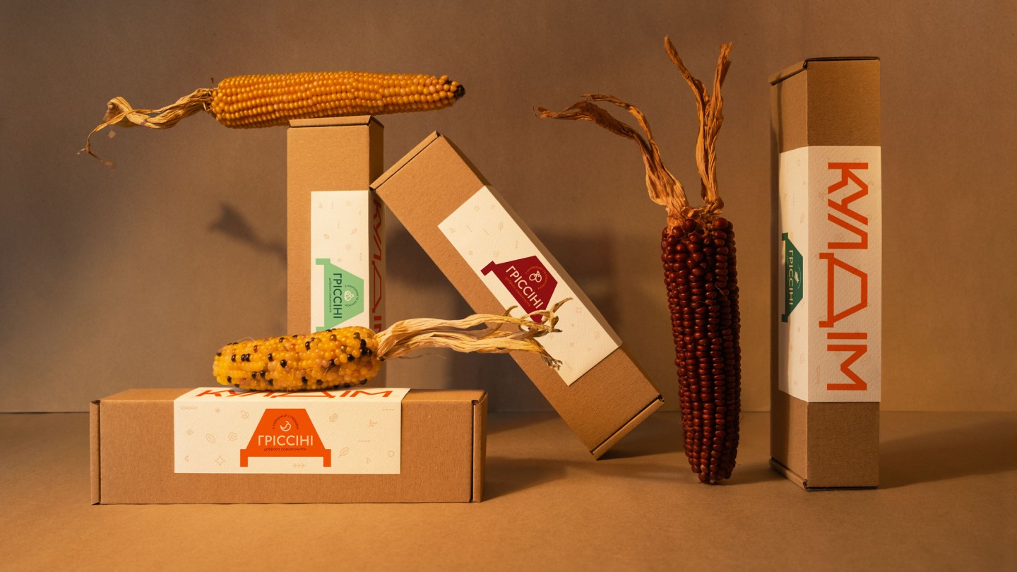
All other visual elements contribute to modernity: icons, fonts, and overall composition. The intentionally geometrically sharp icons merge minimalist symbols with images of food.
By combining all these techniques in the right proportions, we've crafted an appetizing identity that pleases the eyes, stimulates the appetite, and leaves you feeling good.
Enjoy your meal!