Aequo
Law Firm Rebranding: logo and corporate identity
In 2014, a new ambitious player AEQUO appeared on the legal market of Ukraine. The name is borrowed from the Latin expression "Ex aequo et bono" ("with goodness and justice", "in fairness")
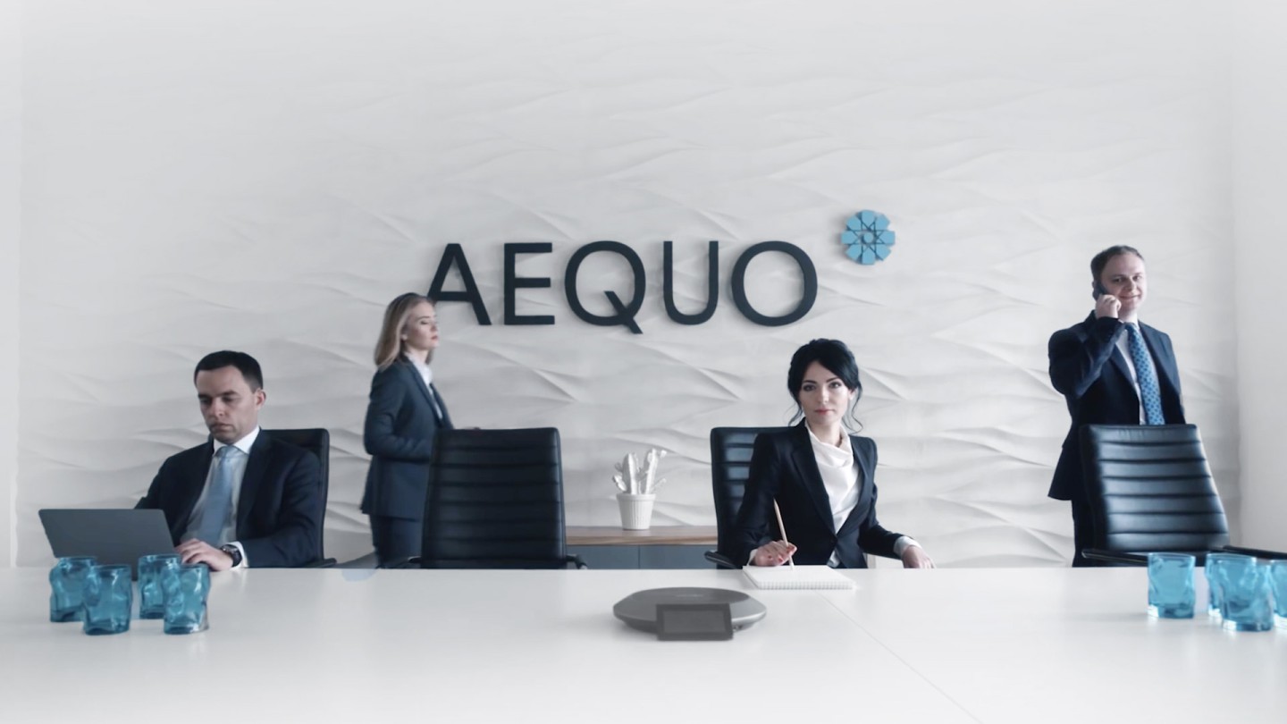

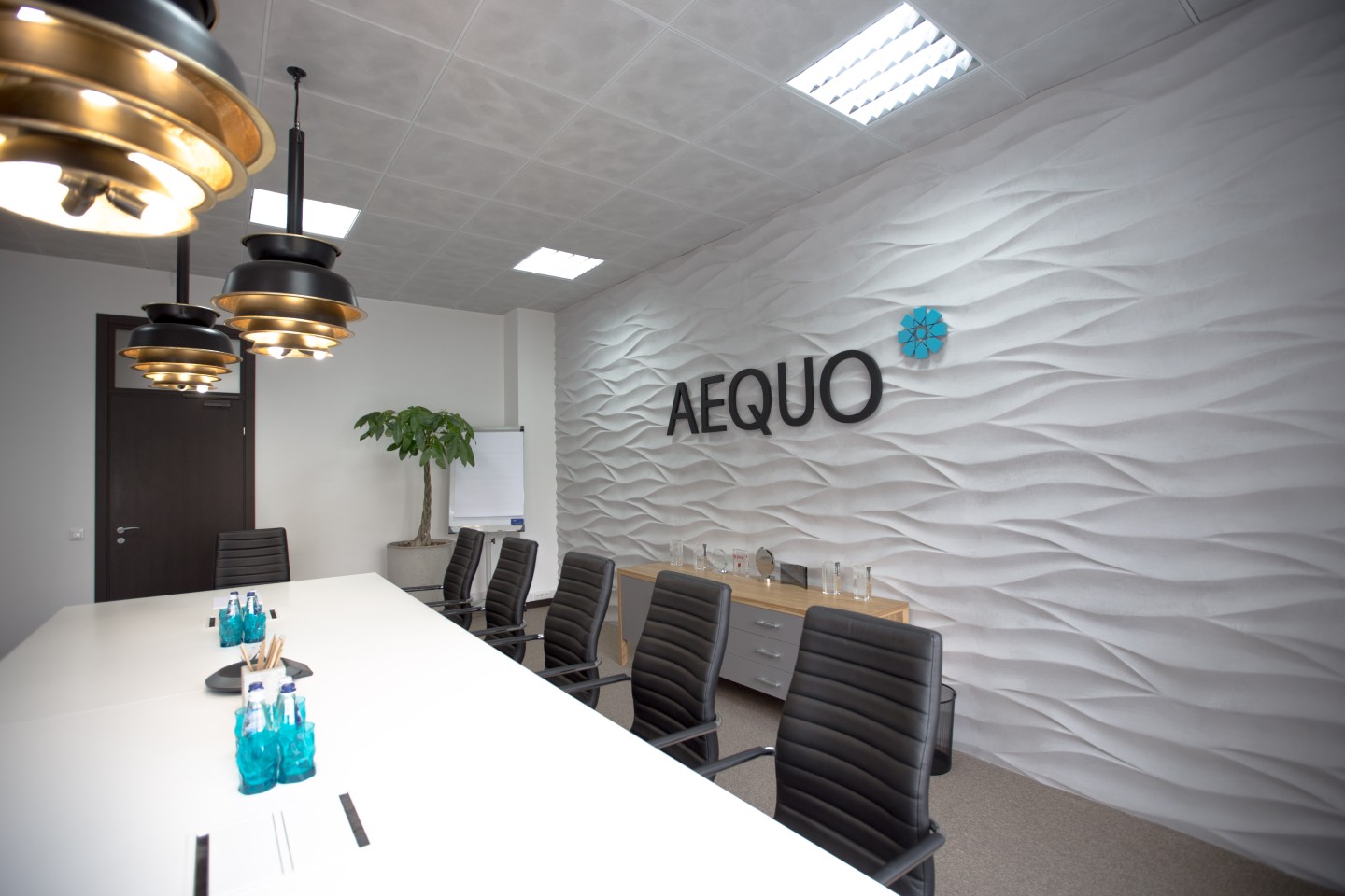
Since AEQUO is a law firm of the future, which sticks to a progressive and innovative approach to solving legal problems, it was decided instead of traditional Antique fonts to use modern and well-recognizable Sans-serif fonts that will not be lost on the background of conservative logos of competitors.
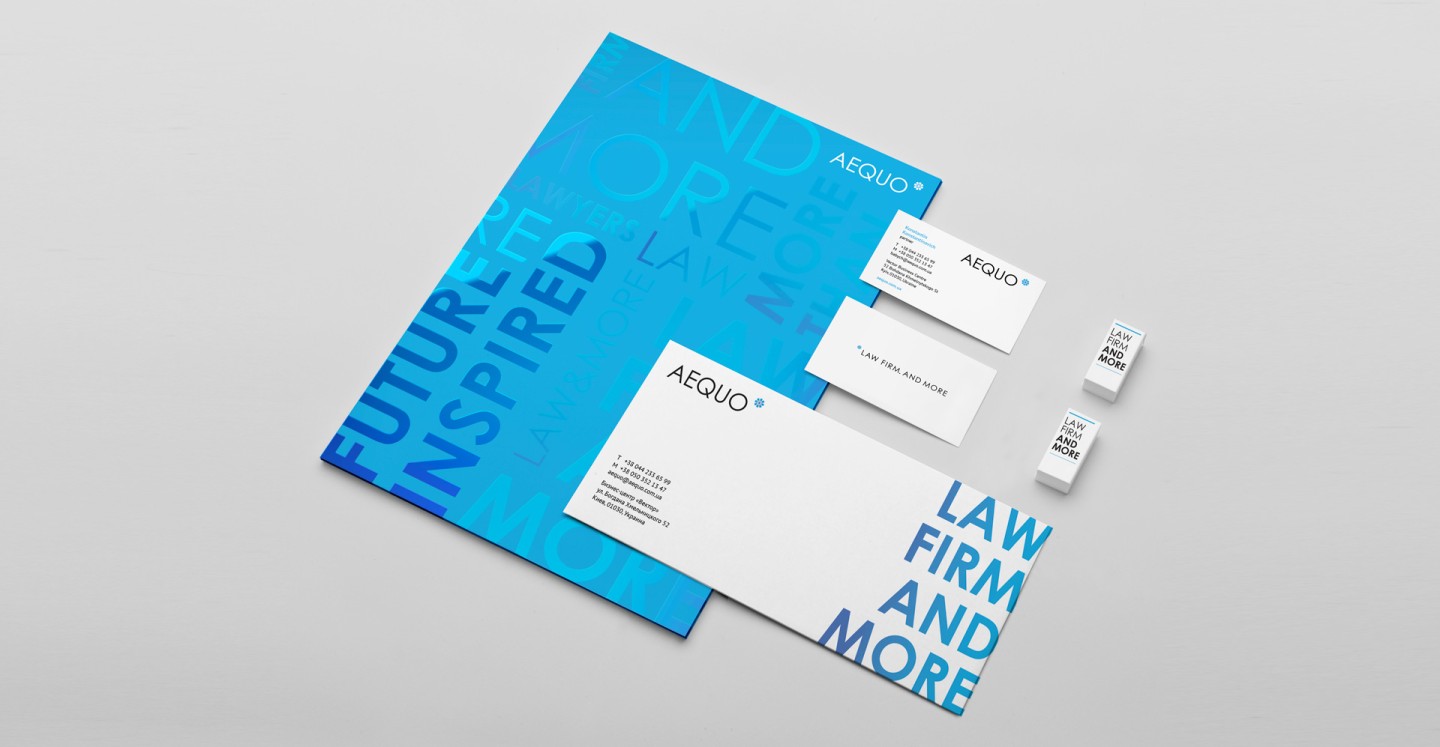
Depending upon what we need to say, a message in the descriptor changes. This allows, while remaining recognizable, not to be boring, to talk enthusiastically about the benefits of working with AEQUO and to share the mission and values in an unobtrusive format with clients
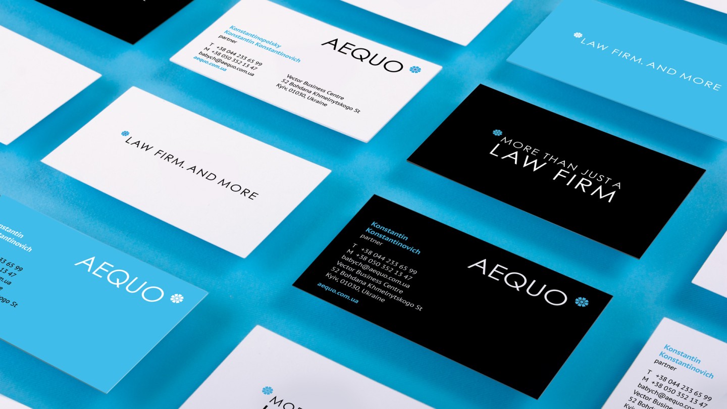
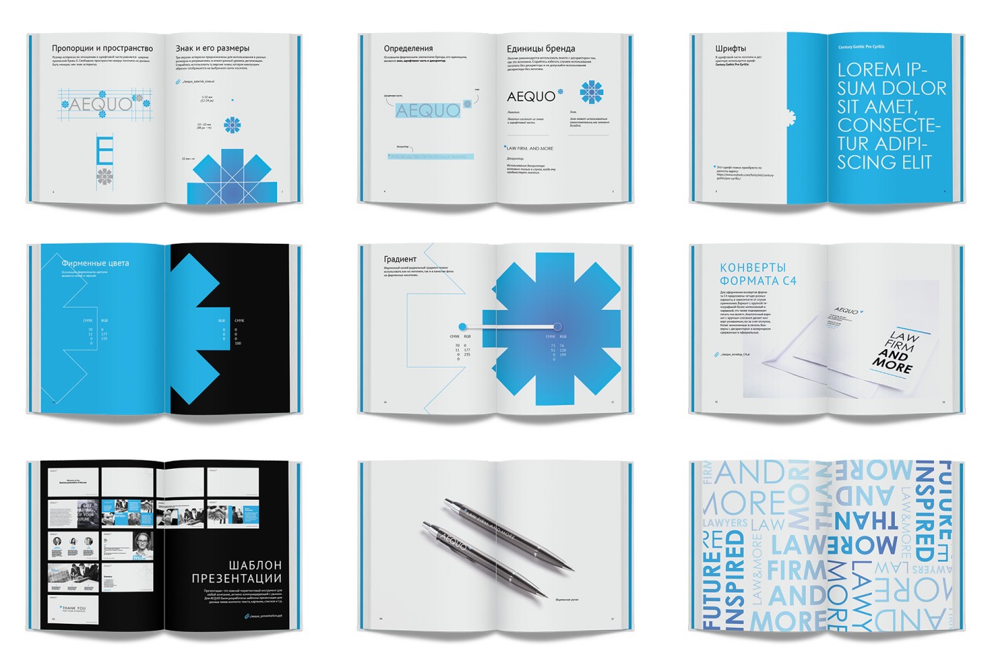
The key communication instrument for lawyers is business documentation. That’s why we developed a detailed guideline for all corporate identity signage to keep succession for all communication instruments, starting with the commercial proposals and contracts and ending with a signature in the emails.
Credits
Art Director: Vladimir Strashkov
Design: Maria Kotemako