Brightman
Law firm brand development: strategy, identity, communication
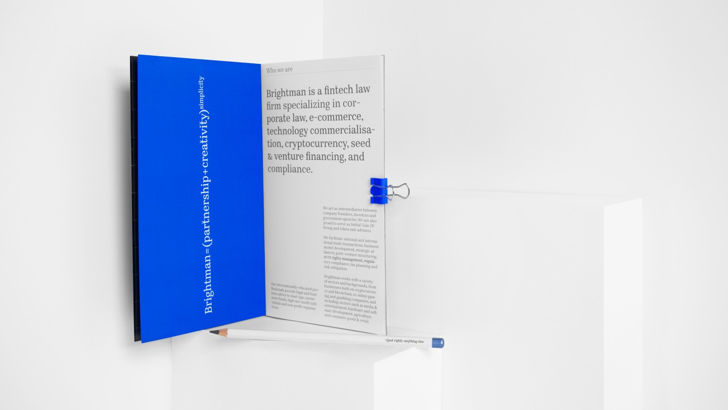
Brightman is a new Ukrainian law firm, technological consulting, which specializes in cryptocurrency investments. It was created by young, but experienced lawyers who studied and worked in the US and Europe.
Brightman's team does not try to seem smarter, speaks the human language and approaches each case creatively. They do not have «monograms» in their heads and «golden loaves» on the tables. On the contrary — everything is as simple as possible. Thus the concept of «Nothing excess» became the basis of the brand.
The main difference between Brightman and its competitors is its excellent ICO knowledge. This makes them a single entry point for businesses that want to attract cryptocurrency investments. For the client, this is a complete delegation of the legal side of investment issues to professionals. For him, everything is as simple as possible.
From this understanding, the brand’s metaphor, Occam's razor, was formed. The principle states that one should not multiply unnecessary entities without extreme necessity. So the basis of the brand became the concept of "nothing extra".
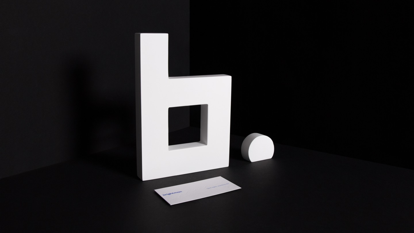
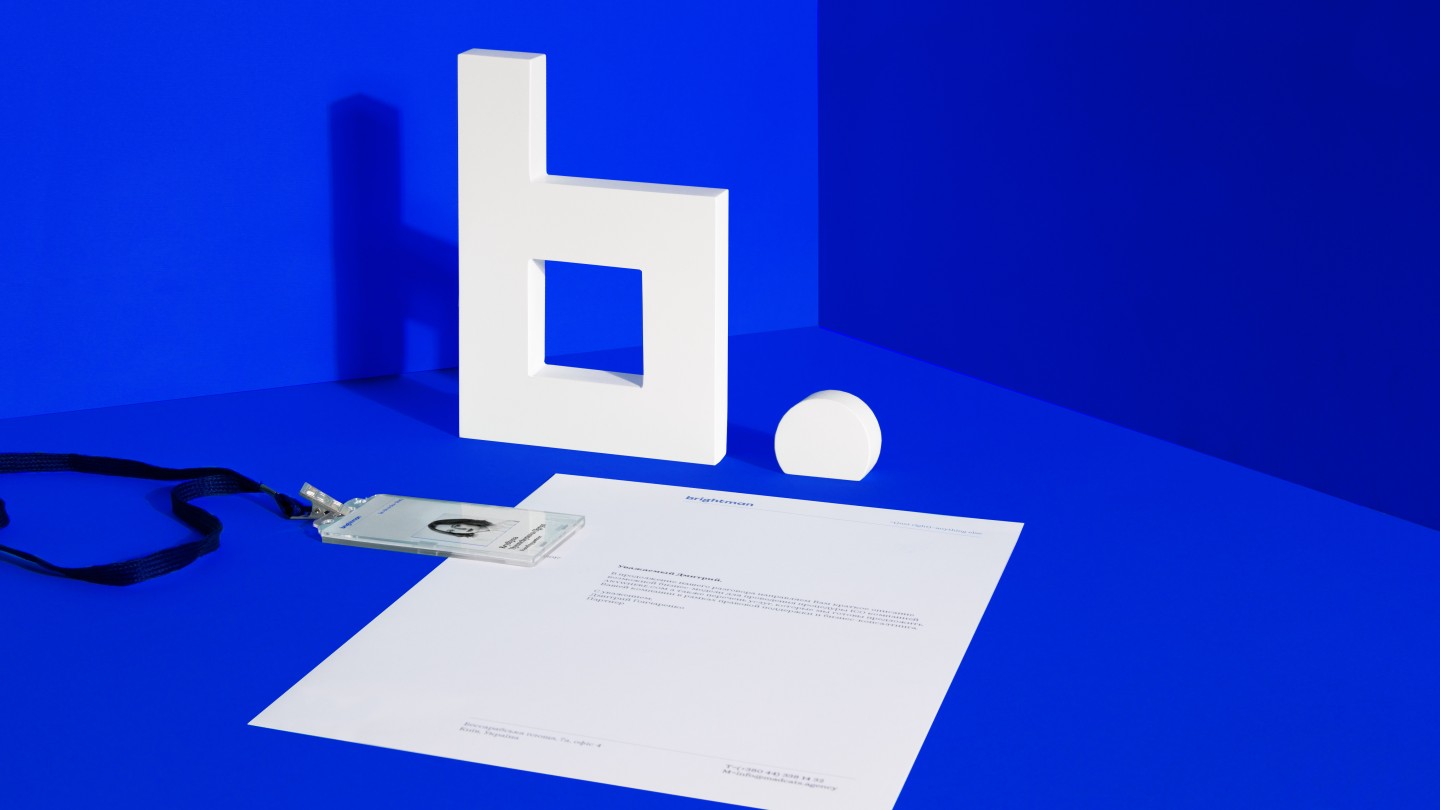
In order to stand out among a rather competitive market of law firms, we left the standard combination with the prefix "and partners" in the name of the brand. Brightman is a hero who, using his fun, shine, and light, seems to mock the gray, traditional market of jurisprudence. The new name has become a natural continuation of the concept.
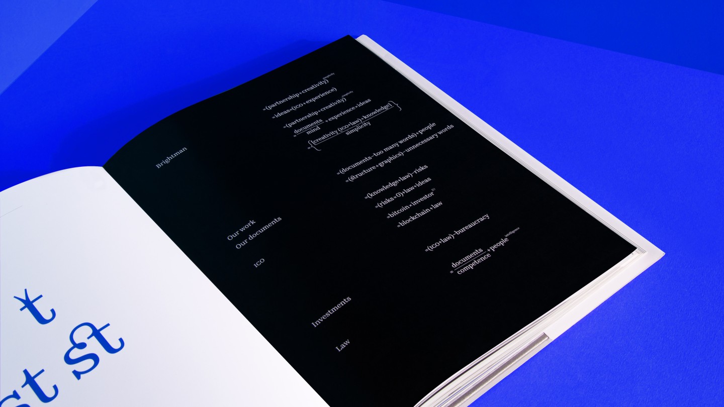
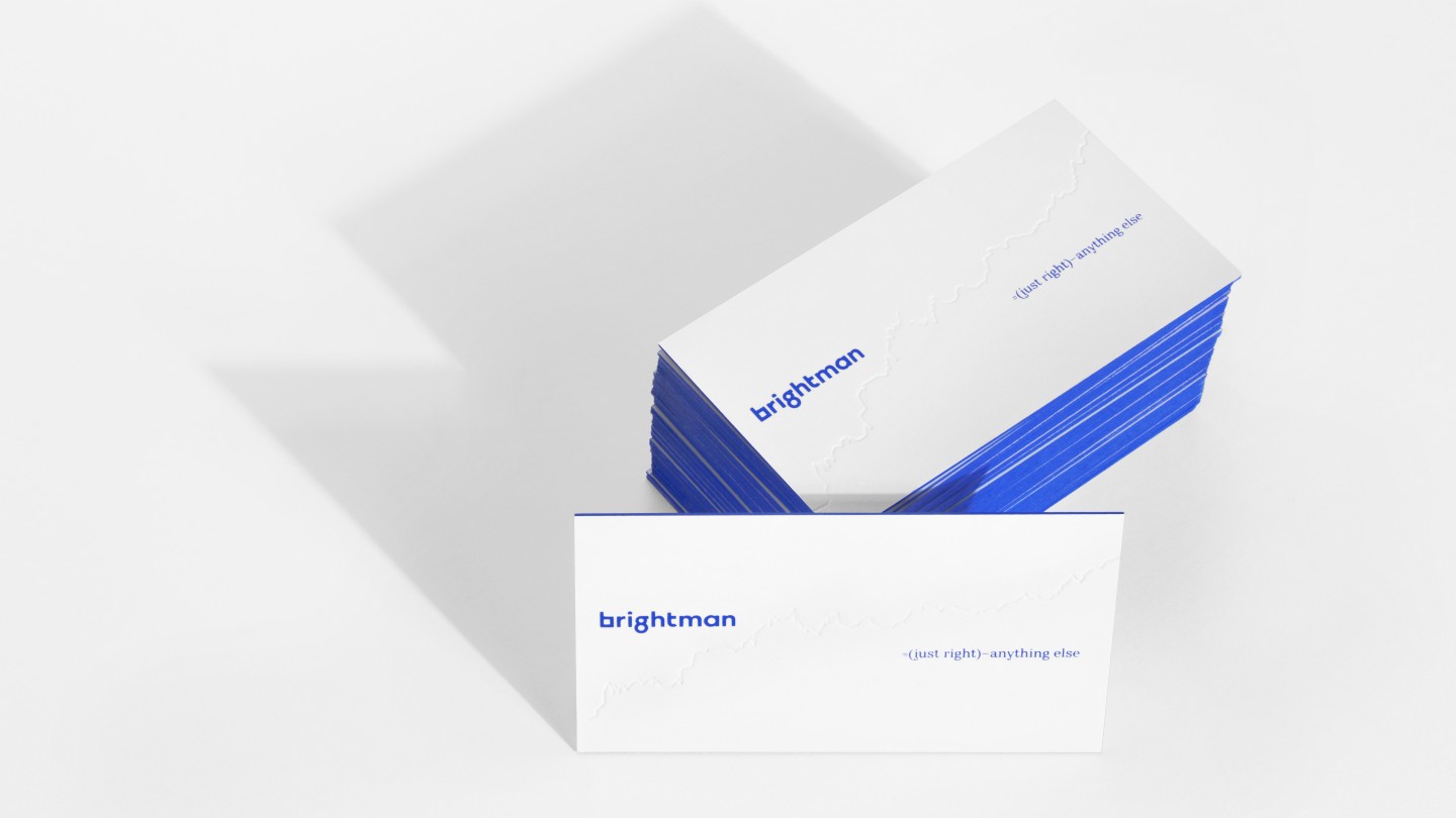
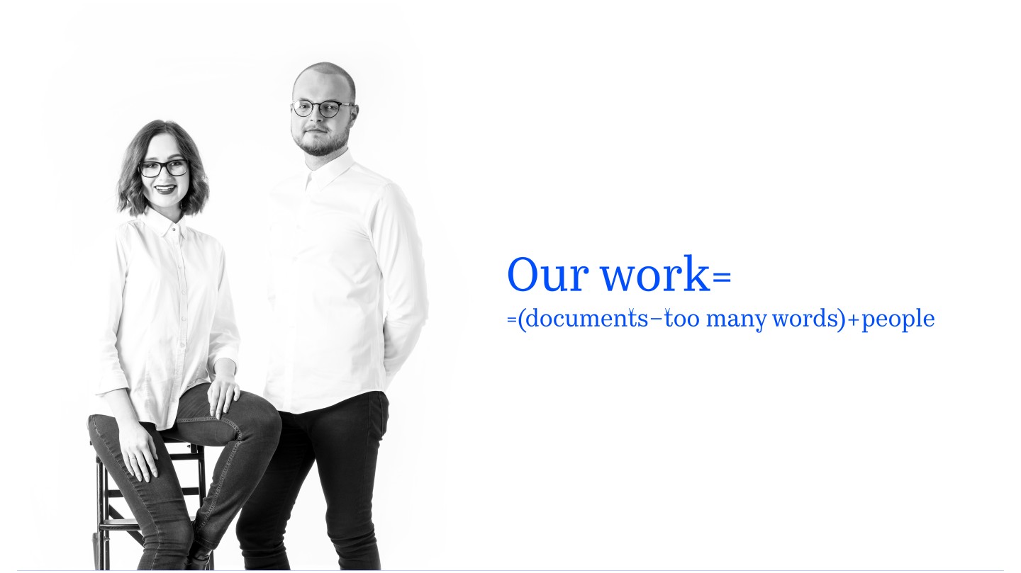
We were looking for the answer to the question, where is there nothing odd? Searches led us to mathematics. Any unnecessary element potentially leads to an error or disrupts the elegance. Mathematical formulas are exactly the example of concise perfection that accurately reflects the essence of the brand.
Communication organically continues the concept – each message is designed in the style of mathematical formulas. Such conciseness shapes the character of the brand, demonstrating intelligence and logic.
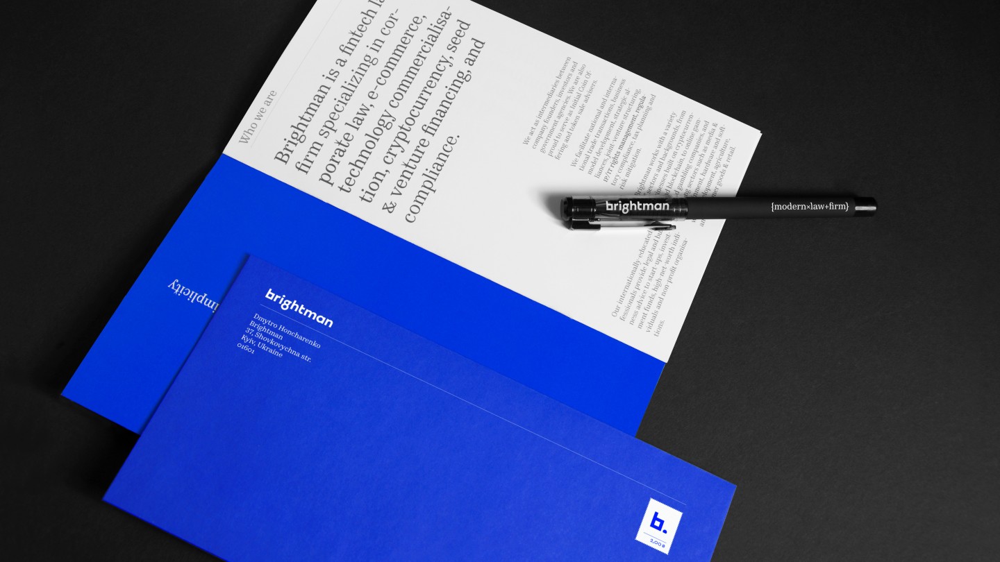
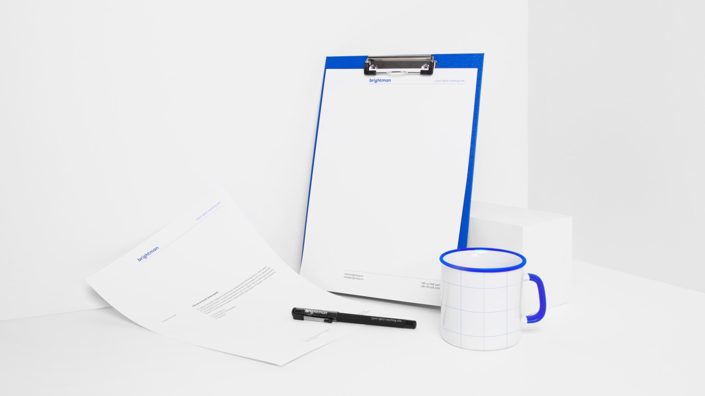
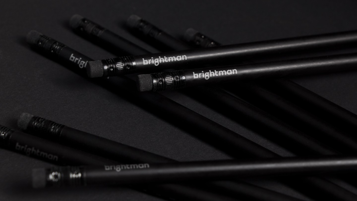
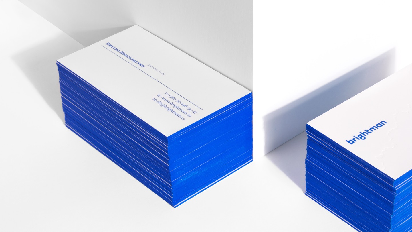
Choosing the corporate colors, we did not refuse the format of brevity and stopped at the basic ones – black and white. Blue color complements them. It creates associations with the intellectual process and its main tool - an ink, emphasizing minimalistic aesthetics of formulas.
Credits
Design direction: Vik Vatamaniuk
Design: Veronika Syniavska, Maria Kotemako
Motion design: Emile Gorodetsky
Copywriting: Alisa Revnova