Eatrix
Brand development for dark kitchen: dentity, animation, packaging, strategy
Eatrix is a dark-kitchen, i.e. restaurant kitchen, which works only as a delivery.
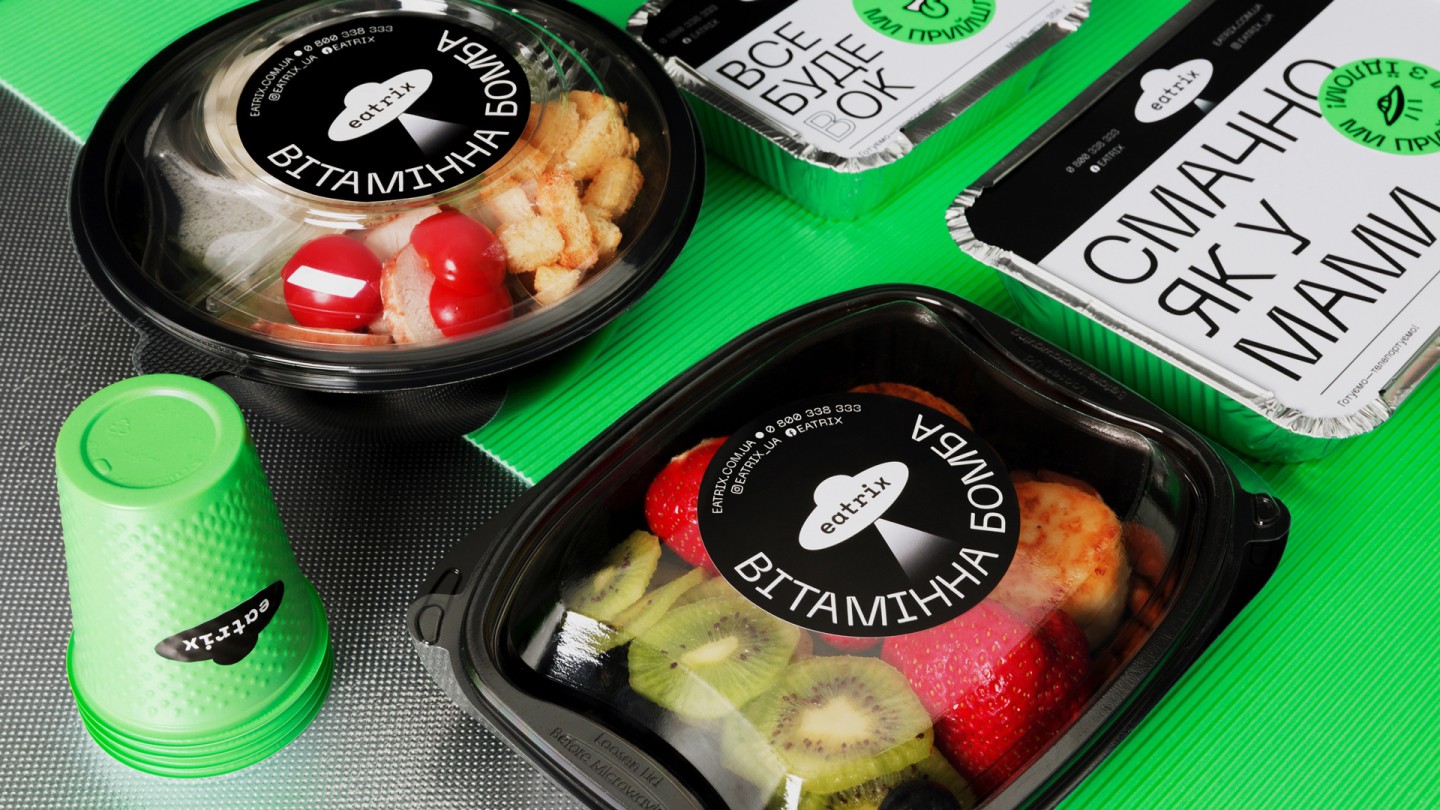
Eatrix differs from other brands by the fact that they are passionate about all aspects of food and delivery: cool chefs developed the menu, couriers are all like Lightning speed Flash from Marvel, serious IT-infrastructure, clear technology of cooking. In April, the first kitchen on the Osokorki district was opened in test mode, with 6 more spots to be opened by the end of 2021. Eatrix menu has more than 100 dishes from sushi and burgers to borsch with purée.
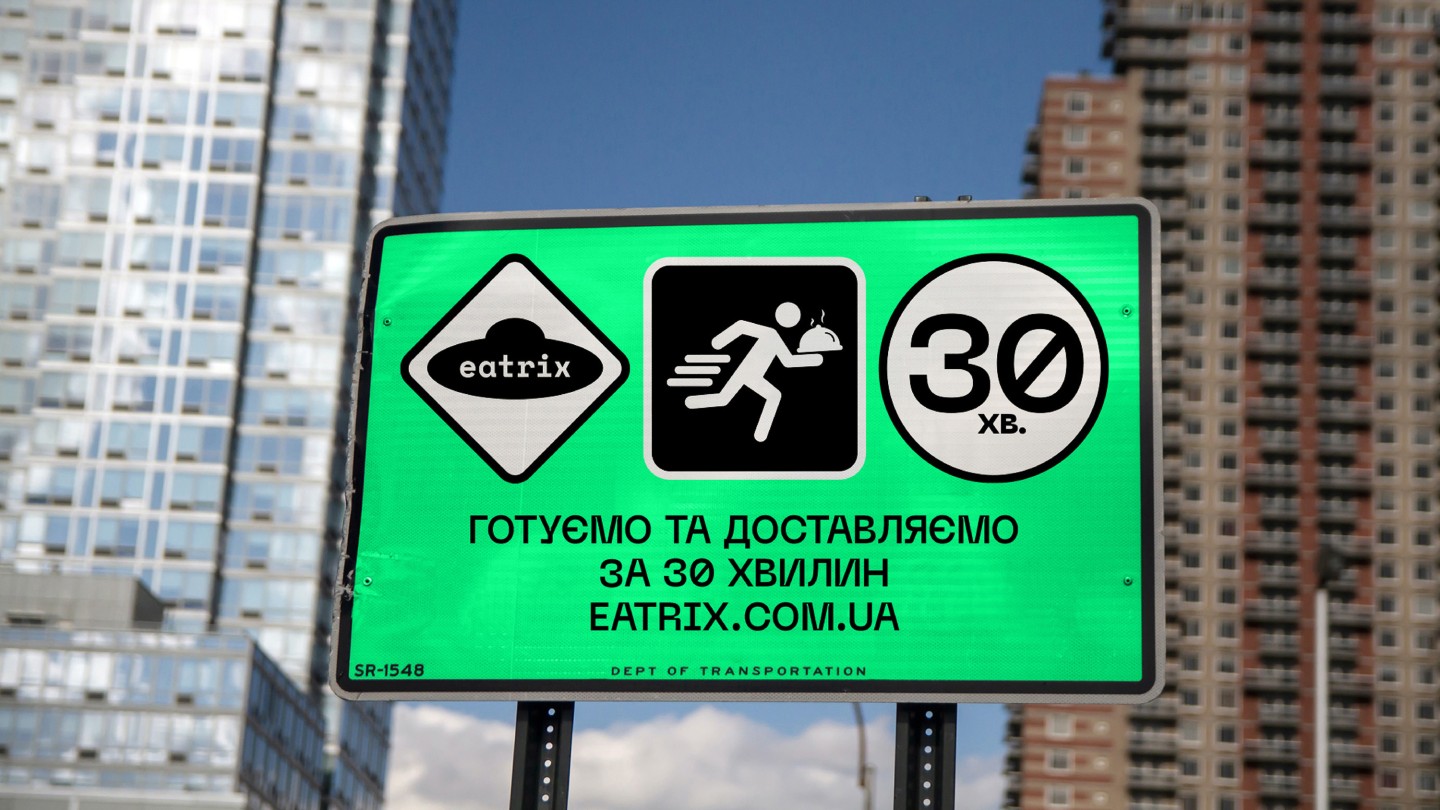
The delivery area is limited so that the food arrives in 30 minutes, warm and appetizing.
Eatrix strategy: "less cooking – more living". It's about what you can do if you don't waste your time cooking: finish reading Harry Potter with your child, go to practice and pump up your biceps, or watch the new episode of Stranger Things.
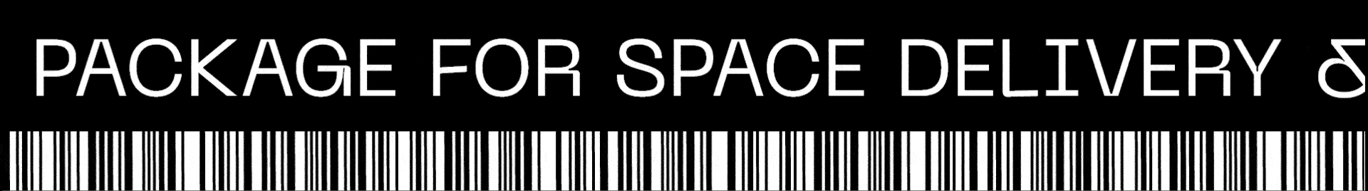
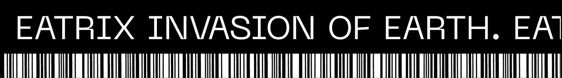
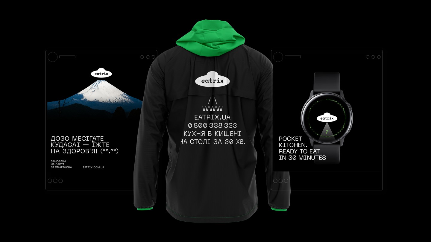
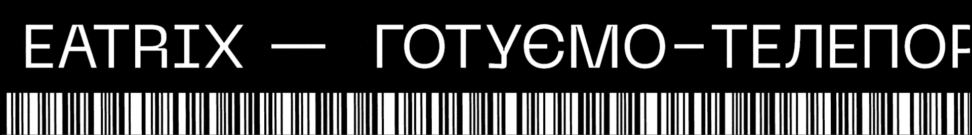
The slogan "Cooking - teleporting", besides the cool sound, reveals the main advantage – cosmic- fast delivery. What else would you want from a slogan?
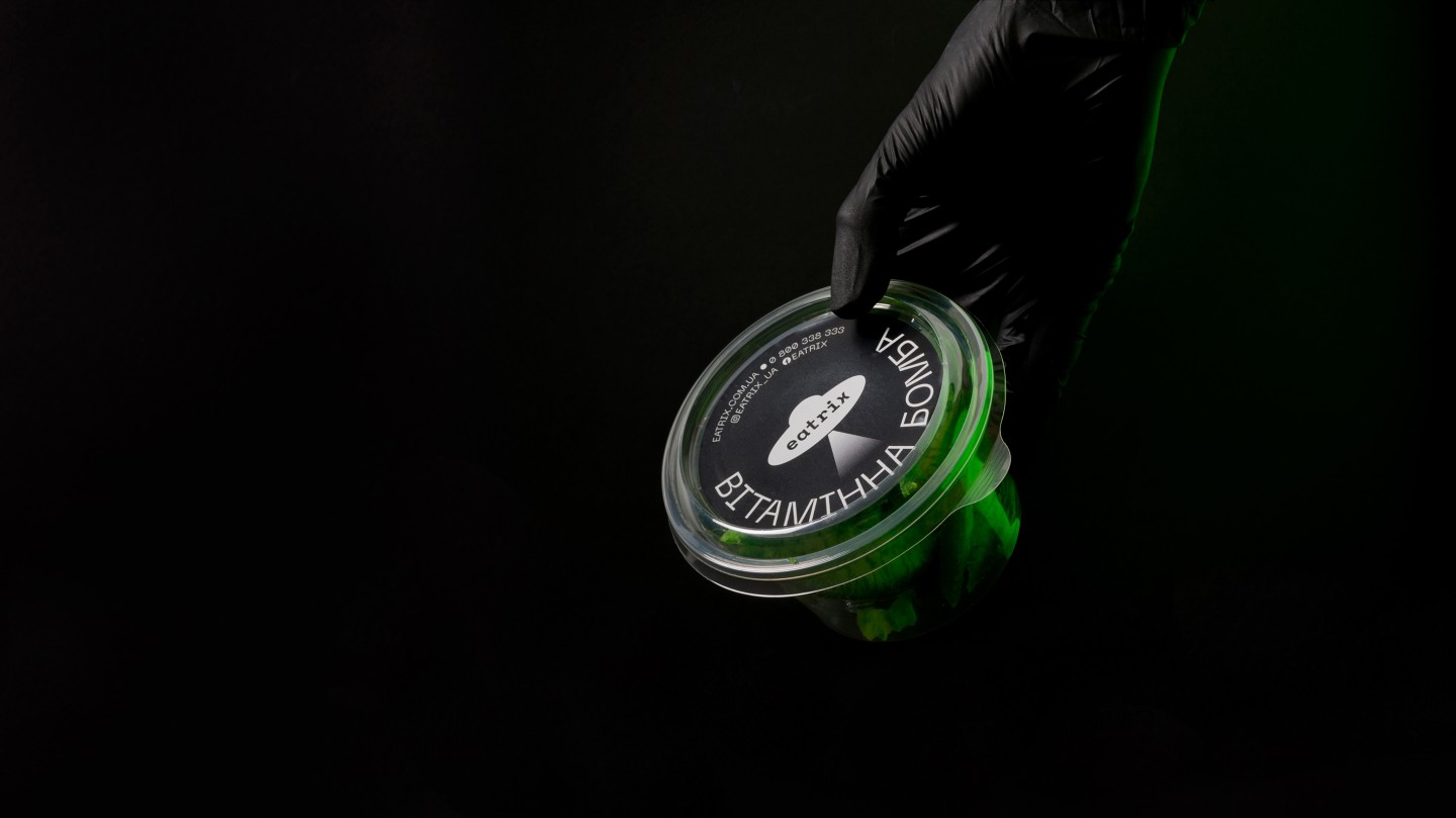
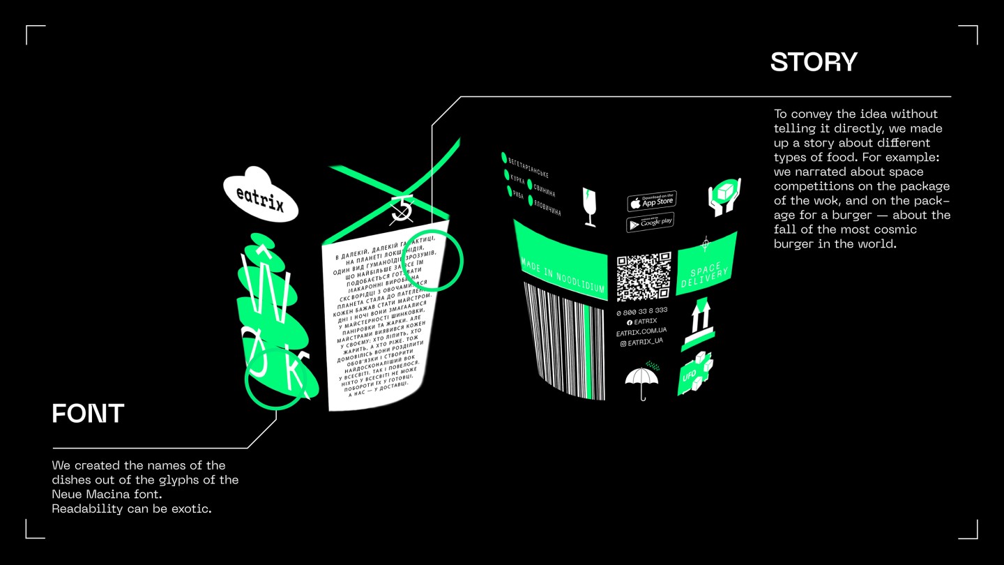
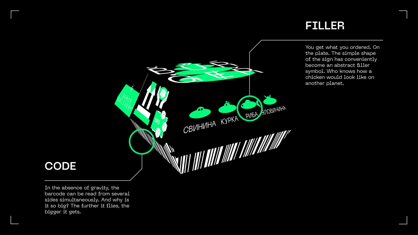
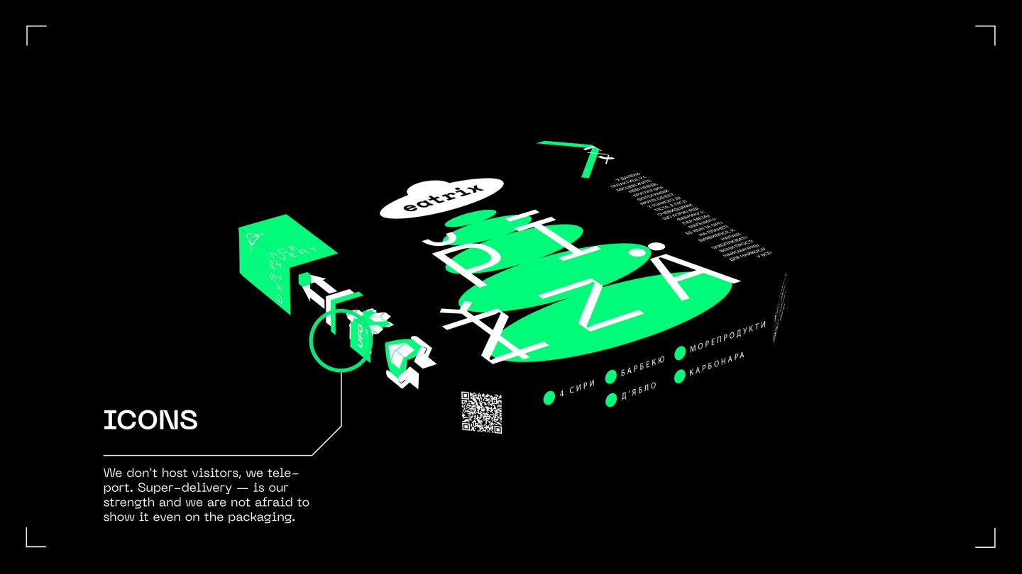
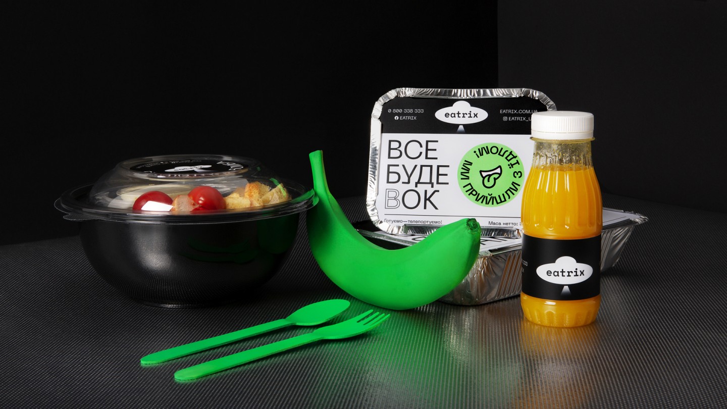
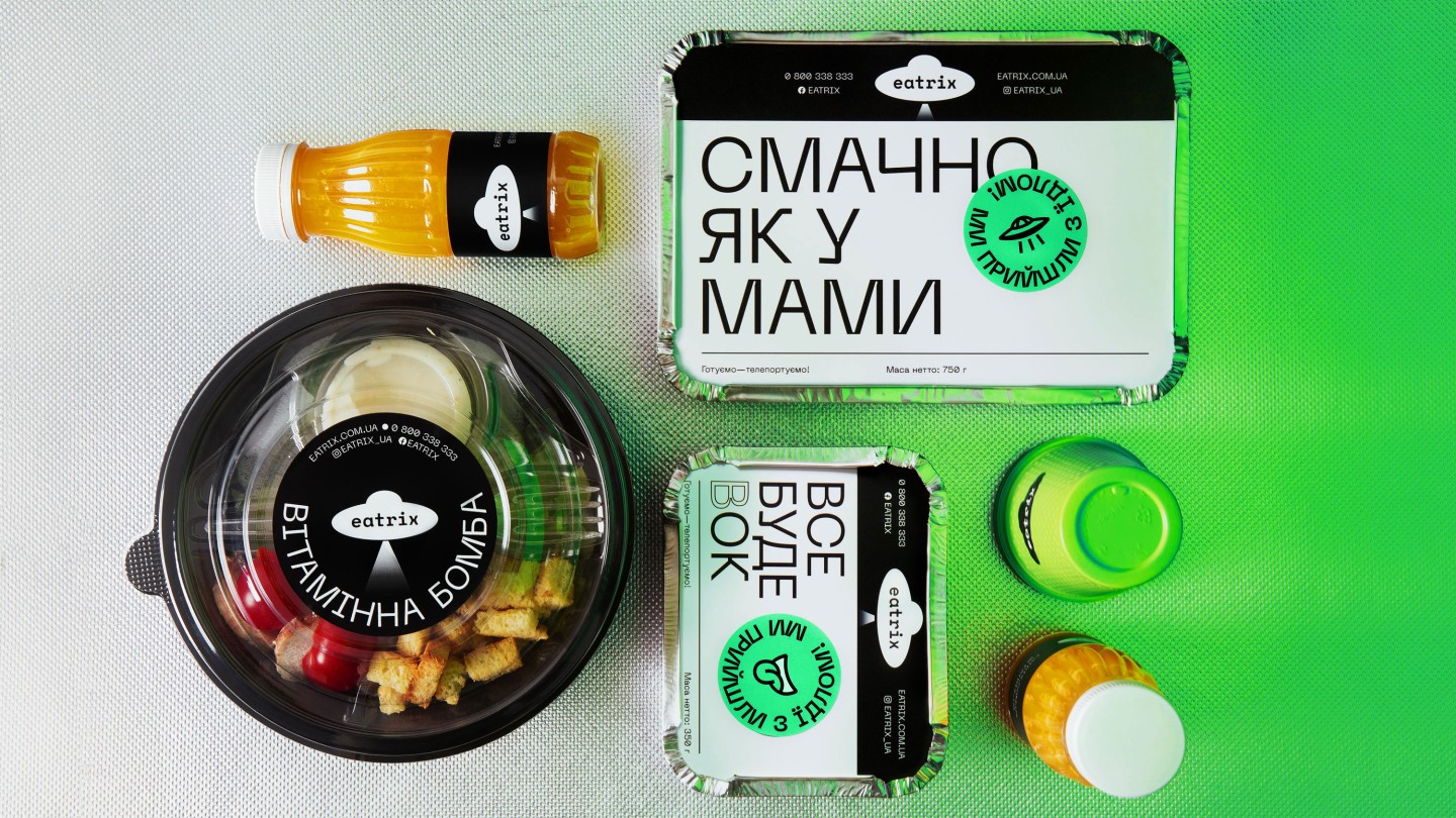
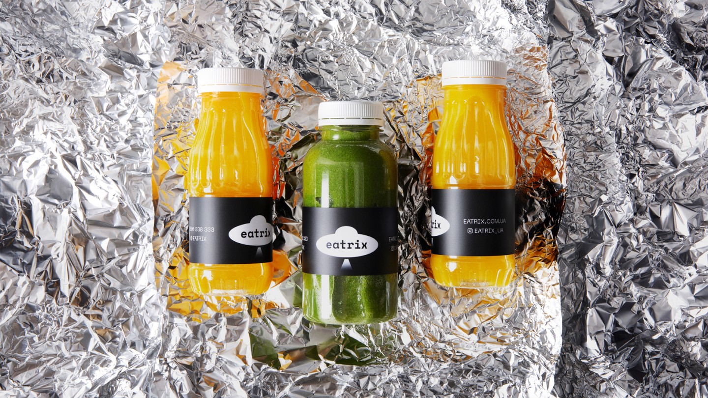
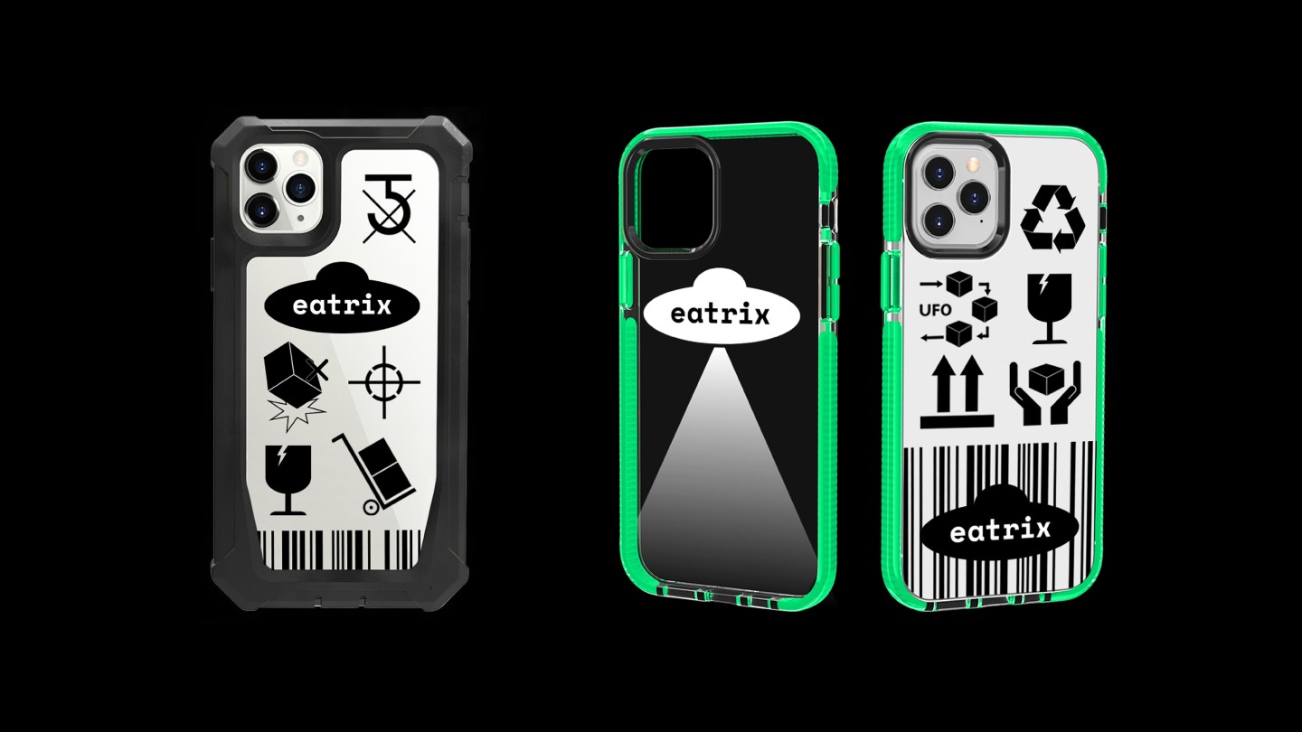
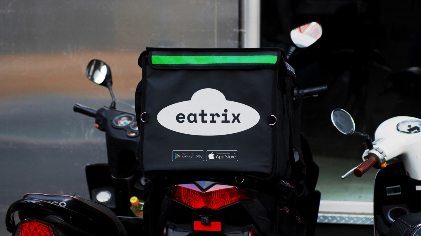
The Eatrix logo is a flying saucer that teleports food at cosmic speed. There are levitating objects and a dynamic beam, into which you can fit anything you want, in brand identity. There is also an uncompromising acid green and, of course, aliens.
Credits
Strategy: Gleb Petrov, Artur Redzinets
Copywriting: Gleb Petrov, Stasya Lutova
Design management: Vik Vatamanyuk
Design: Vik Vatamanyuk, Stasya Lutova, Veronika Syniavska
Motion design: Egor Priyma