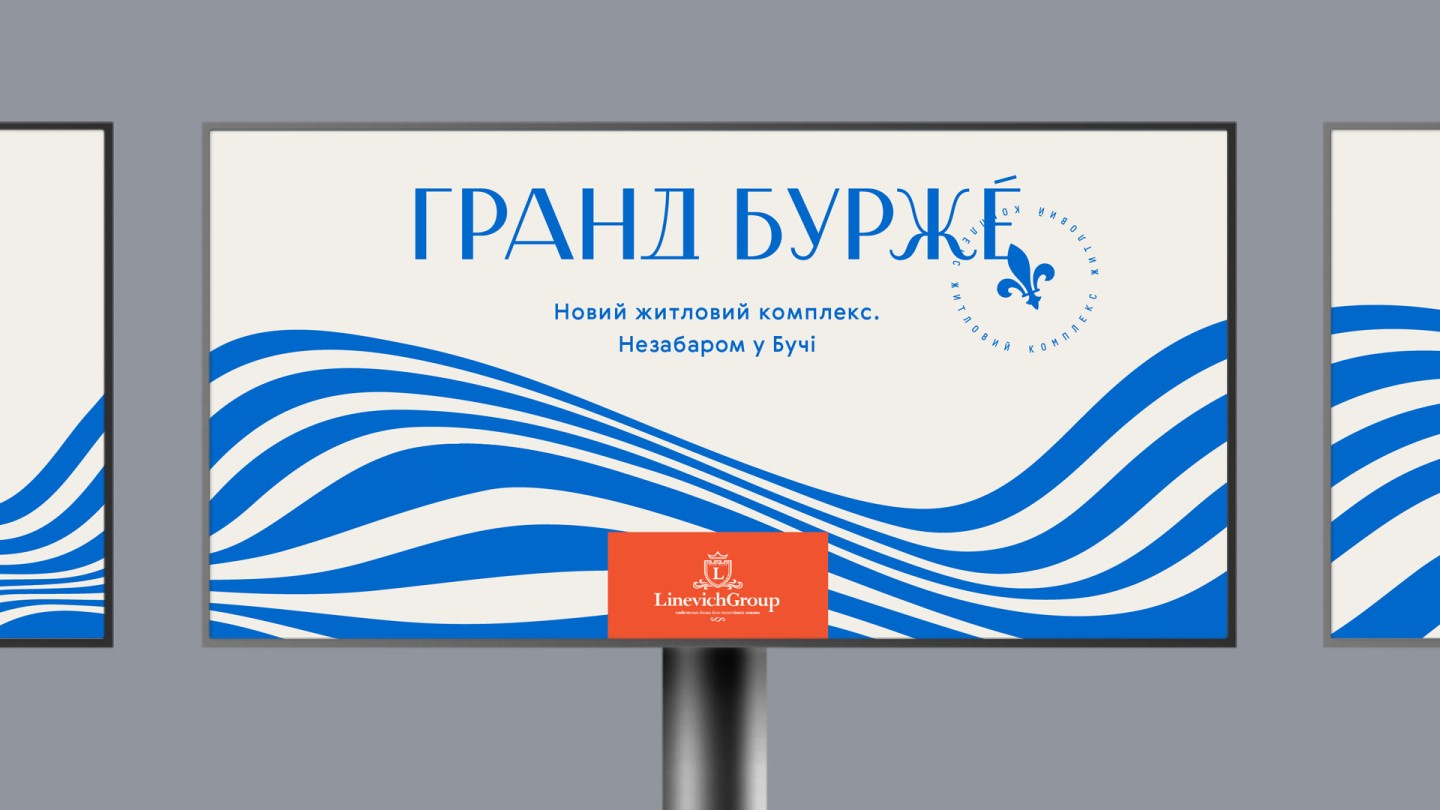
Grand Bourget
Real estate branding: strategy, design
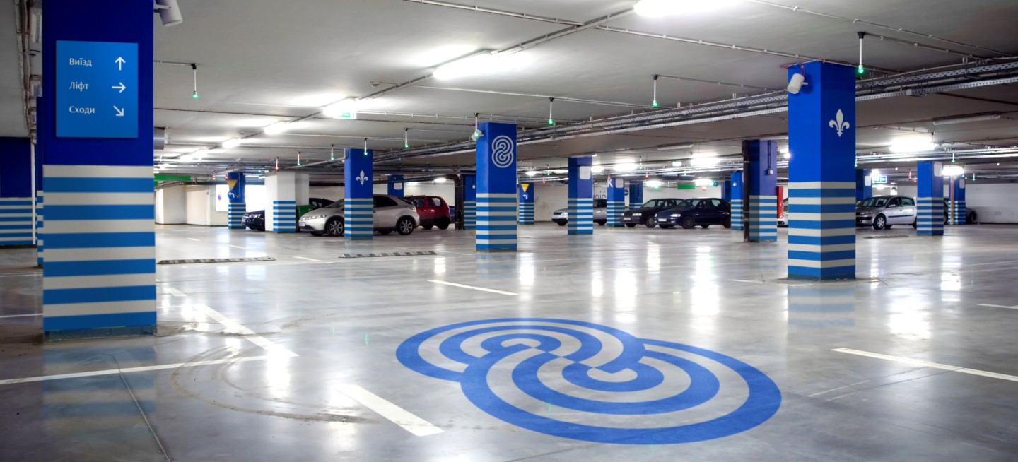
Grand Bourget is a modern residential compound in the town of Bucha from Linevich Group. The concept of the compound intends to build bright and cozy apartments with improved planning and create a multifunctional infrastructure, including playgrounds, small lakes, a shopping mall, underground parkings as well as fitness club with three swimming pools and a kindergarten

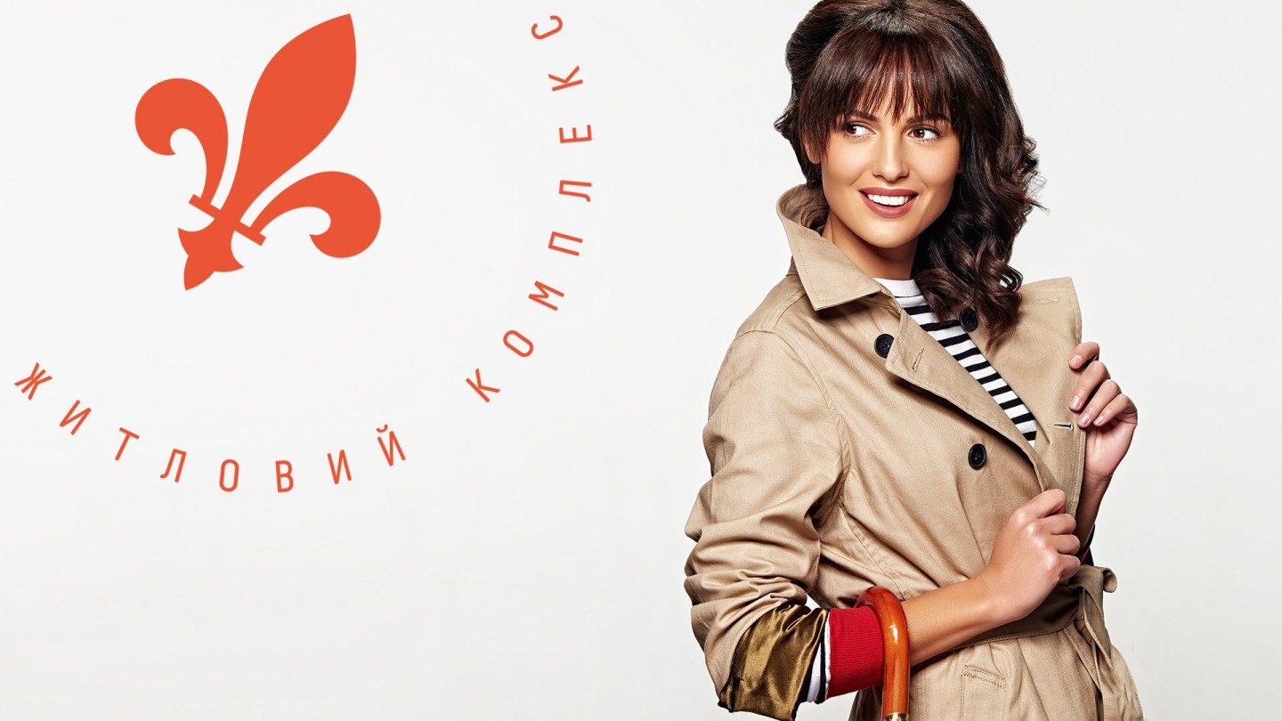
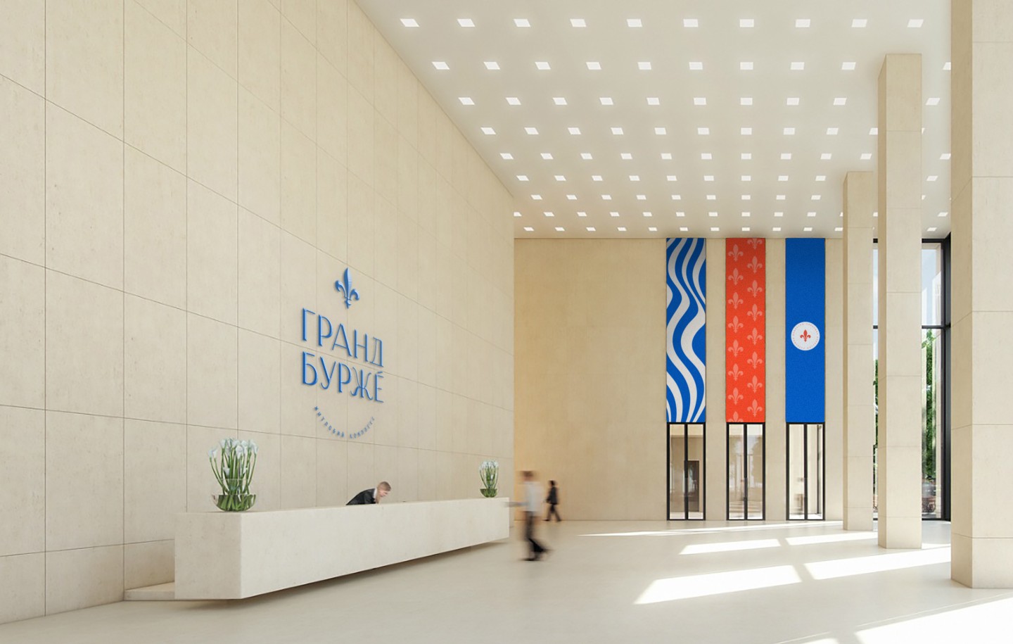
We created an image of the compound with French elegance, which recalls Lac du Bourget. This lake and its surroundings are among the most picturesque places in France
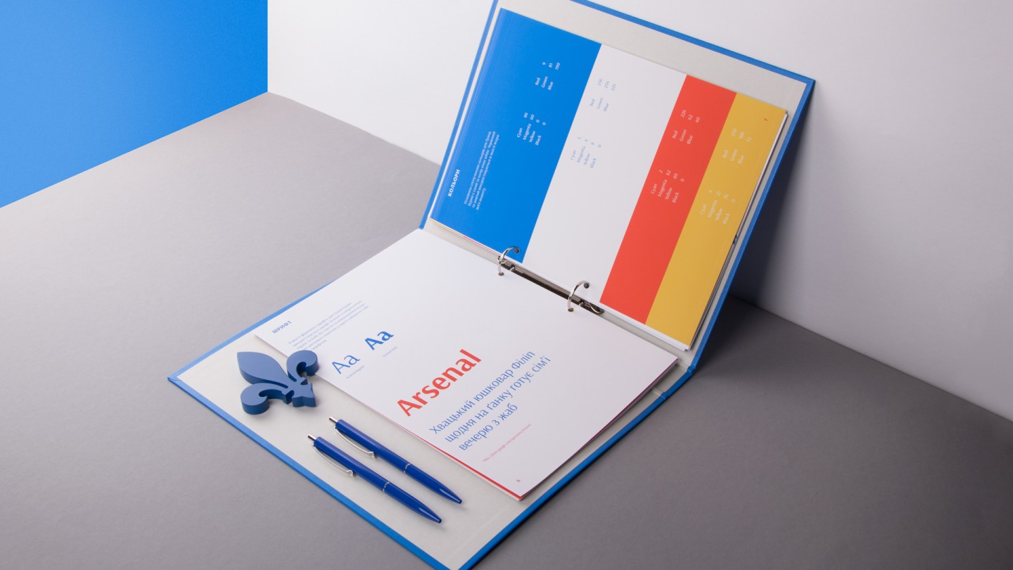
We wanted to avoid styling to an archaic Frenchness and escape from the use of antiquity. So, we created a contrasting grotesque inscription with a low “waistline”, a playful wide -A- and diacritics over -E-, which also points to a word stress for Ukrainian customers.

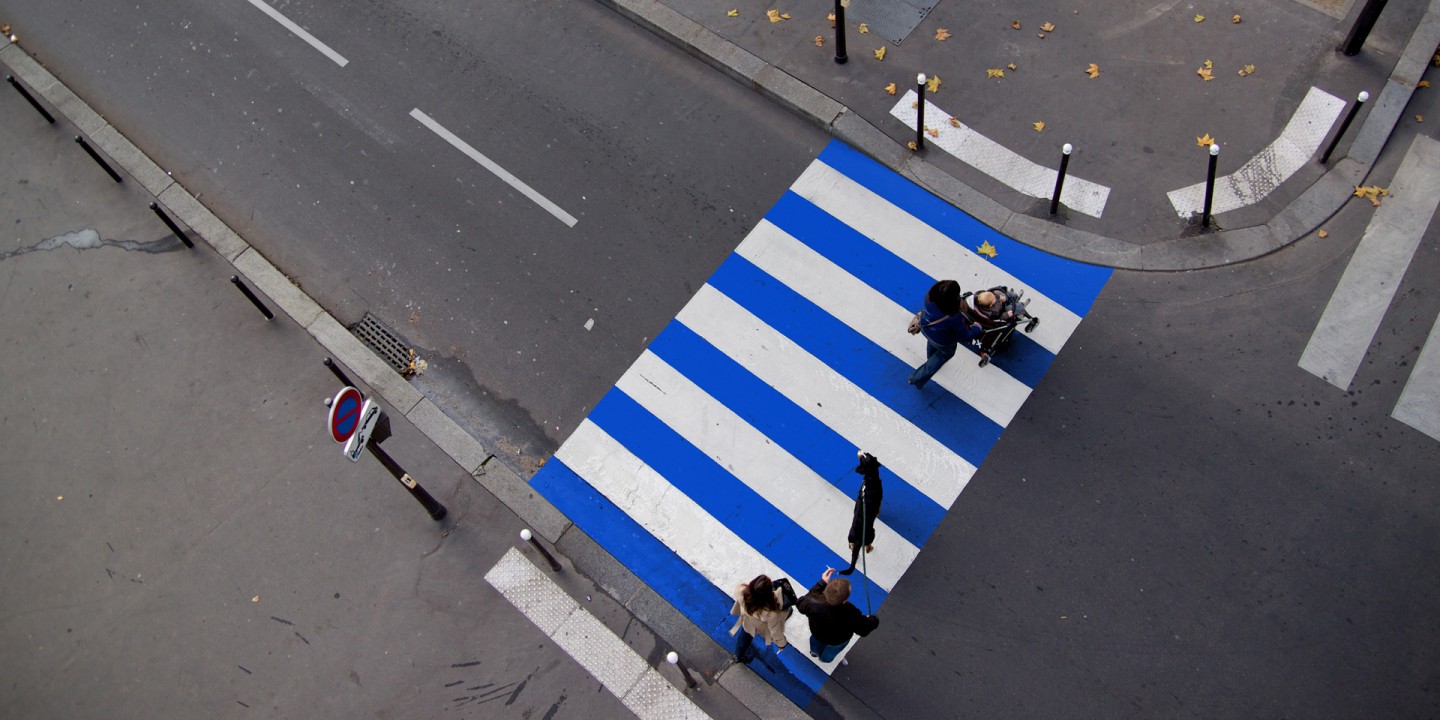
Wavy lines hint at water and irregularity of their rhythm imparts elegance and delicacy to the pattern. We all know that French fashion designer Jean-Paul Gaultier is famous for use of stripes. This inspired us to involve in compound’s ad not only usual building visualization but also a girl with striped elements in clothes.
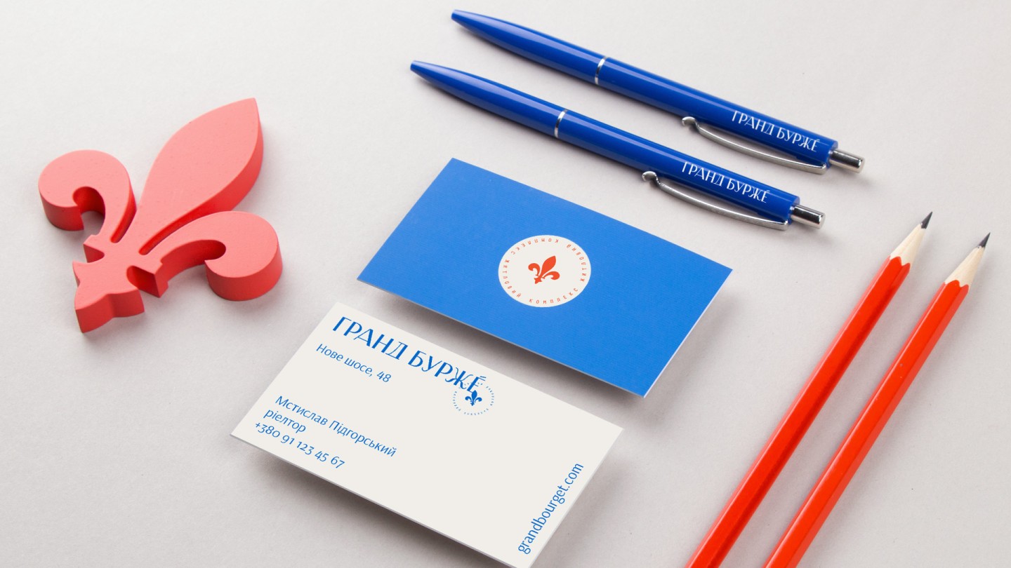
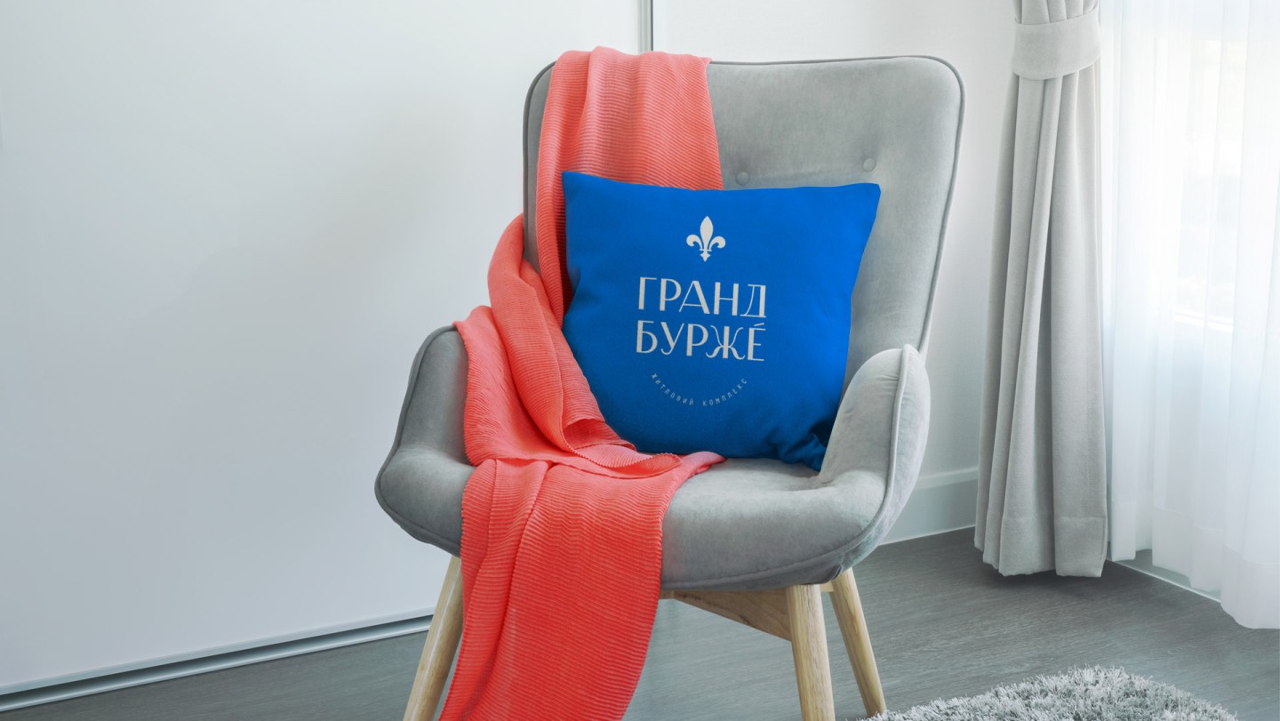
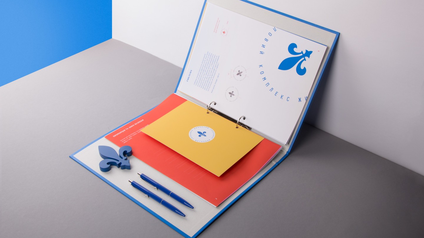
In addition, we used the fleur-de-lis (French lily) as a symbol of France. It became grotesque to create a harmony of symbol and inscription.
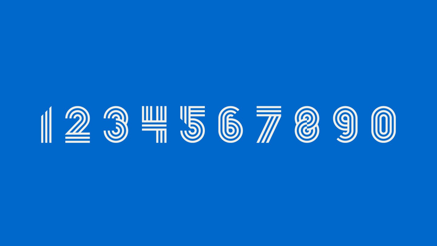
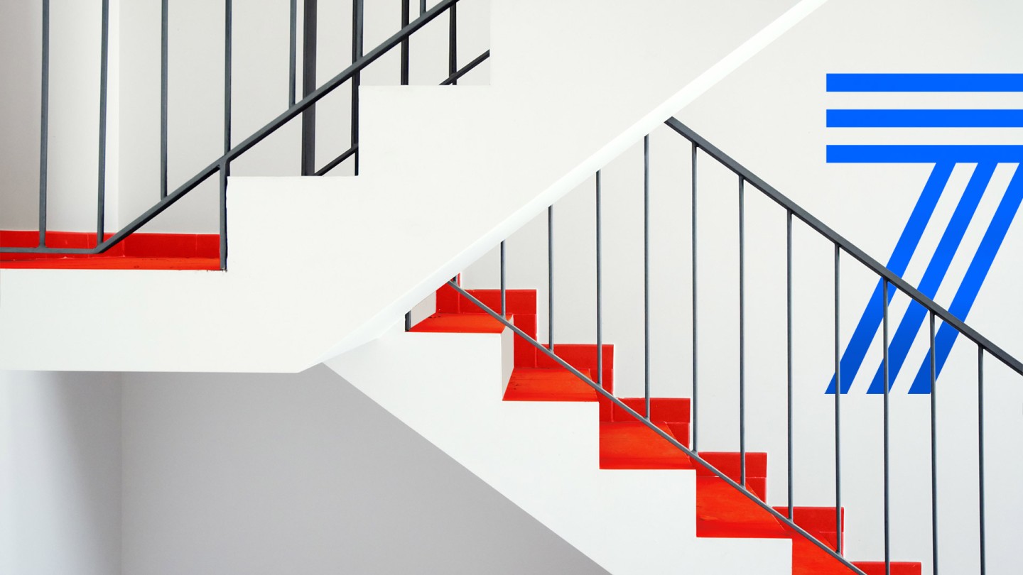
We designed a unique set of patterns and stylizations for numbers that are related to the wavy pattern. This is the best solution to print on promotional items of big sizes, such as walls, facades and billboards.

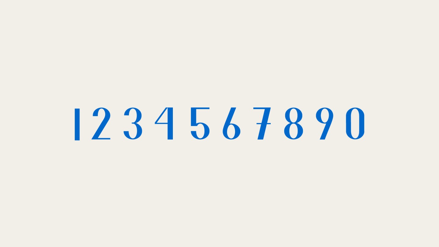
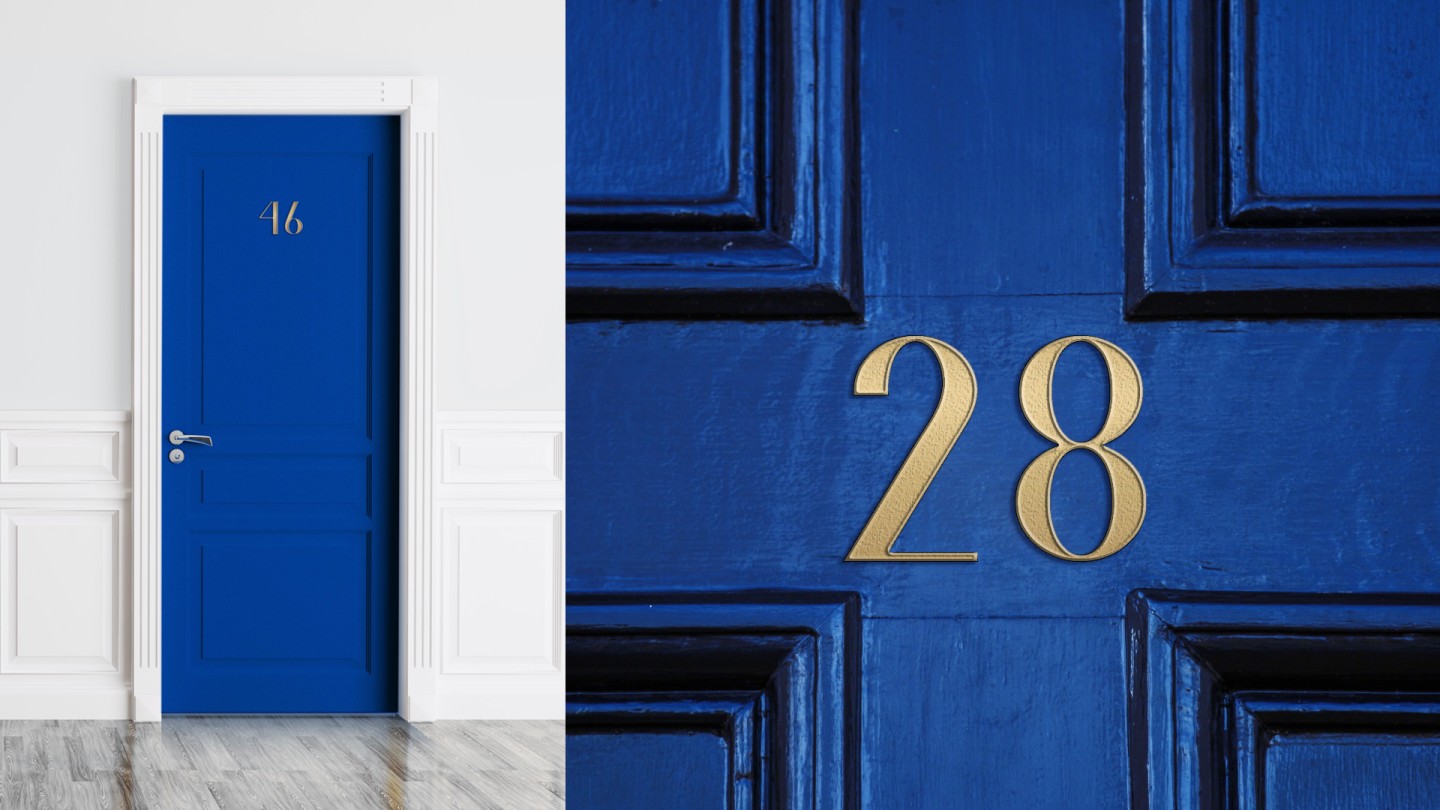
We was designed a special set of figures for apartments’ number plates that rhyme with the logo.


Credits
Design director: Vik Vatamaniuk
Design: Anna Kuts, Maria Kotemako
VFX: Emil Gorodetsky
Consultant: Vladimir Strashkov