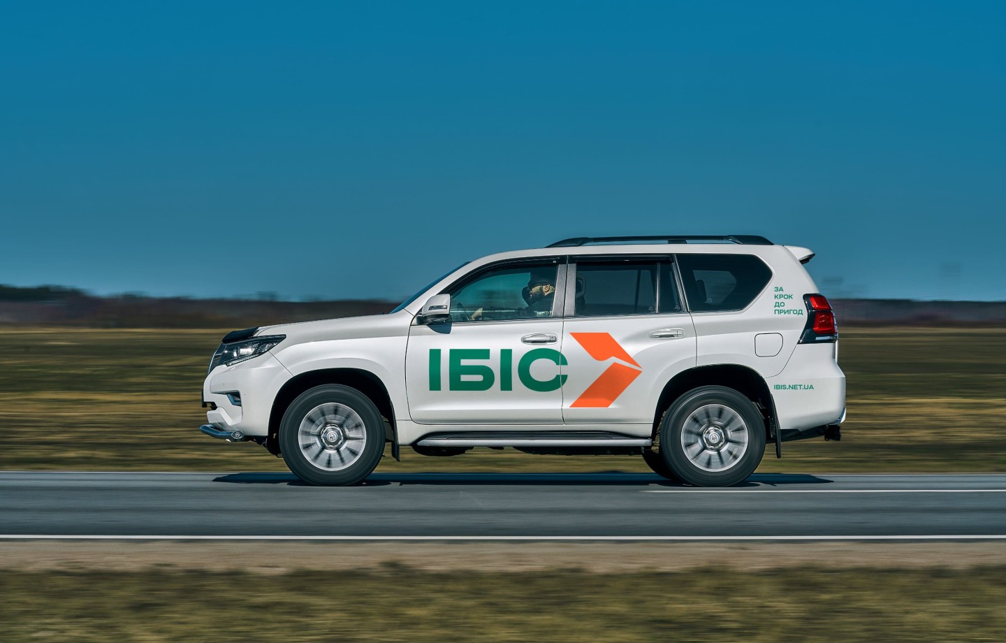
Ibis
Rebranding: strategy, logo and identity
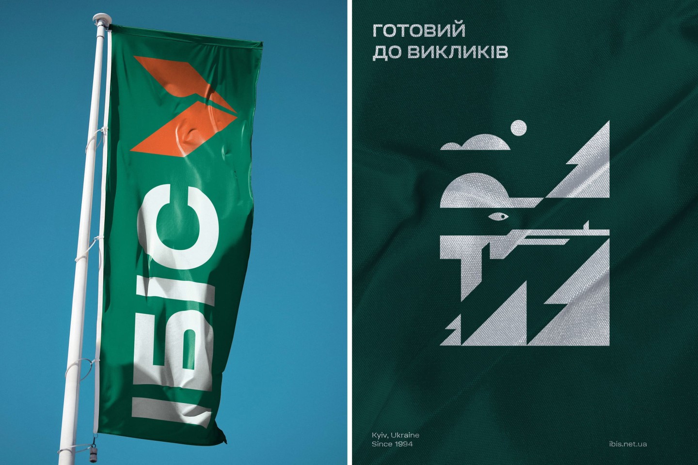
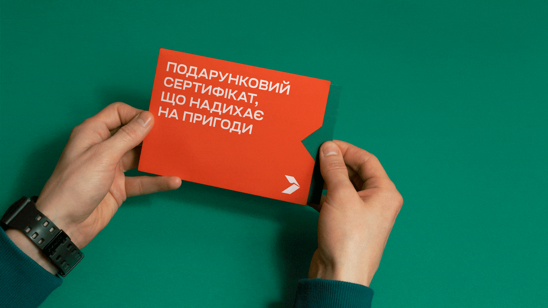
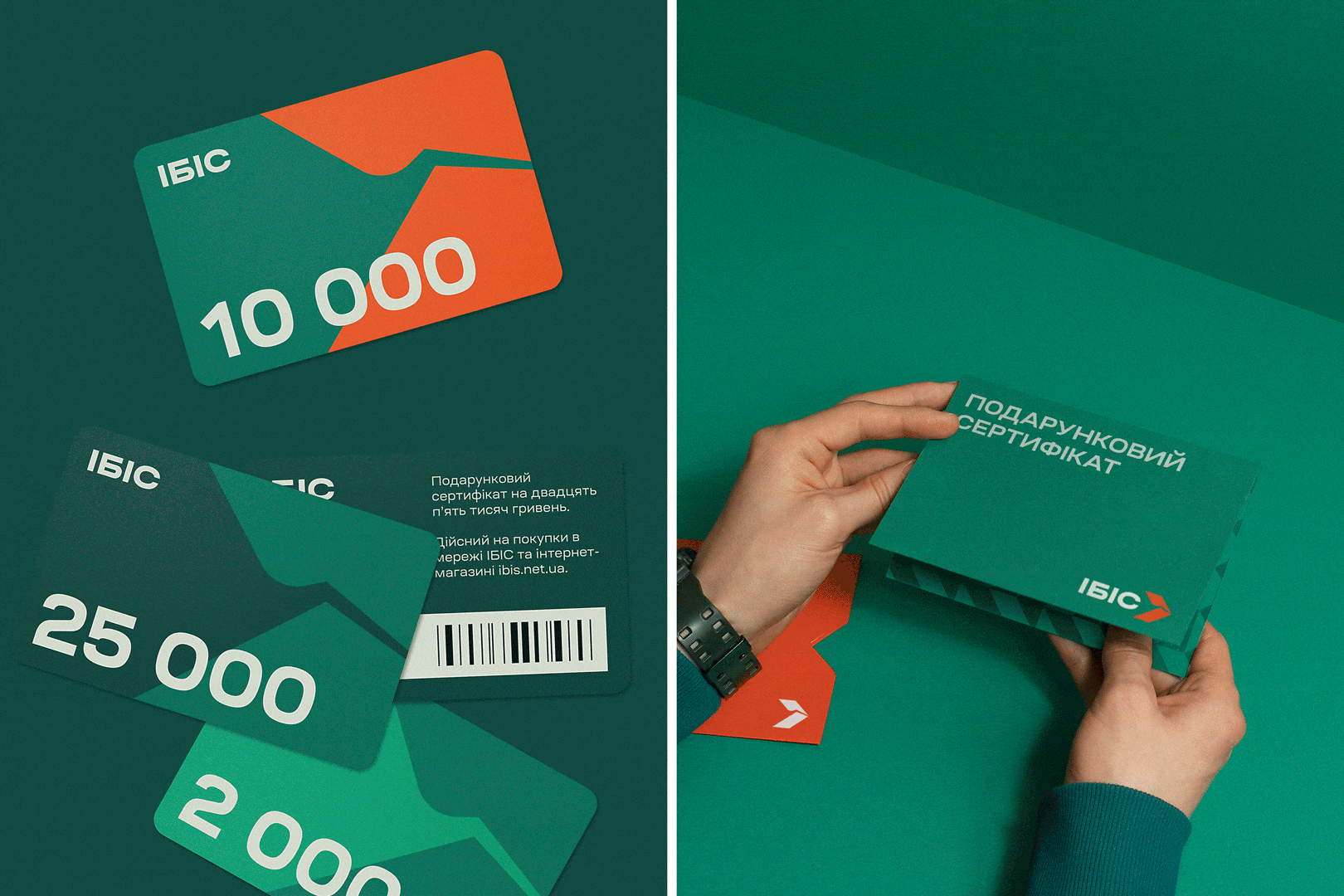
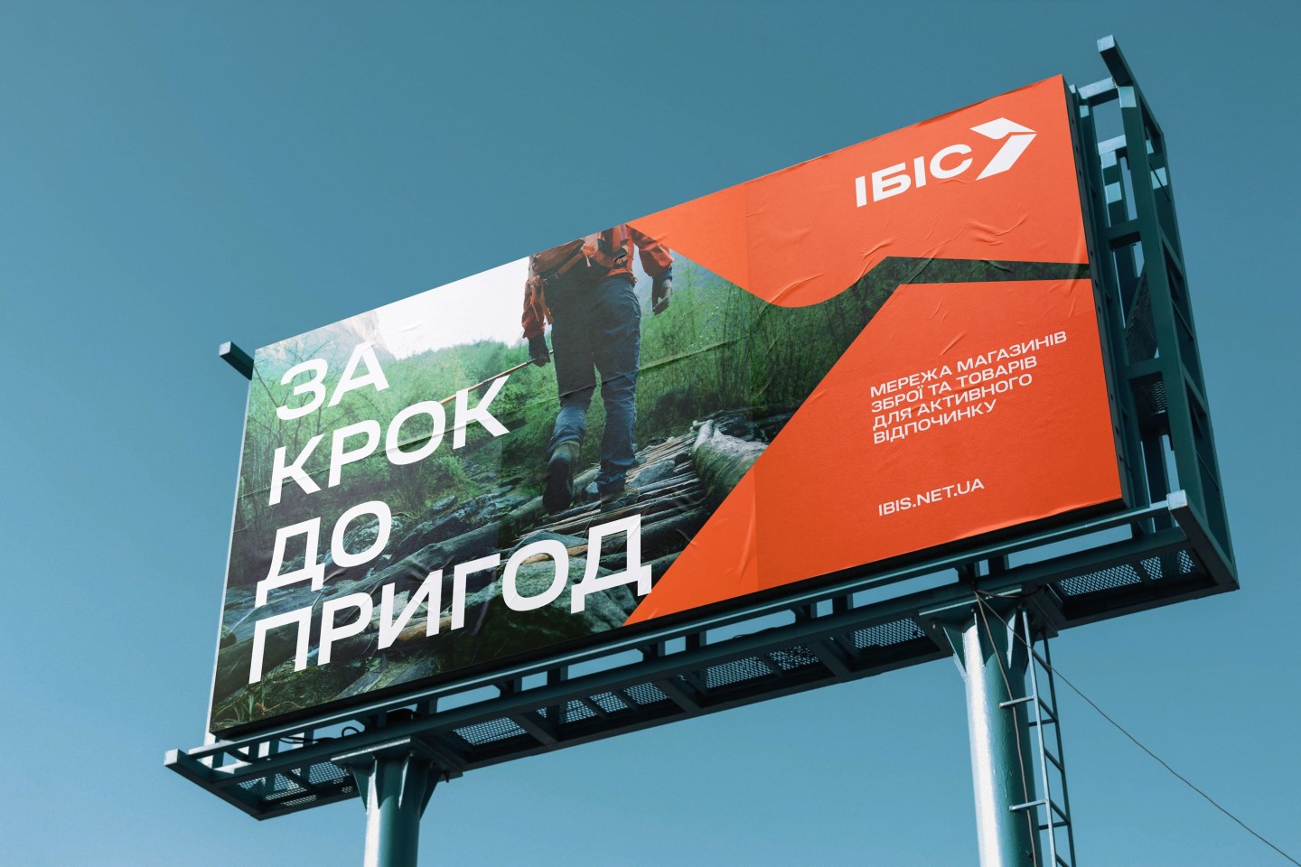
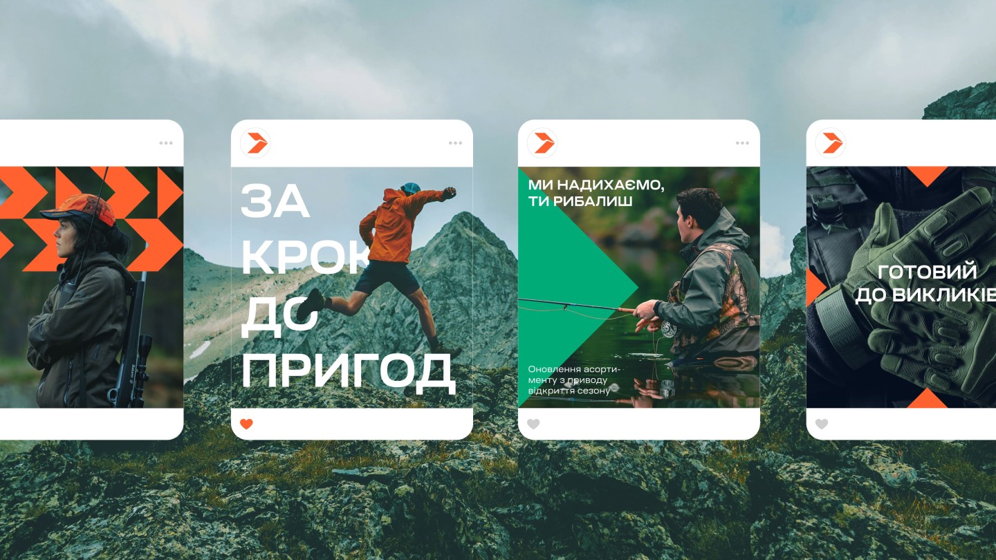
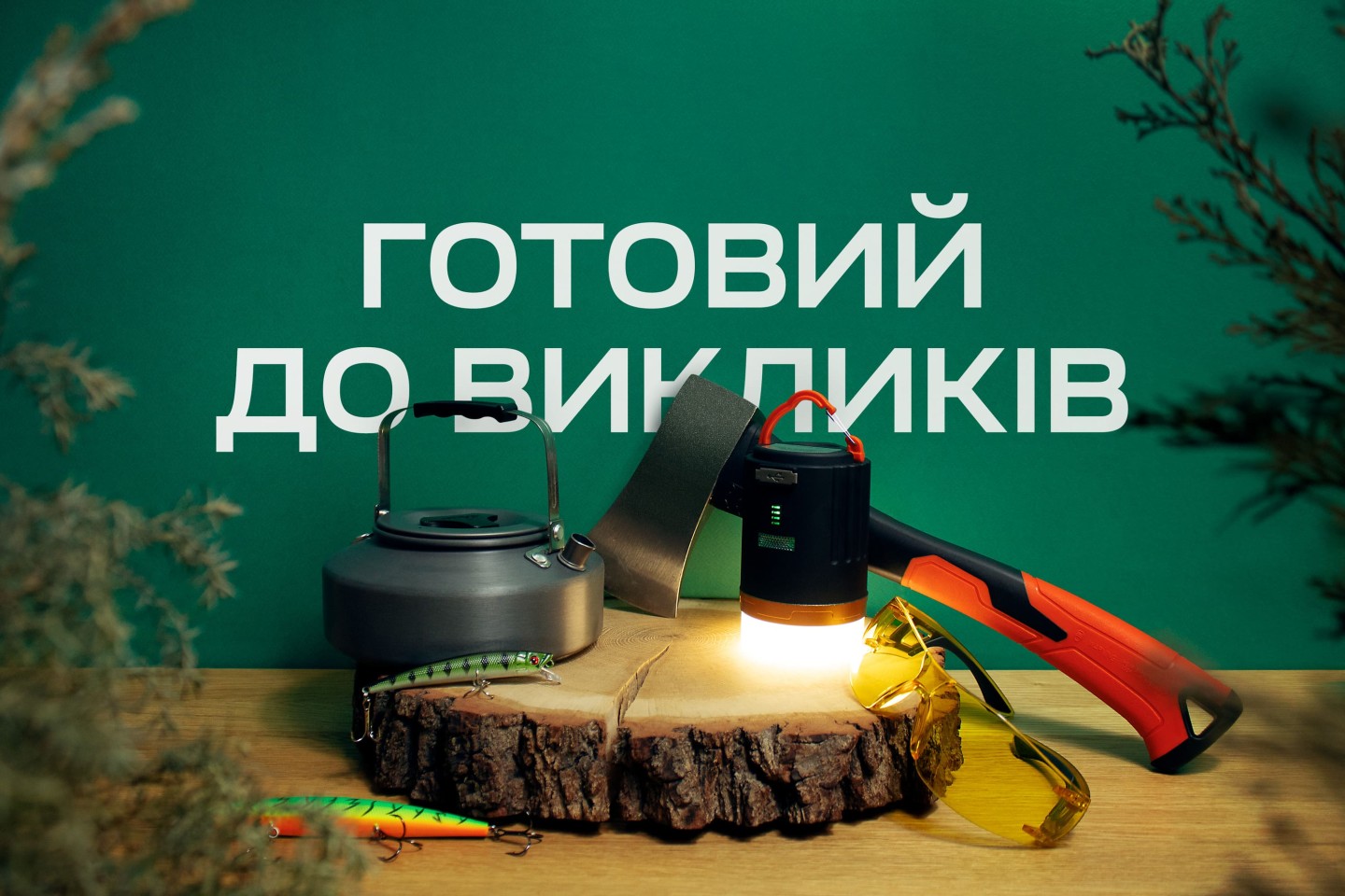
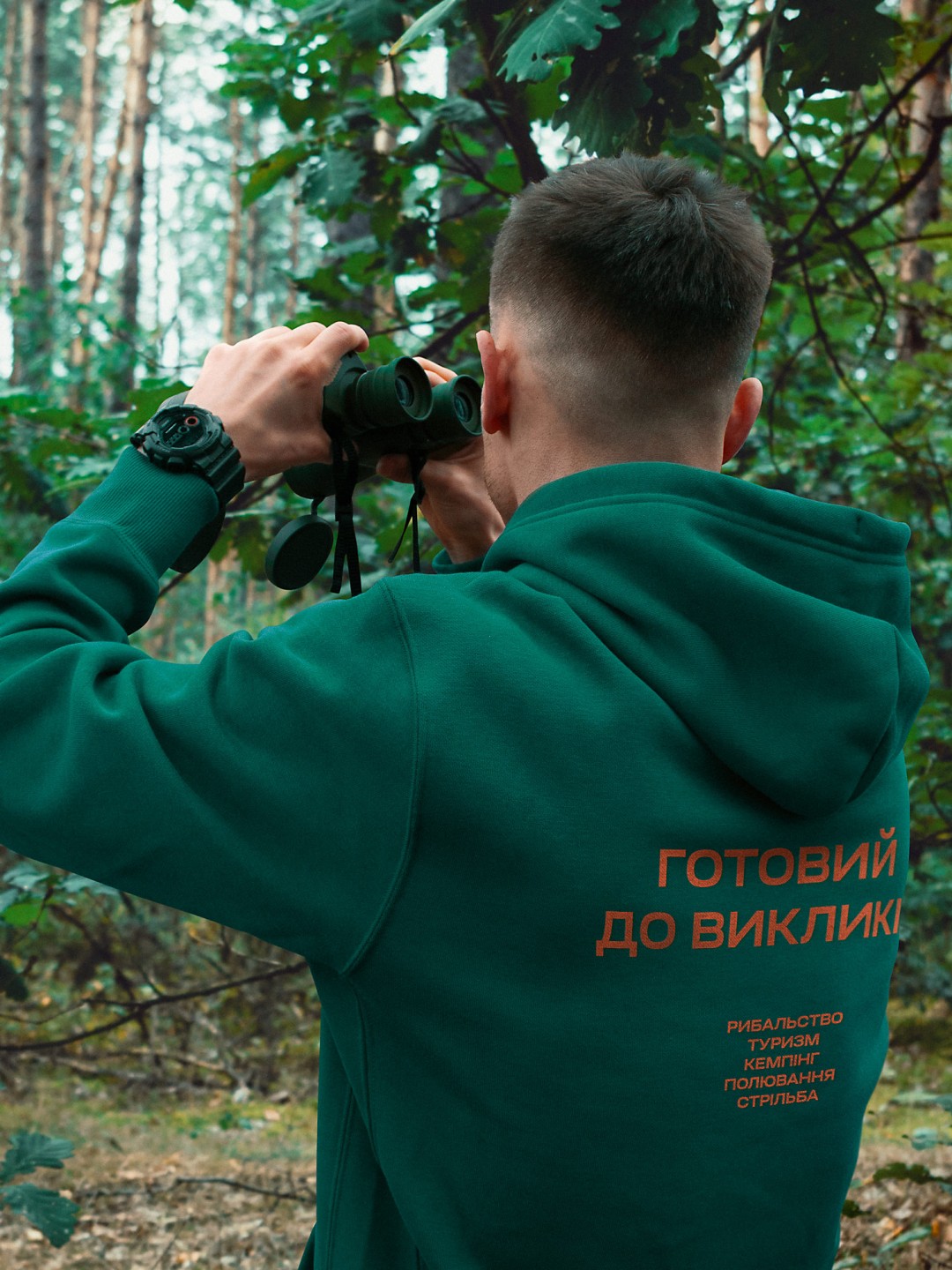
IBIS: Ready for challenges, ready for adventures.
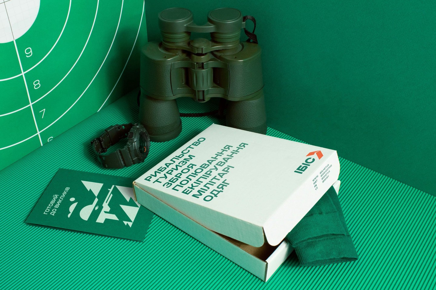
Many dream of having adventures in the style of Indiana Jones, but for this, a reliable helper is always needed. People are used to living within the confines of the city, and the wild nature presents a real challenge to them.
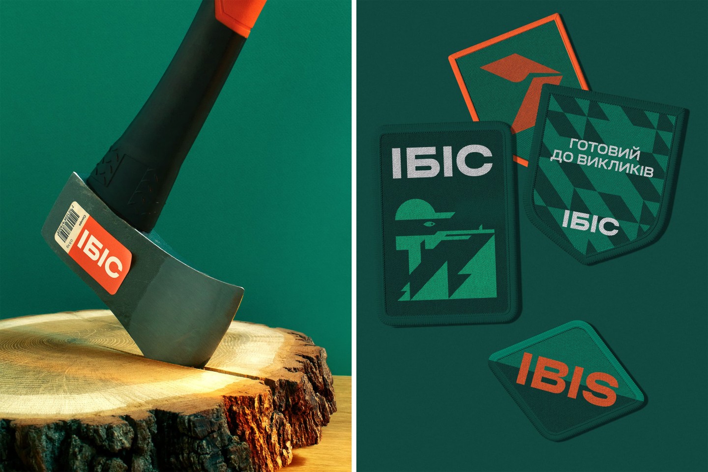
IBIS has everything to prepare a person to take their first step towards a new experience: the brand has thirty years of expertise and a wide selection of reliable equipment.
The strategy of the updated brand is to prepare people for the challenges that await them during adventures.
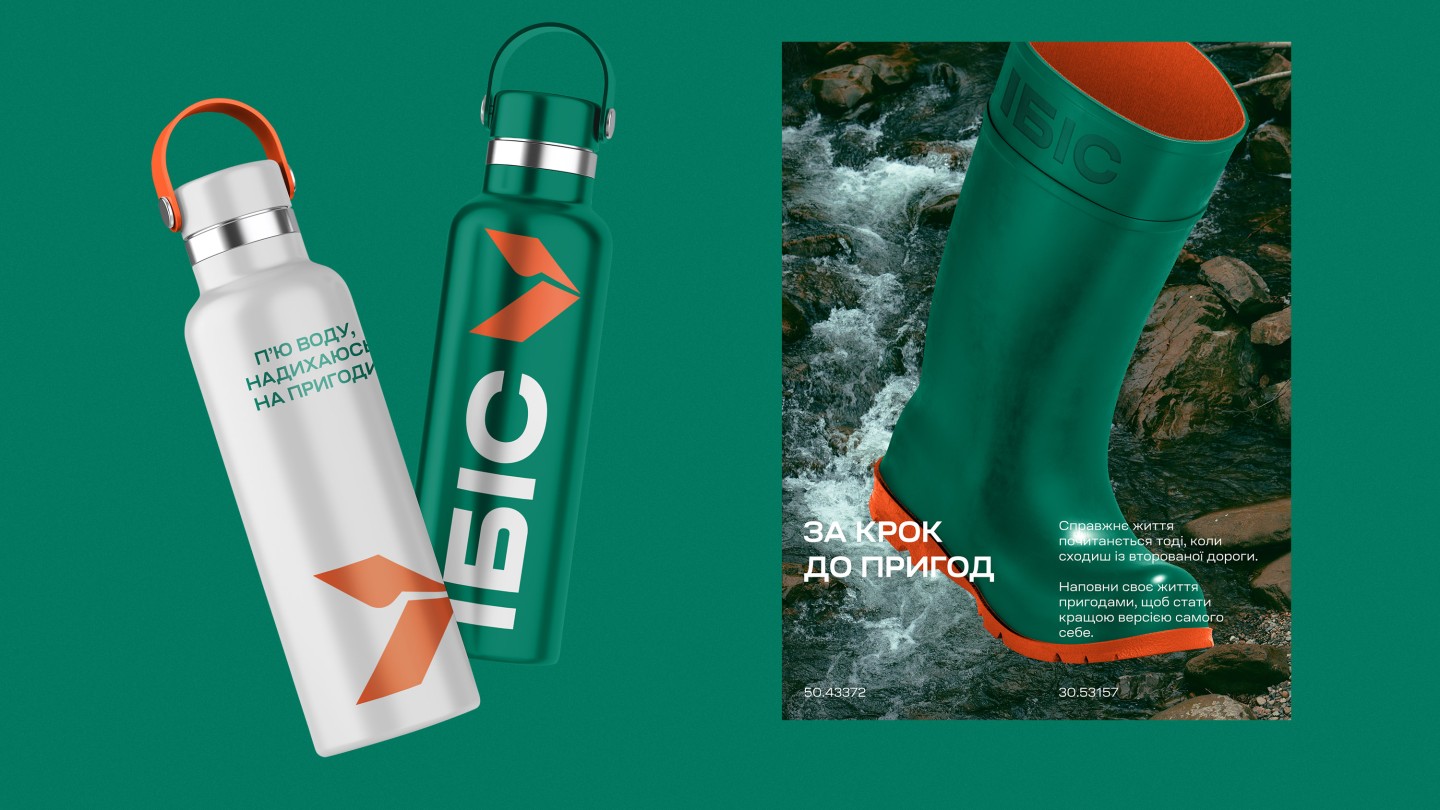
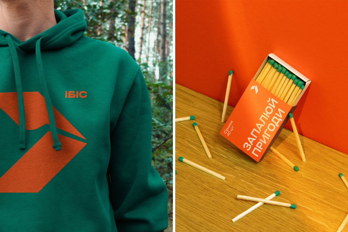
During wartime, IBIS helps people overcome the trials of a rough time: civilians can find lighters, warm flasks, and flashlights here, and military personnel find their favorite AR-'s and gear.
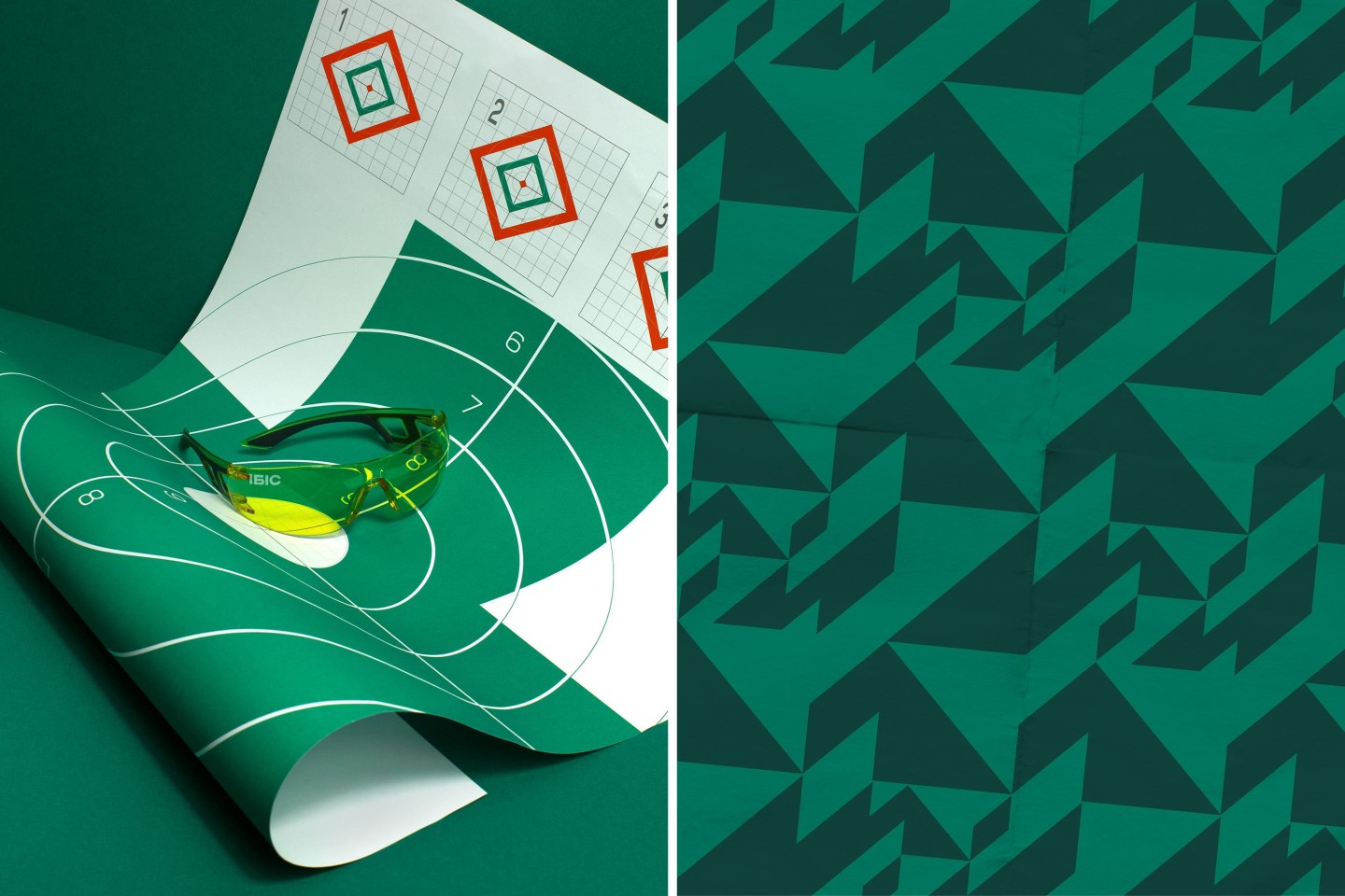
IBIS will help everyone choose the proper tool for any situation.
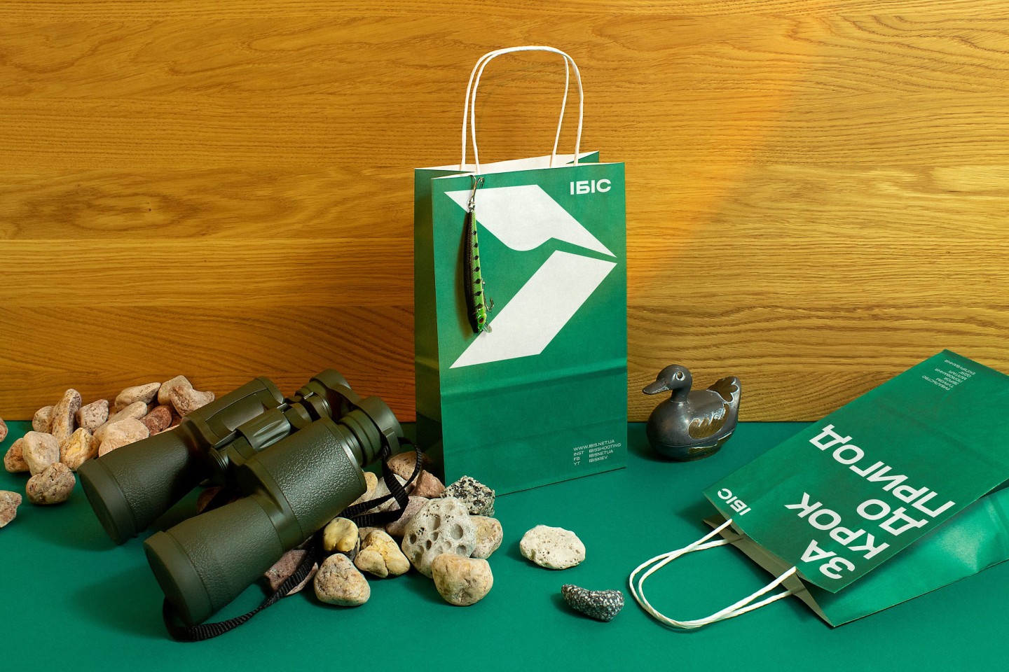

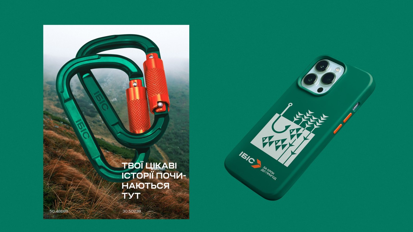
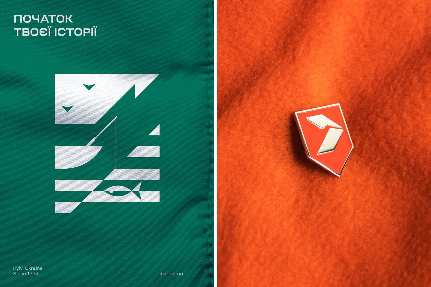
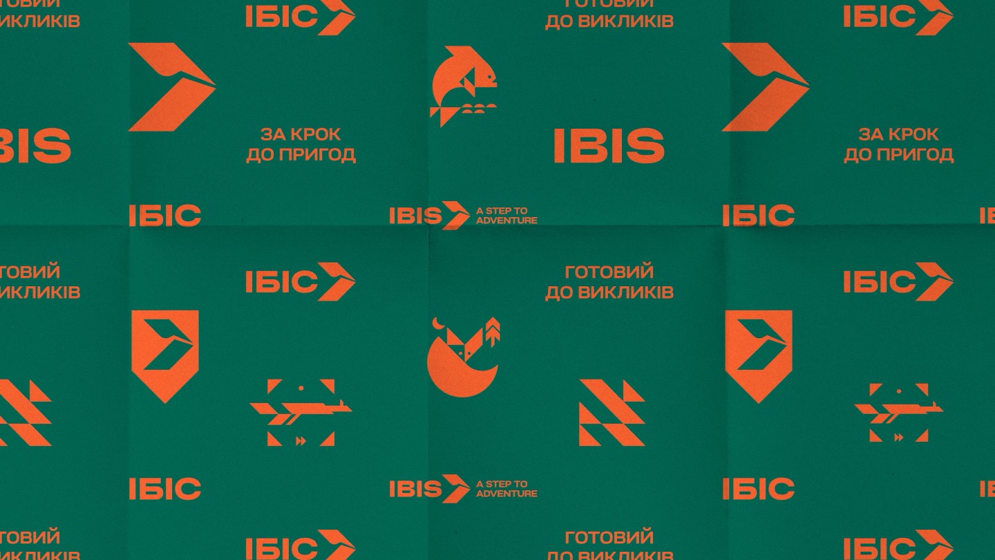
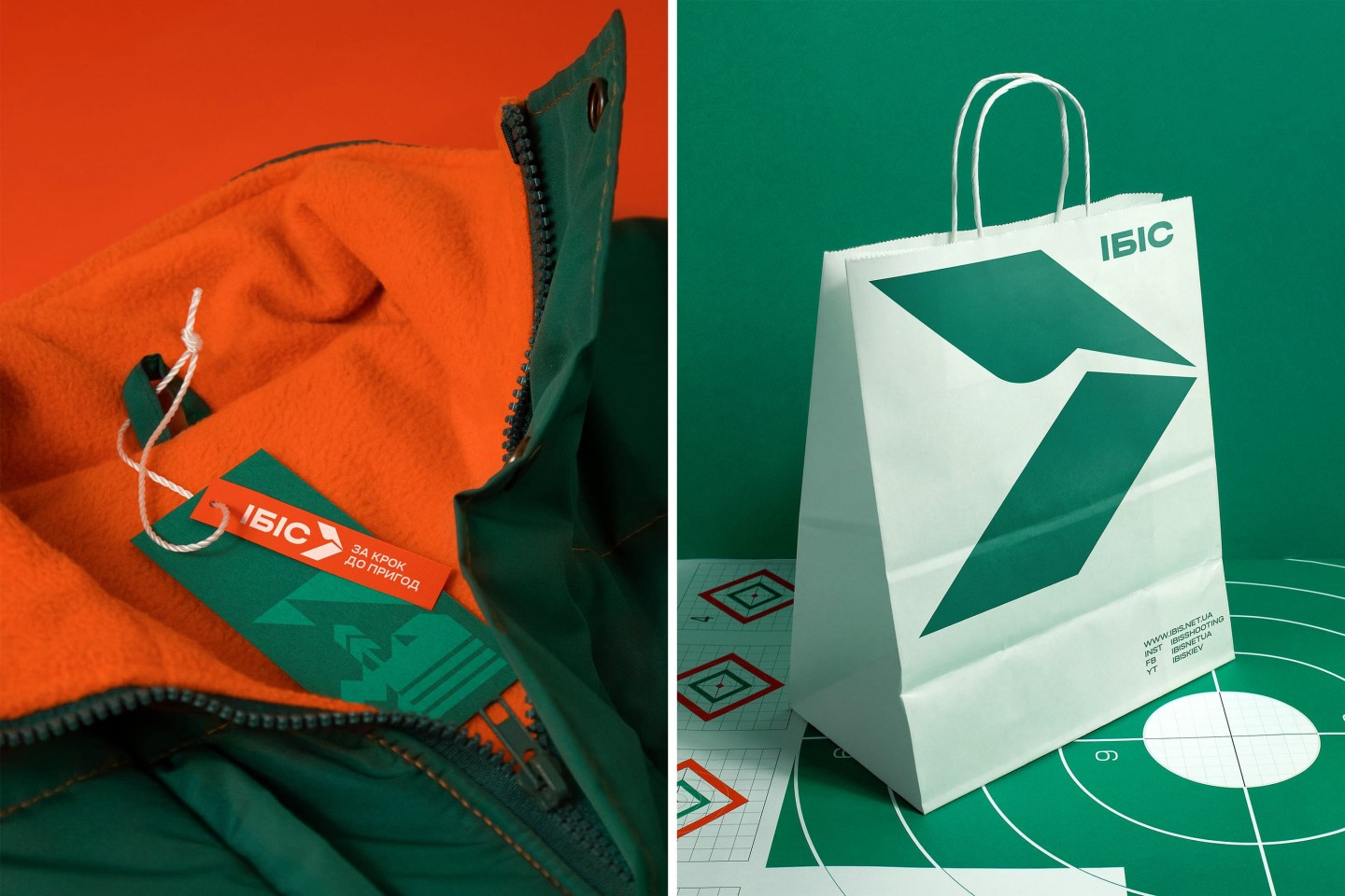
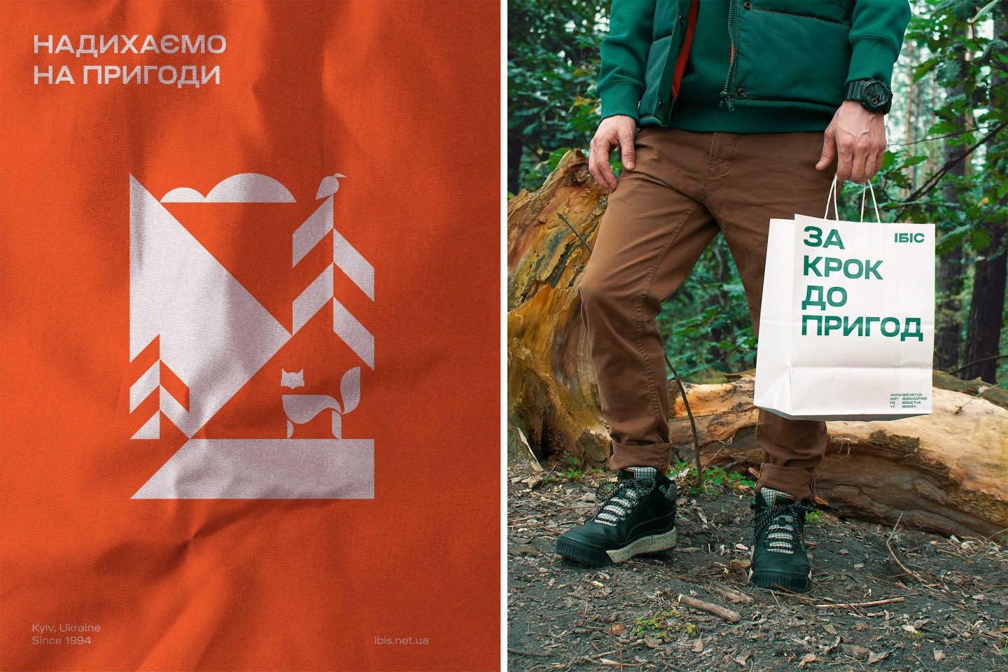
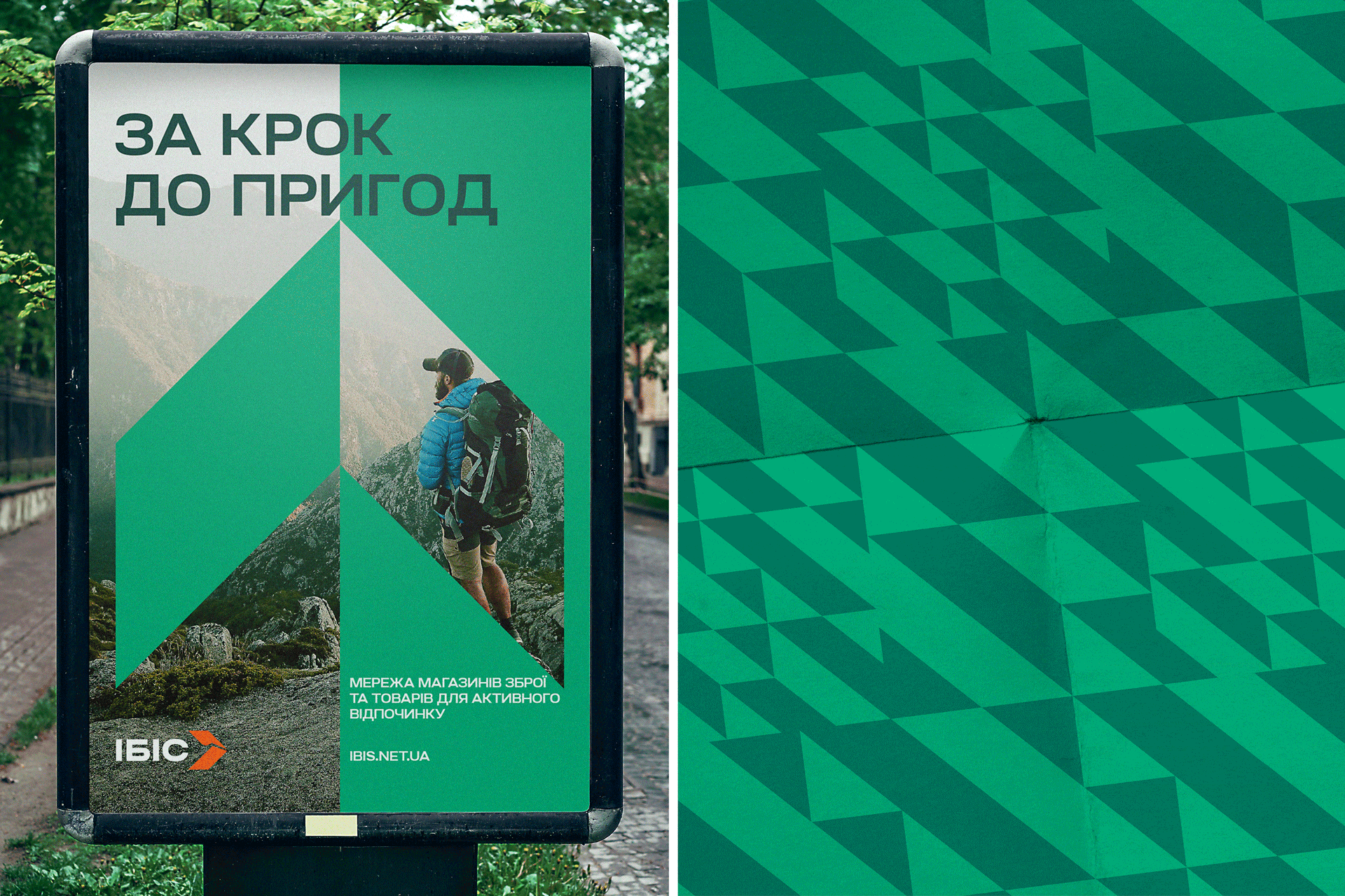
The basis of the brand style is an arrow that rushes forward.
The arrow is a universal sign that, on the one hand, symbolizes travel and discoveries and, on the other hand, reflects positive changes.
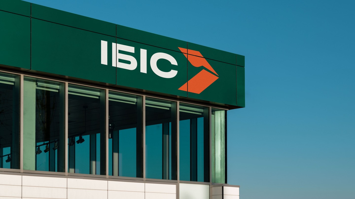
We wanted to maintain a connection with IBIS traditions. Therefore in the updated logo, we combined the arrow symbol with the silhouette of a legendary bird that fearlessly flies toward new horizons.