Katacult
Brand development of ticket service and media: naming, strategy, design
Katacult — is a celebration. Events, concerts, parties, fury. You dance.. and there you are surrounded by art-director, designer, operator and a few more creators at the smoking area. Why should you go far, if everything you need is close to you? Everyone, who knows what’s up, who is in the flow, everyone who wants to make life brighter and bring it to the next level. Everyone, who is Madcats.
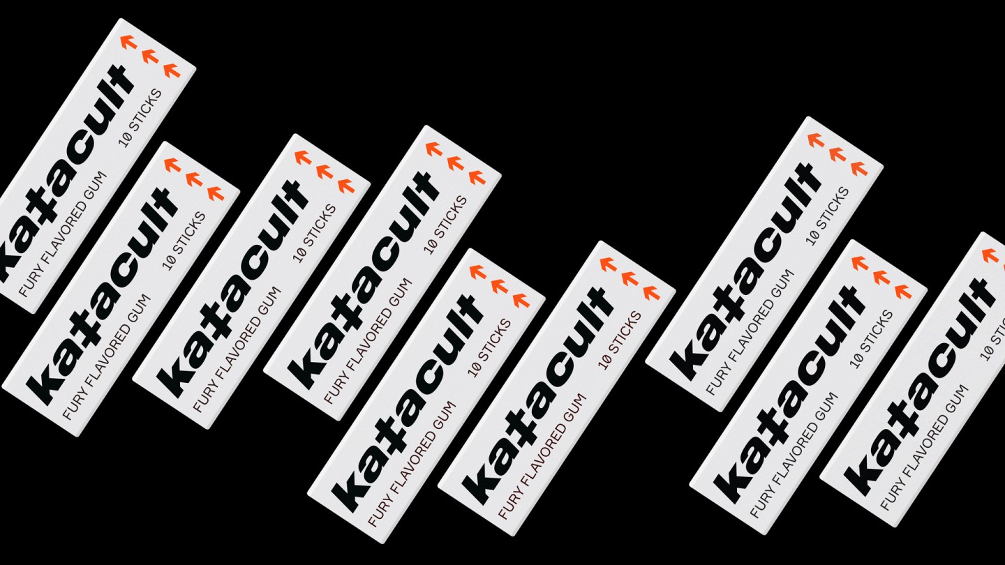
This project was developed for us as well. And so we started with the word: Katacult — it’s "kata" + "cult", where the first part comes from traditional eastern martial arts, and it means relapsed movement, basically a dance; the second part is a hail to parties, music and people. It’s sound-like rhythmical name with the slight allusion on a catapult’s power and the phonetics of a dj-pad. It is easy to memorize, once you’ve ever heard it — it’s all yours.
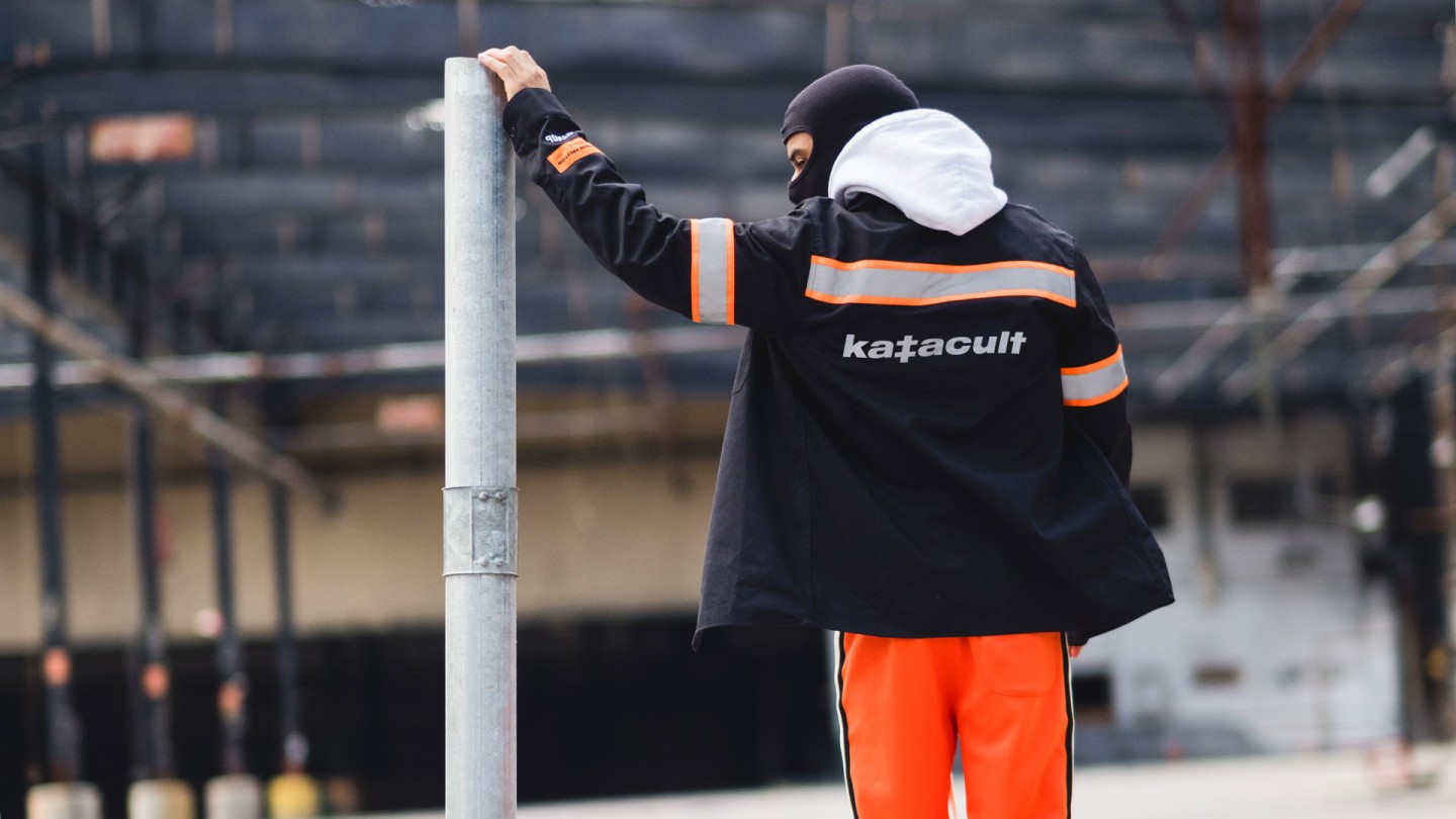
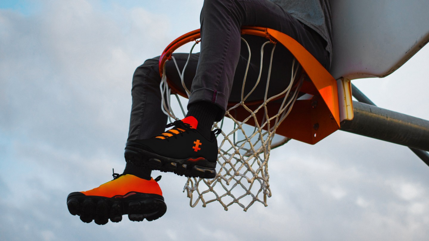
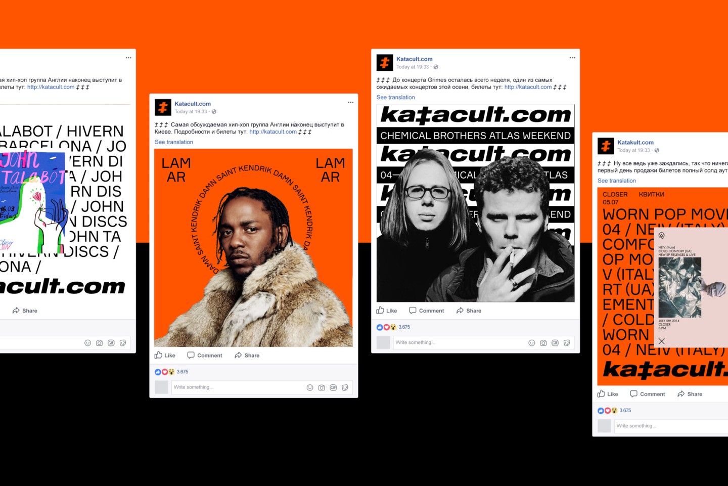
We intentionally made everything so bright and loud. Brand, that specializes on events should be recognizable, so that the people would always know where to go and what to do. So, there is Katacult, and there is an event for a punk, for a party animal or a party for a jazz enthusiast. You don’t need to memorize the names of clubs, line-up’s, you don’t need to surf the internet to find things, that you didn’t even need. You need to remember the only thing, and its name is Katacult.
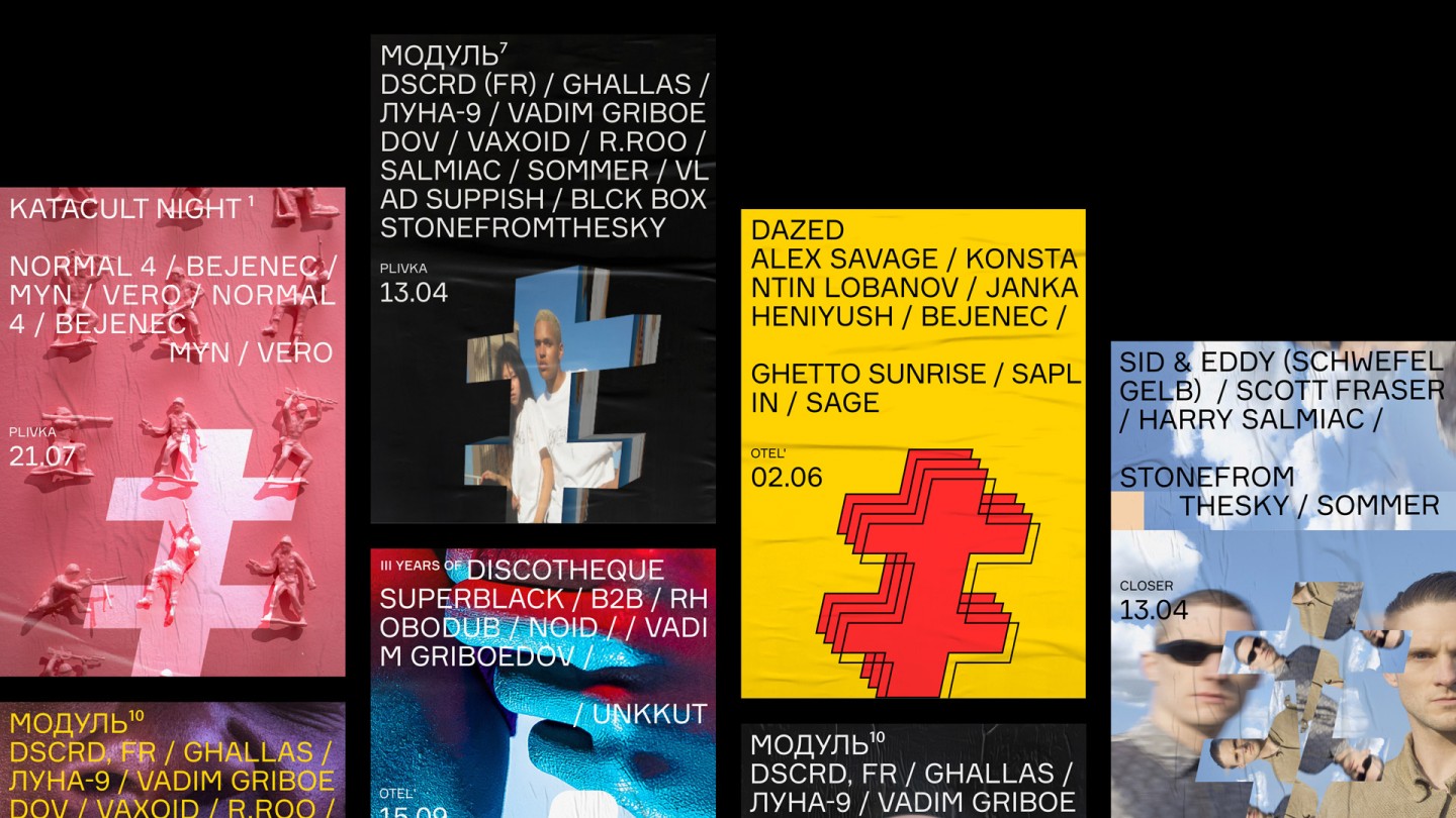
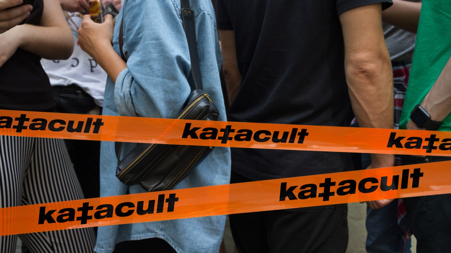
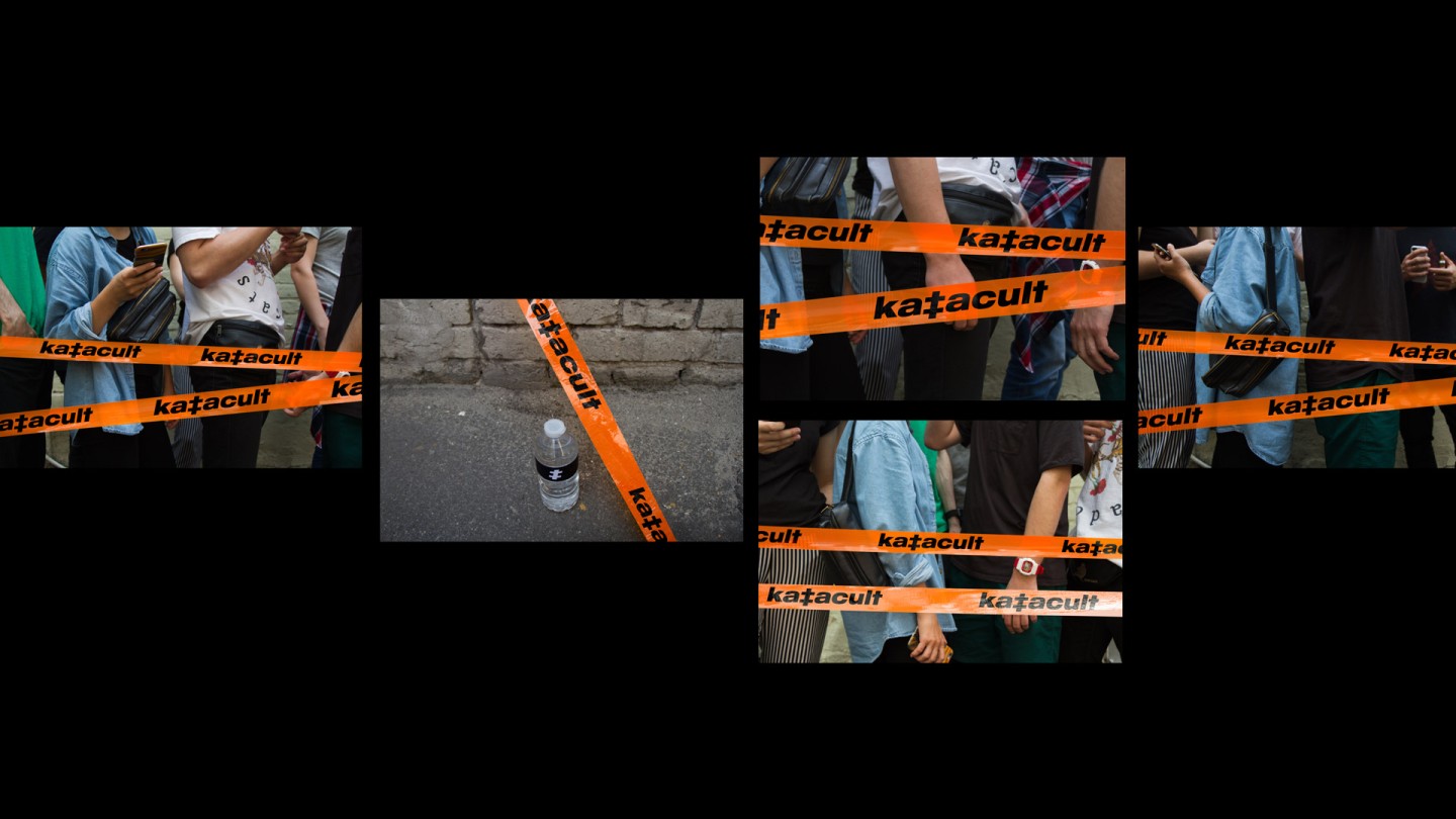
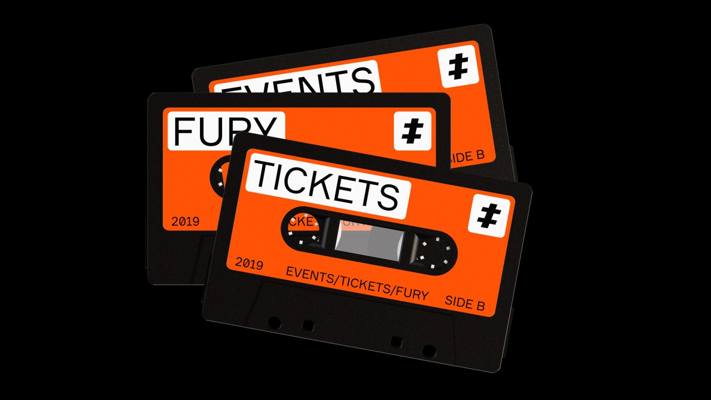
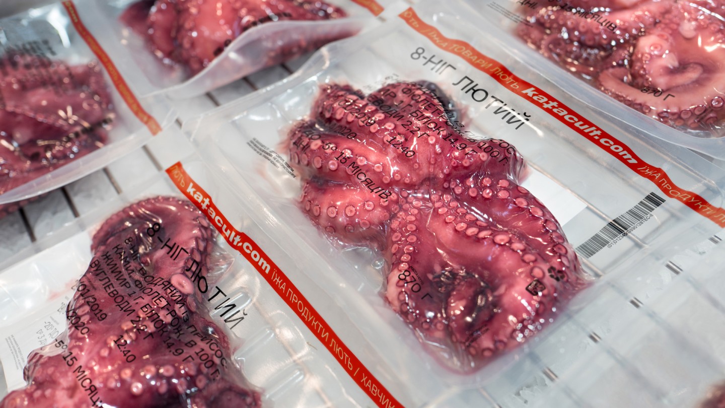
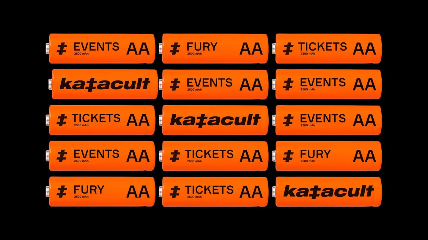
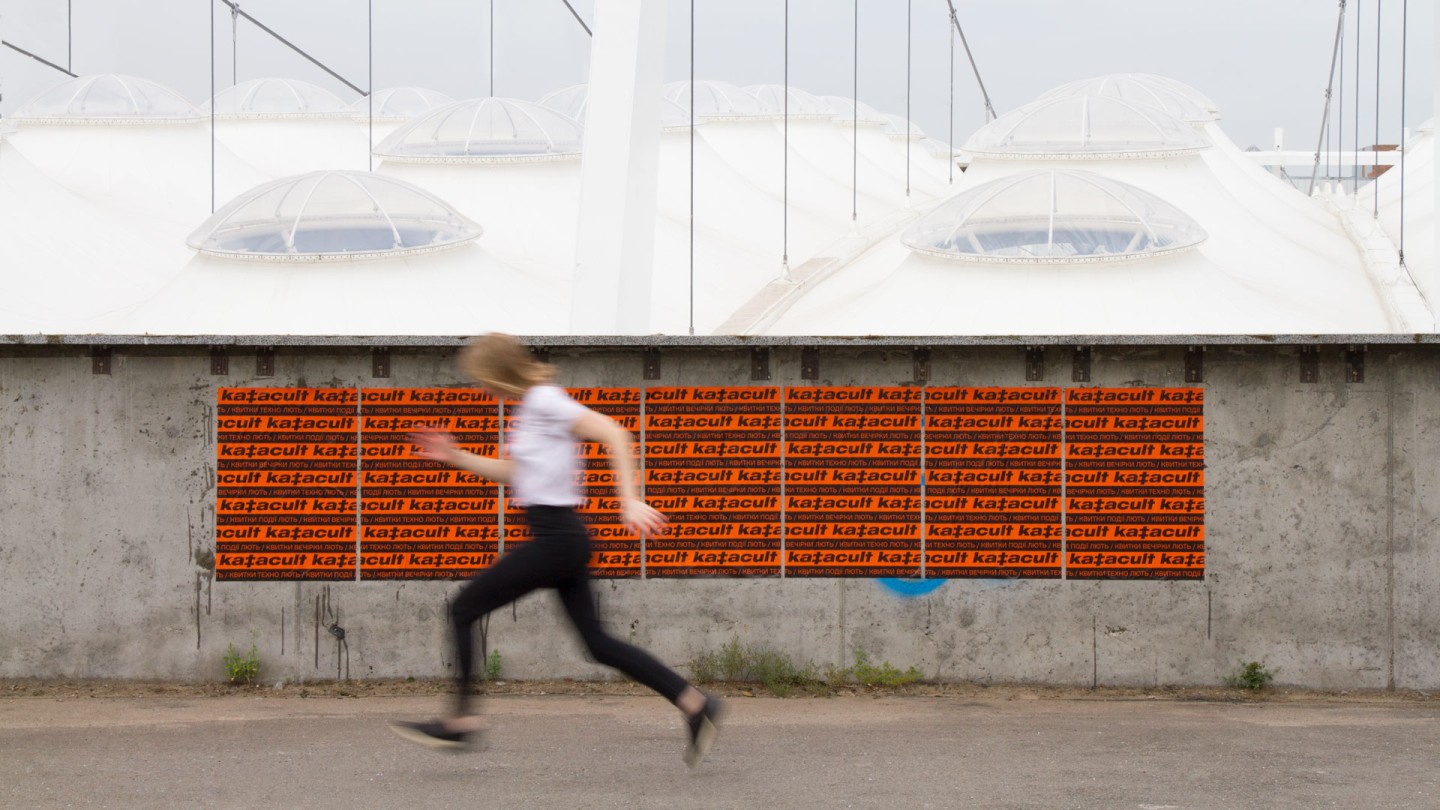
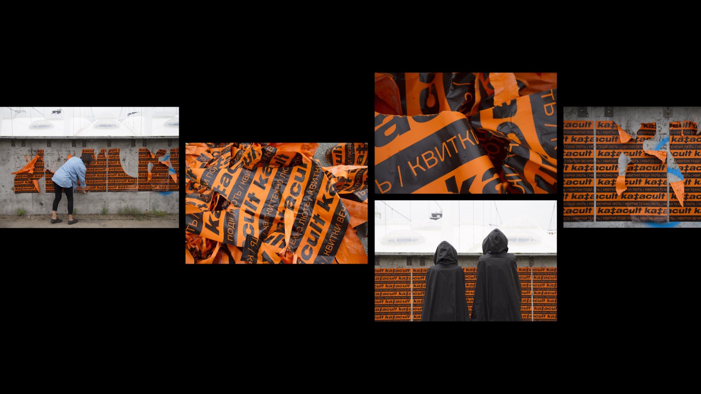
Orange and black colored stripes, catchy posters on the fences and walls of the buildings of city’s downtown worked out perfectly well. The same trick worked with «the walls» of the digital-resources: once you see the Katacult’s communication, the brands name is imprinted in your subconscious world eternally. One shot — one hit, nothing odd.
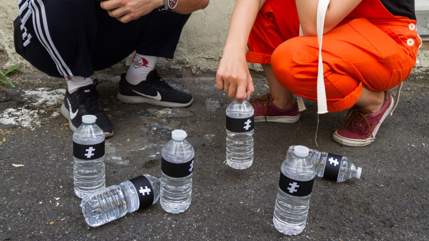
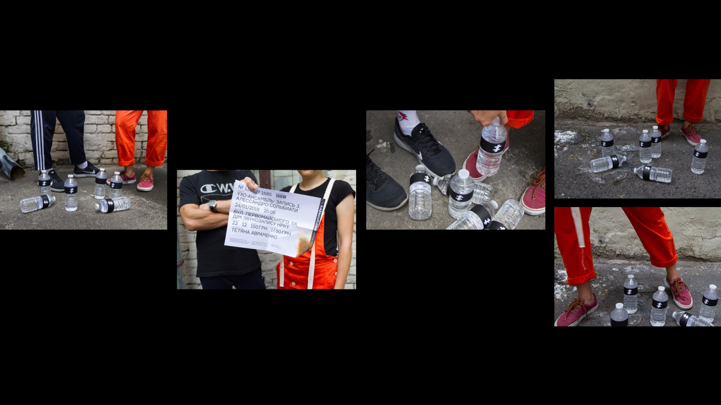
We intentionally created the logo in a minimalistic way, so it would look like a cross. The essence is hidden in logo itself: nothing could be compared with the influence of occult symbols and the echoes of voodoo drums — the sound and the dance were born simultaneously with the humanity. We speak with the feelings, not with the words, with the help of images, we awaken the want to be ourselves, the want to be Katacult.
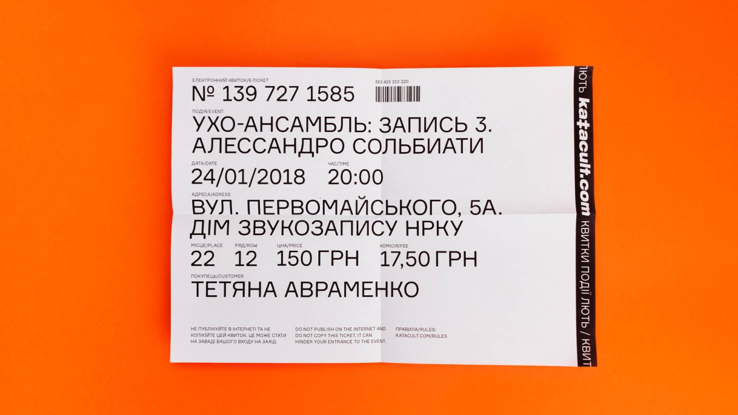
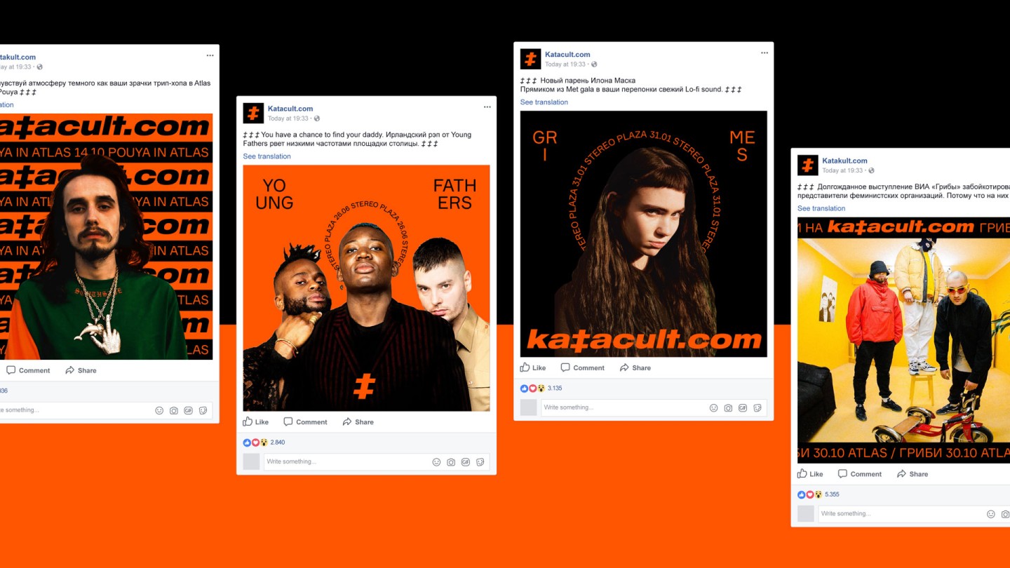
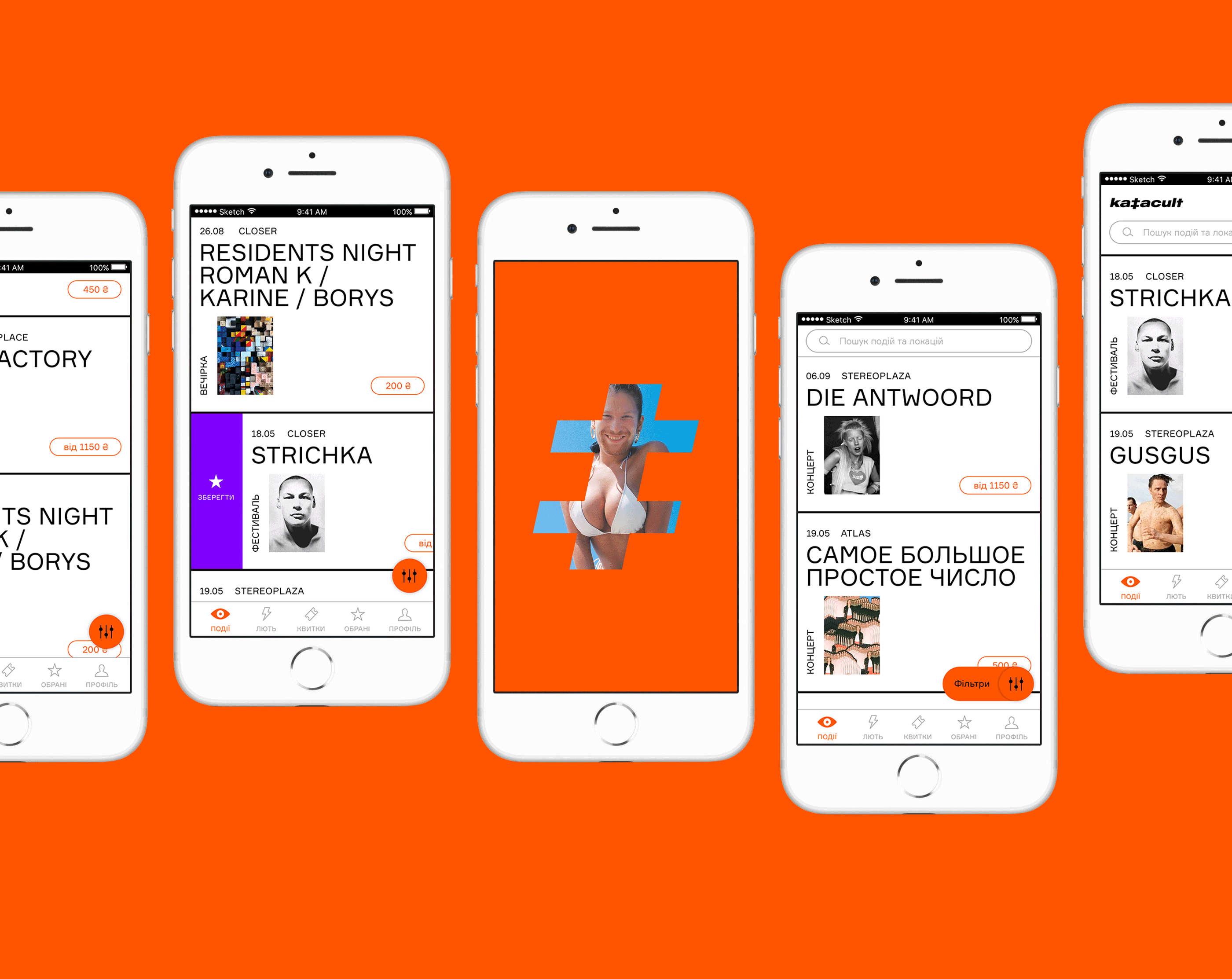
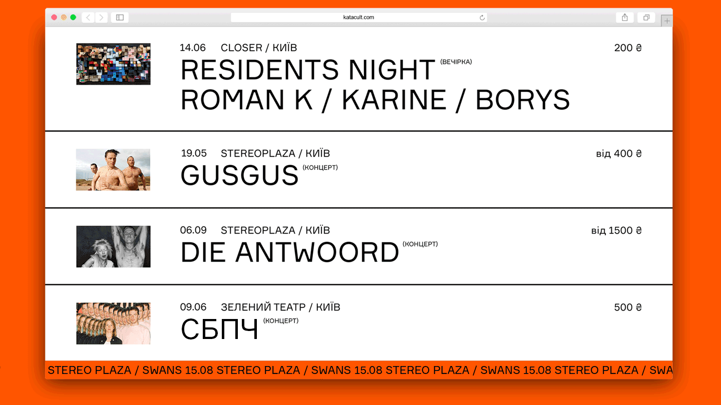
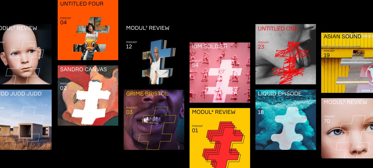
Also, the logo — is a half of a hashtag symbol. Along with the ticker line, that was used in brand’s identity, it transfers the primeval essence into a digital world, into our era. The symbiosis of the design and the content with the help of high-end digital tools, appeals to our feelings, that are as old as the hills; and it actually works.
Special thanks to our friends and colleagues Vlad Volochai and Alexander Livanov.
Credits
Strategy: Anton Solonko, Artur Redzynets
Copywriting: Alisa Revnova, Sergey Vorvikhvost
Art-directing: Vik Vatamanyuk
Design: Tania Avramenko, Maria Kotemako, Veronika Syniavska, Yulia Didchenko
VFX: Emile Gorodetskiy, Platon Fedorchenko