Organic Prink
Windscreen cleaner branding: naming, identity, label design
We believe that clients invite us in to turn ordinary things into exceptional through design and creativity. That's because making an epic for a Southern California medical cannabis brand is easy, but making a windshield cleaner, for example, is a challenge.
So when our good friends from GPL suggested we do an anniversary, the fifth brand for their holding company, we gladly accepted the challenge.
As always, we started the project with research. The shelves of cleaning fluid in petrol stations and at car dealers left us dazed, just as the writer Bukovsky was dazed by a strange woman in bed the following morning.
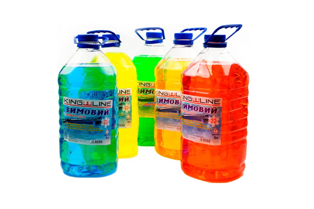
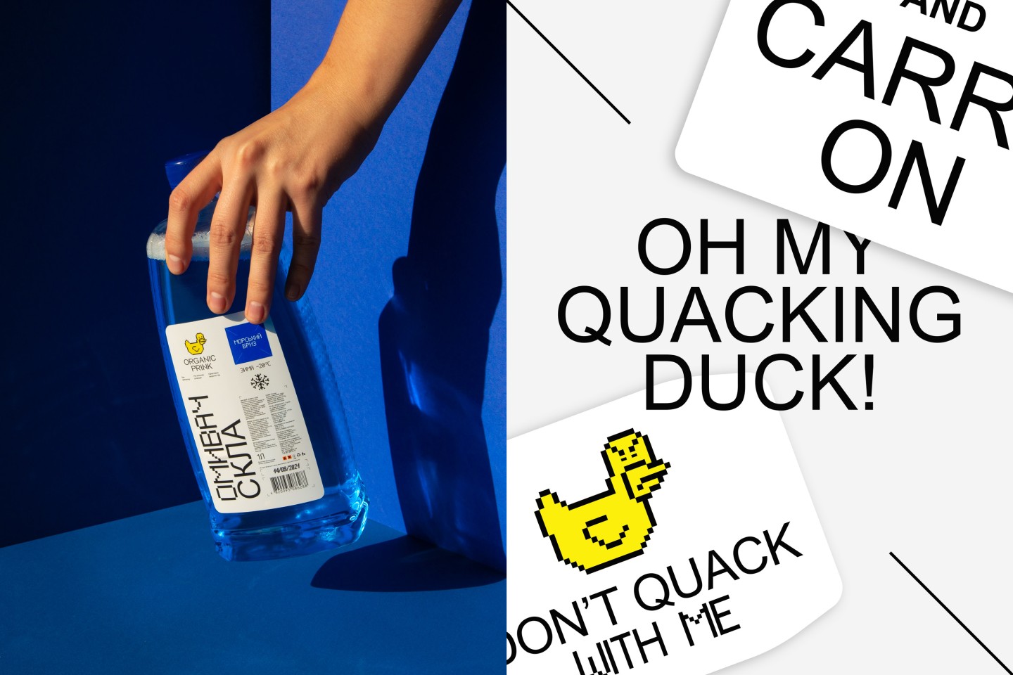
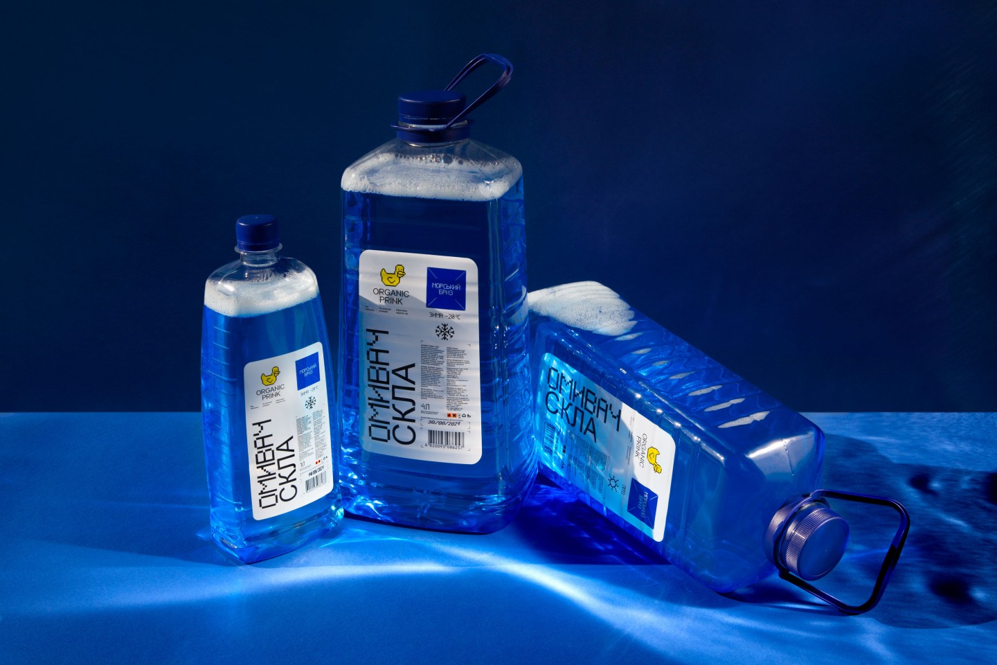
The design of the cleaning fluid is brutal in its predictability: if it's a sea breeze, a poorly photoshopped sea breeze is sure to be drawn on the plastic bottle. If it's frosty fresh — the snowflakes are sure to be drawn.
The windscreen washer is usually a gaudy, straightforward, and belligerent, like a chickweed
When thinking about brand aesthetics, we always want to achieve correspondence between the essence and the form. And something beautiful, accurate and precise does not correspond to the aesthetics of gas stations, regional auto stores and plastic bottles.
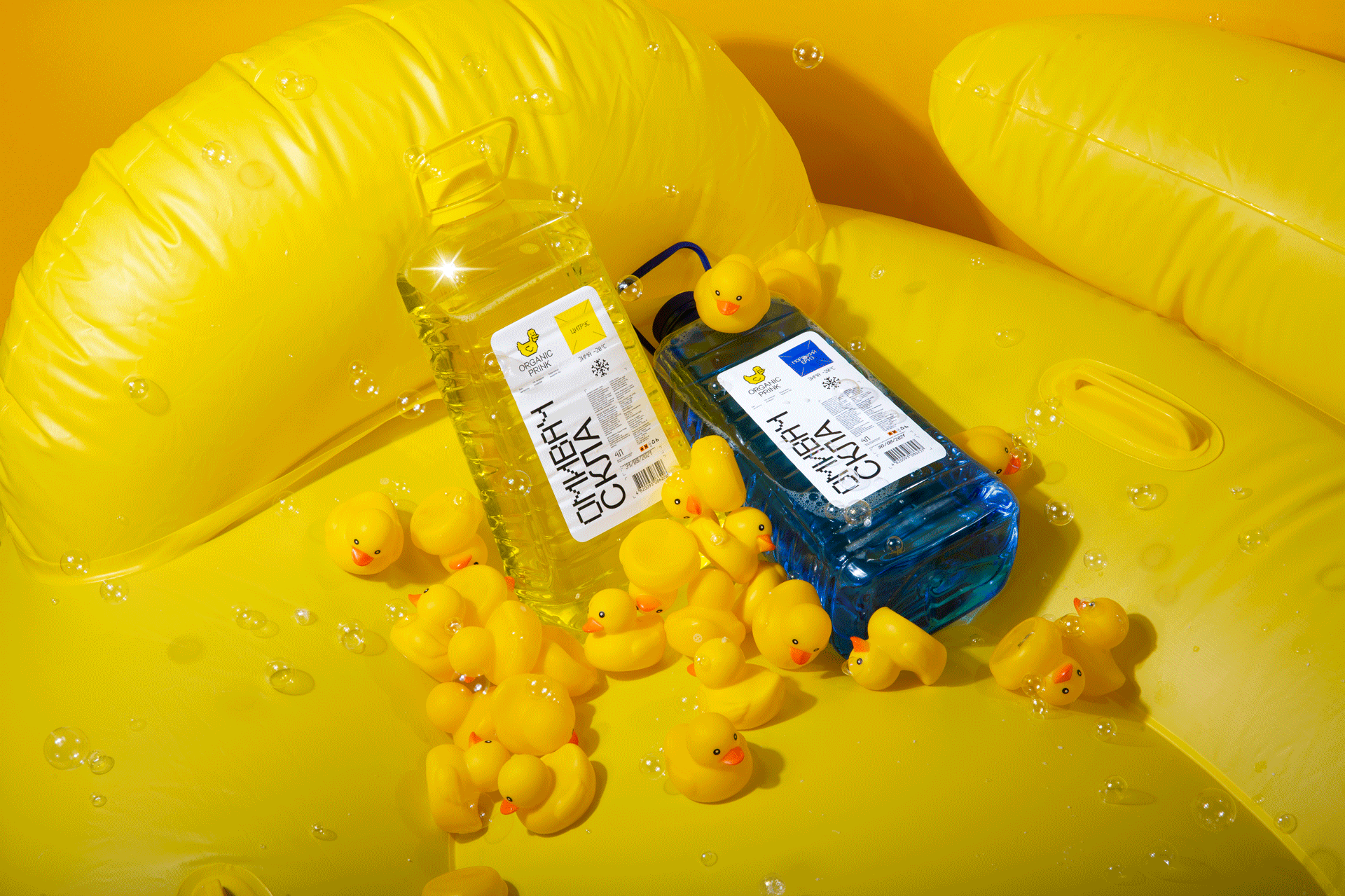
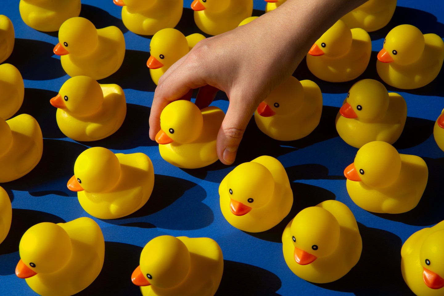
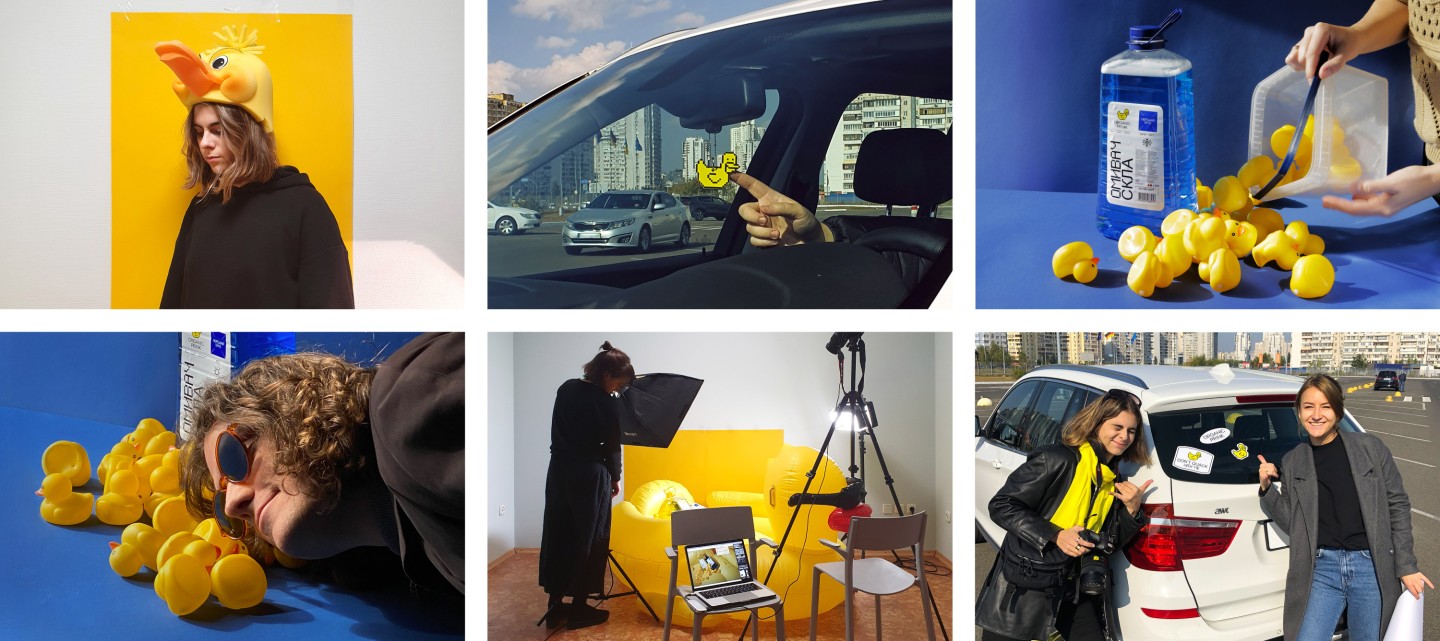
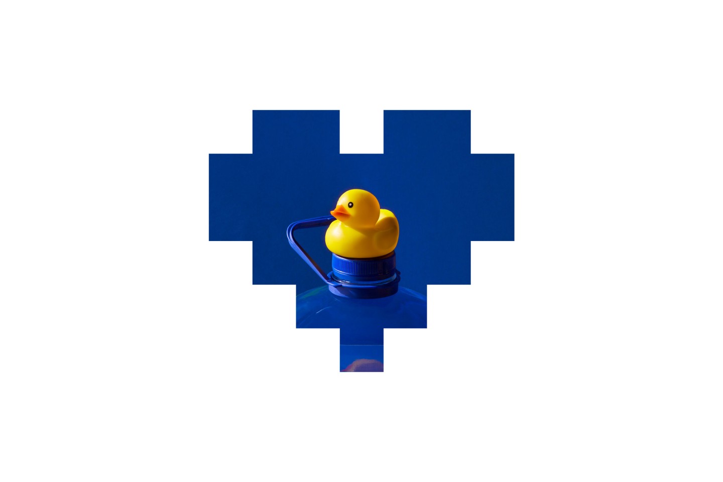
We were looking for an expressive symbol that would make Organic Prink stand out on the shelf so that we could say: please grab that washer with... a duck.
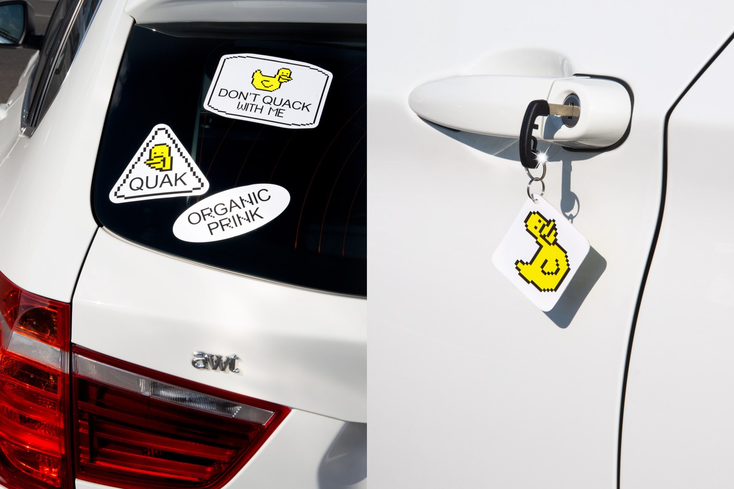
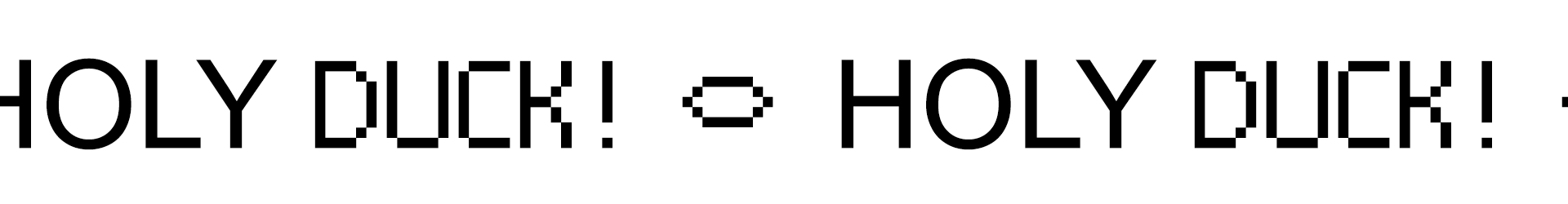
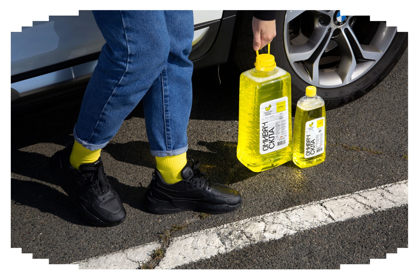
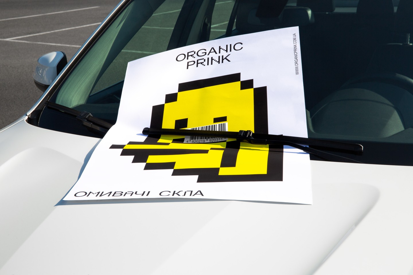
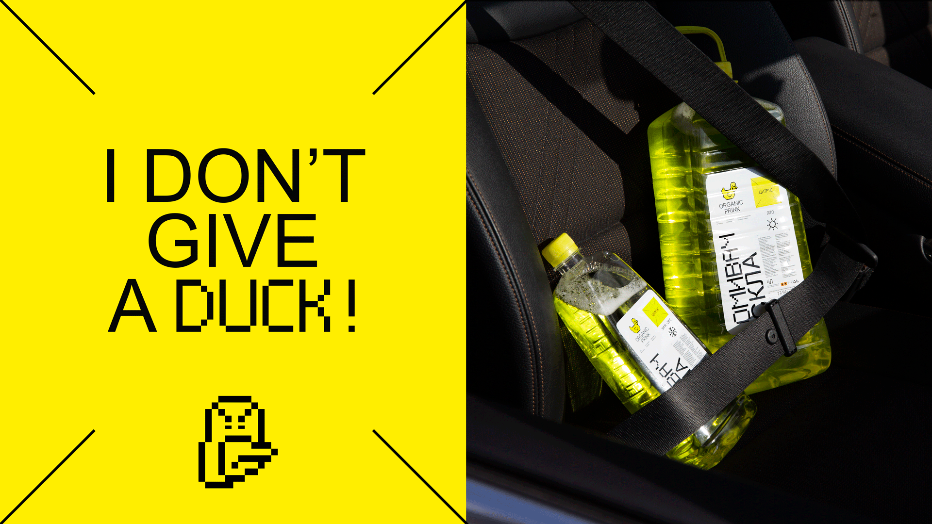
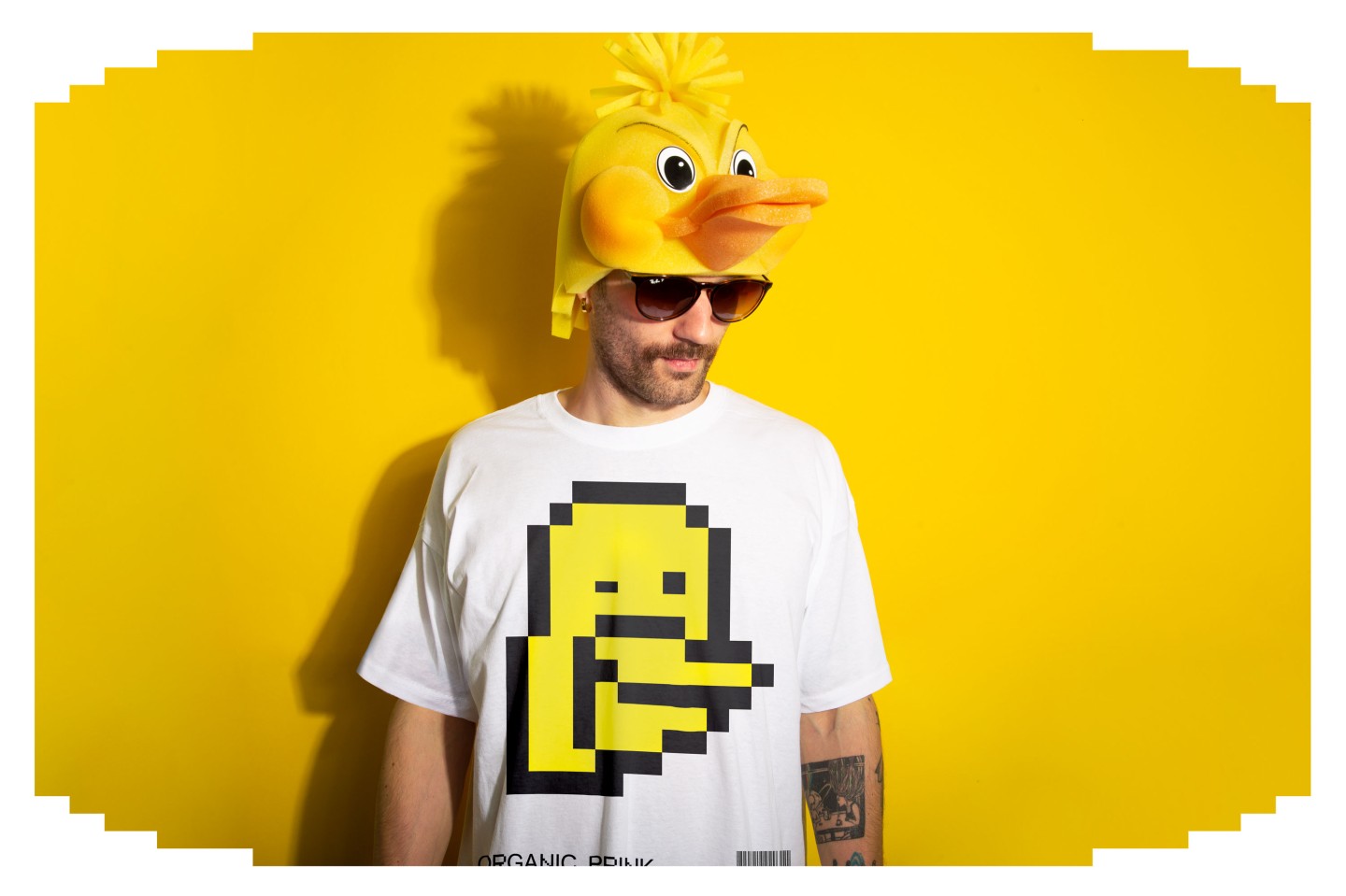
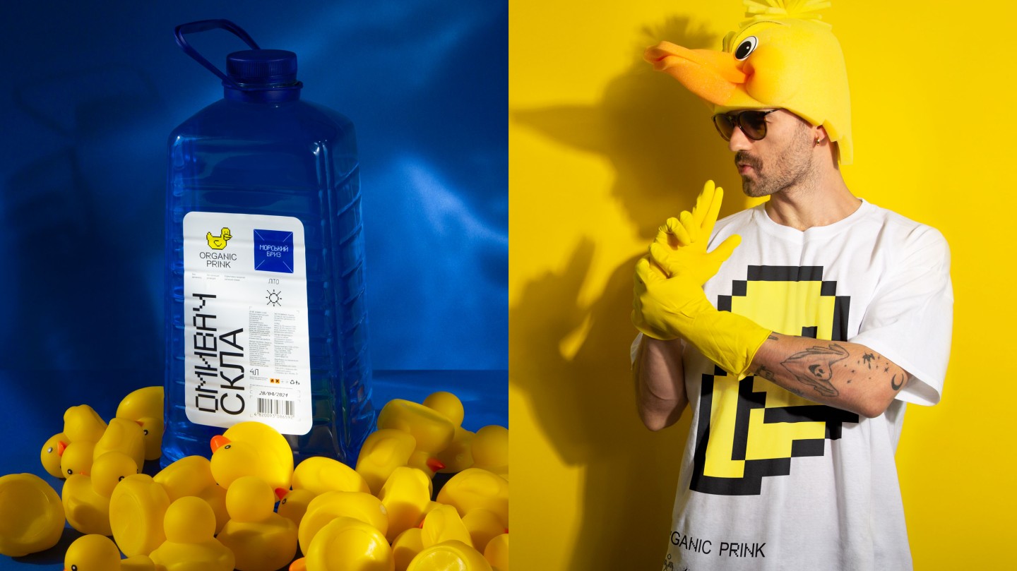
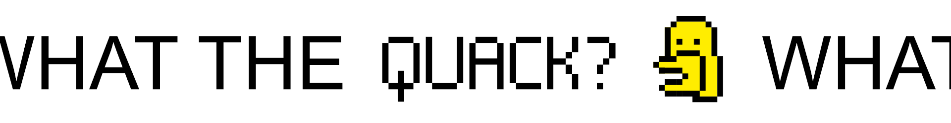
Prink = cleaning feathers, so we came up with Norbert, a funny pixelated duck who loves cleanliness, freshness and English humour. Norbert adds a dash of romantic absurdity to the tedious process of buying a washer and makes it a little more fun.
Everything gets better with a pixelated duck.
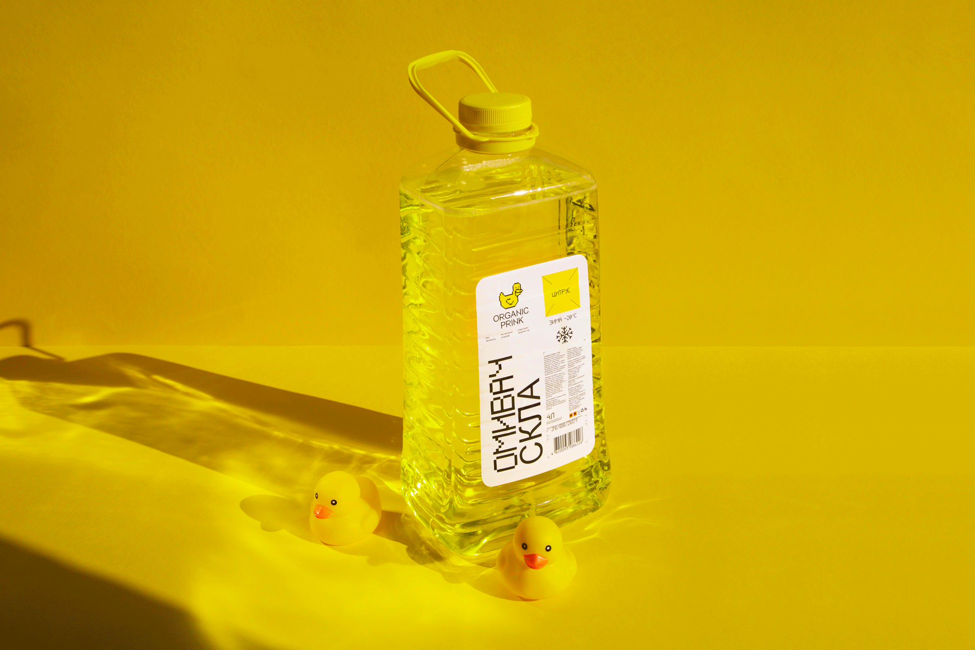
Organic Prink's identity is not at all a case when you need fancy fonts. So we didn't go far and chose regular Arial, diluted with pixels. Why pixels? To emphasize technical aesthetics and because pixels are cool.
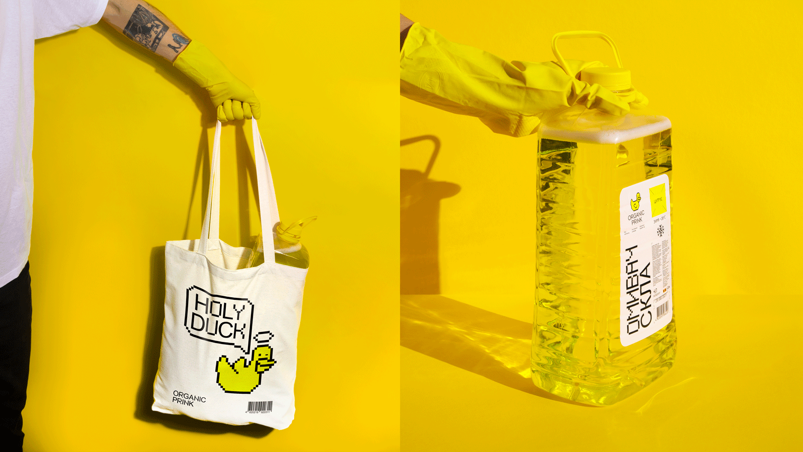
We moved away from all the clichés in the category: breezes, snowflakes, gradients and grotesque car images. Instead, we created a clean, white label not to distract from the main thing: the accent duck.
What could be better than a duck? Only a giant pixelated duck!
Thank you for participating in the project Stanislav Gulak, Vladislav Gulak and Tatyana Gerasimenko
Credits
CD: Gleb Petrov
Copywriters: Roman Pyskun, Anton Solonko
Design-director: Vik Vatamaniuk
Art-director: Veronika Syniavska
Designer: Olesia Bahrii, Alexandra Romanenko