Tomin Family Development
Real estate branding: strategy, identity, communication
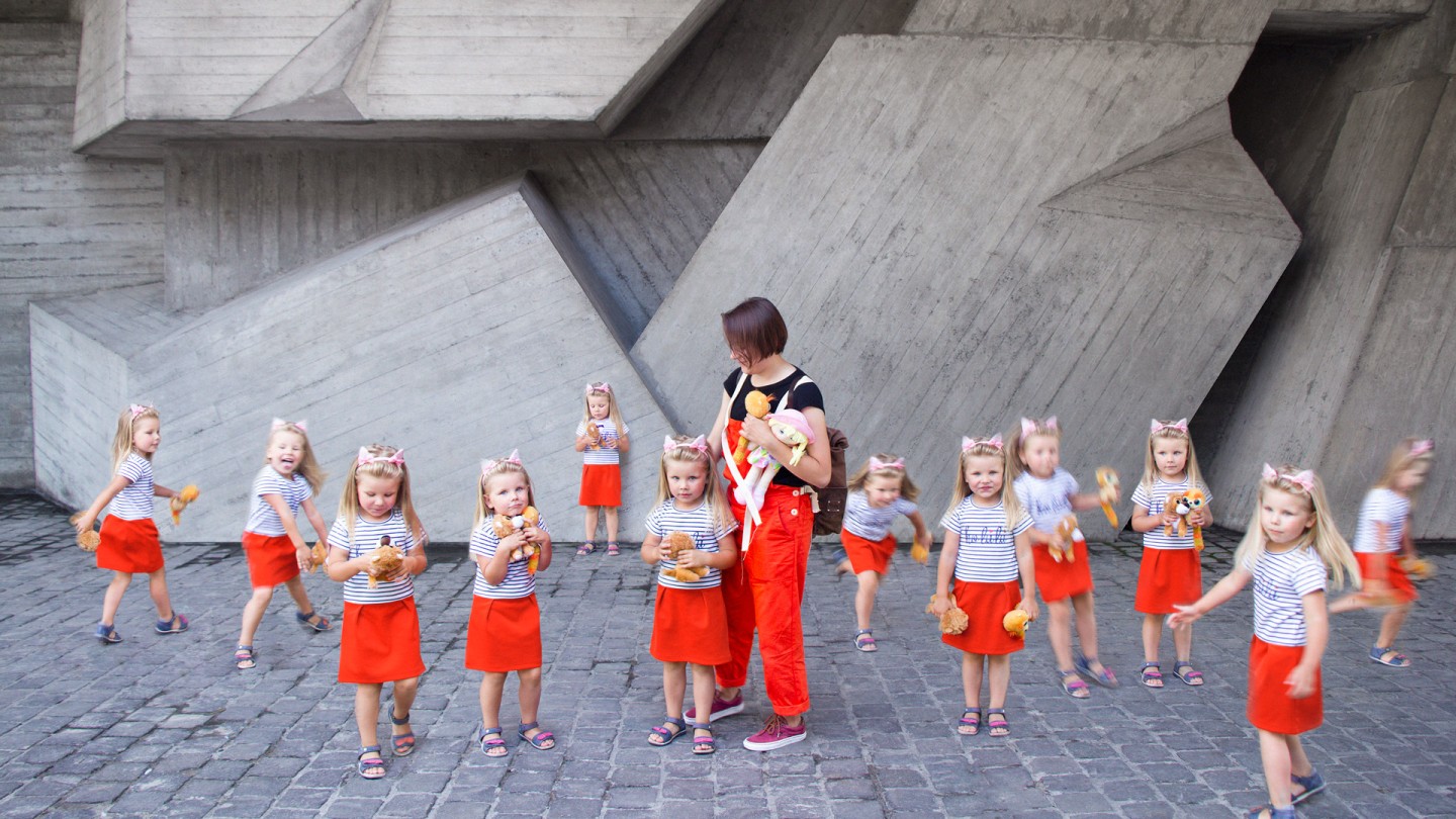
He wanted to build a house for himself. In a cosy place with a forest and pond, shop and school around the corner. So he can live there with his family, bring up the kids, jog in the morning and go out for some coffee time. He had wanted to build a house for himself, instead built it for everyone. The one, who knows how to create the happiness is obliged to share it. His name is Tomin, and this is his life moto.
Madcats likes this type of people, moreover we love working with them. Money is not the reason for cooperation. Instead the will to make a great product is our driving force.
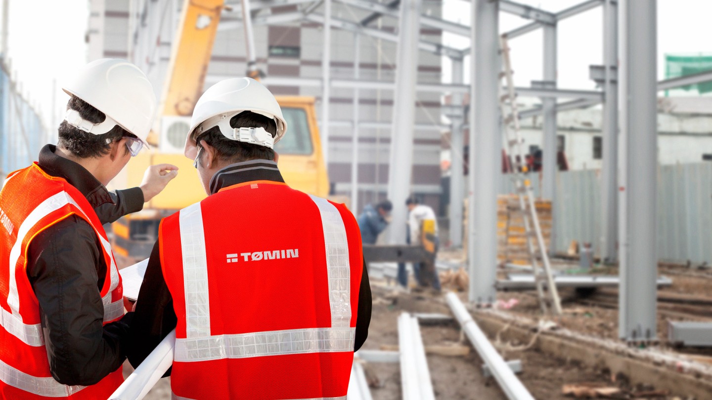
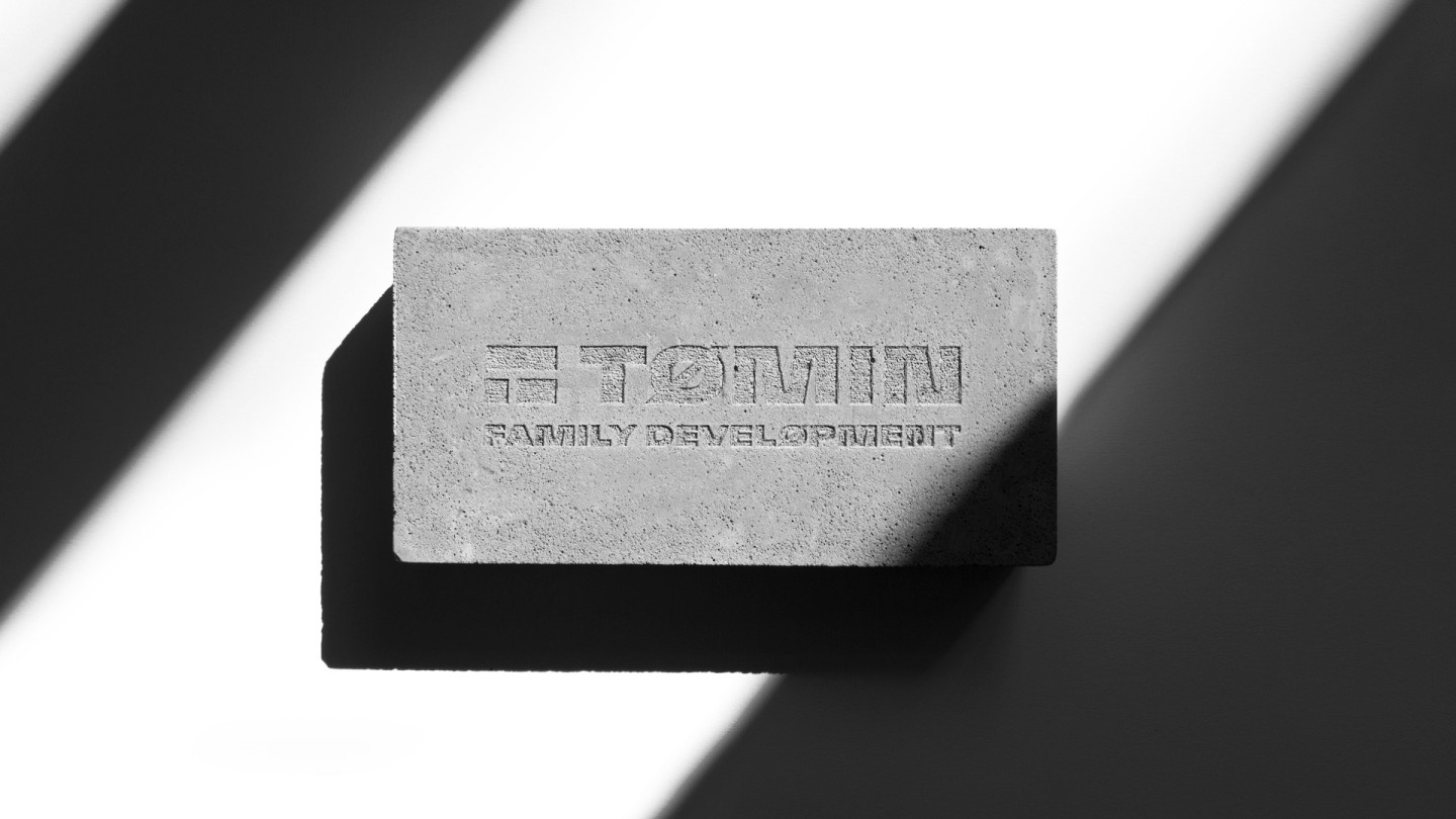
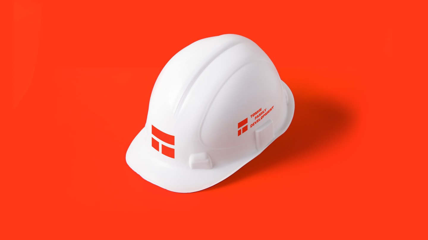
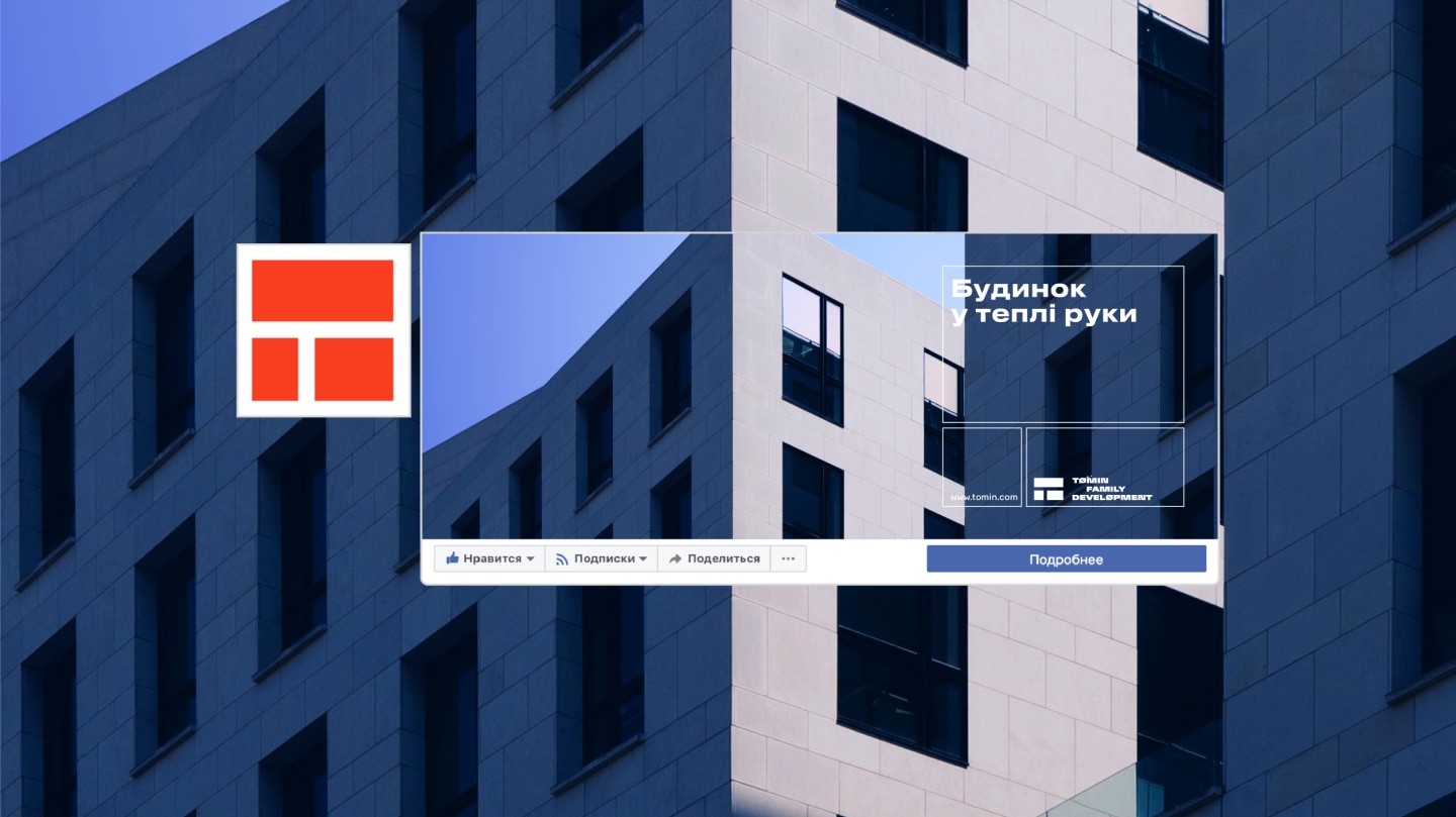
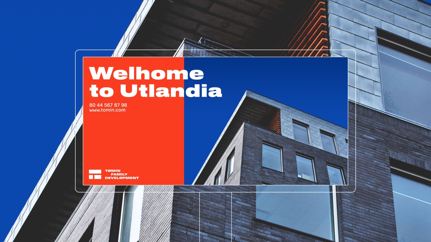
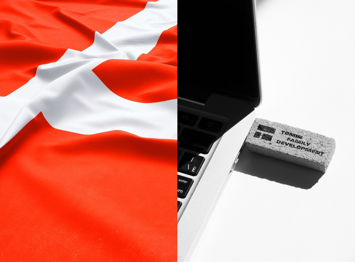
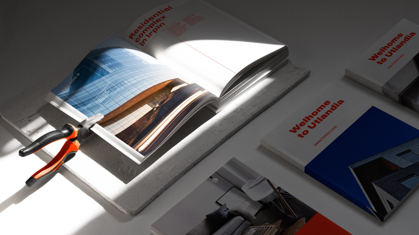
The Tomin brand grew out of Mr. Tomin himself. In past, he used to be a real-estate developer, now he is a founder of his own business. He has been to Scandinavia plenty of times, spent sometime exploring this land, therefore, after coming back to Ukraine he remained a big fan of northern minimalism. Project identity follows the owners passion — logo itself looks similar to a flag of a nordic country, moreover it includes tons of semantic symbols: construction crane, a window, interior scheme, and a building itself as well. It is a good point, when so many obvious symbols became a part of one laconic logo. It truly is very Scandinavic.
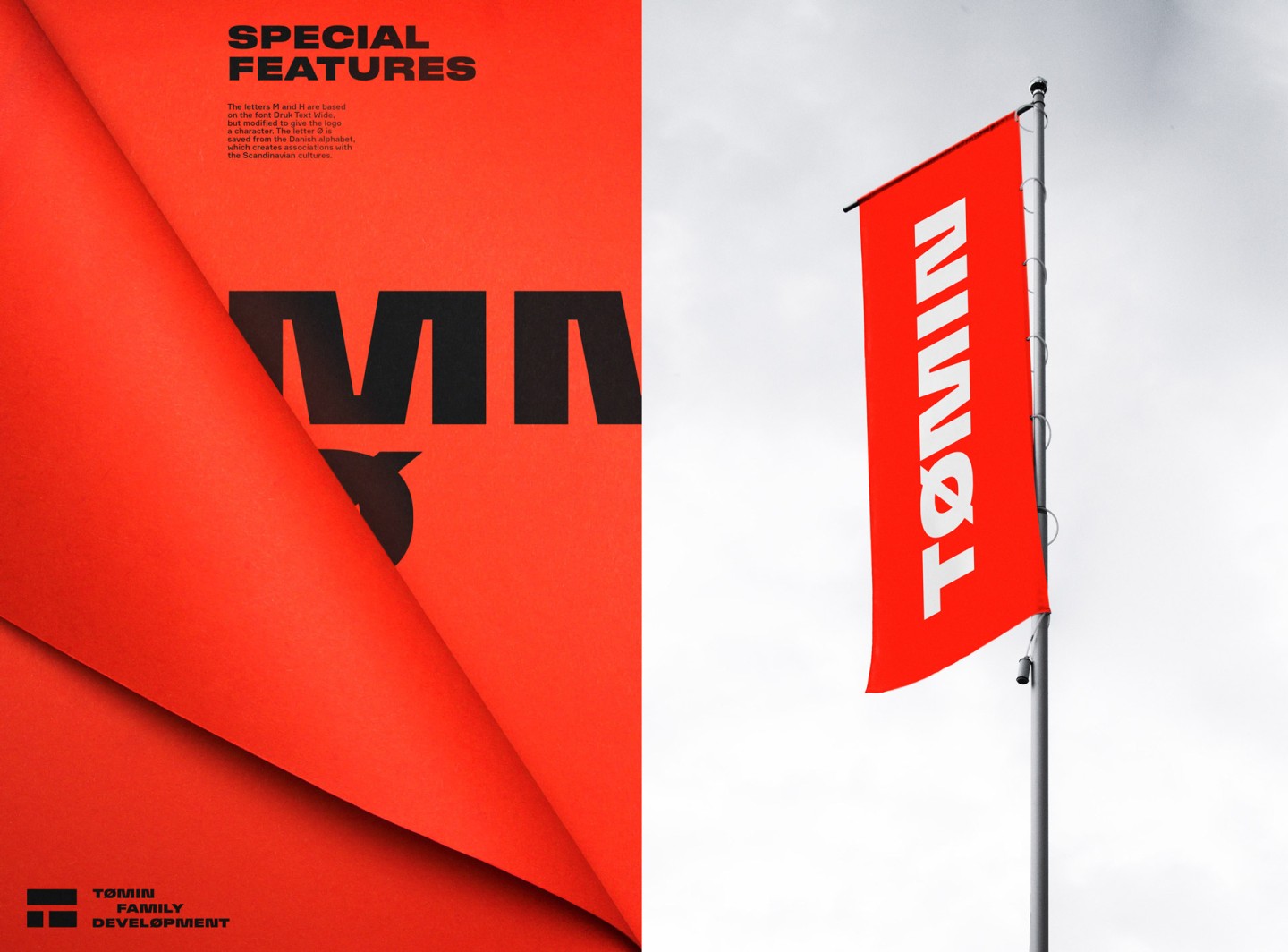
Regarding the font style, we have a lot to tell about. Have a look at the letter «T», that is shapely resonating with the logo. This connection creates a link between the visual part and the text: elements are combing each other making a fulfilled message. And the letter «O», with the diagonal dash, fully prove that we here are talking about Scandinavia: this letter exists only in Danish, Norwegian and Faroese orthography.
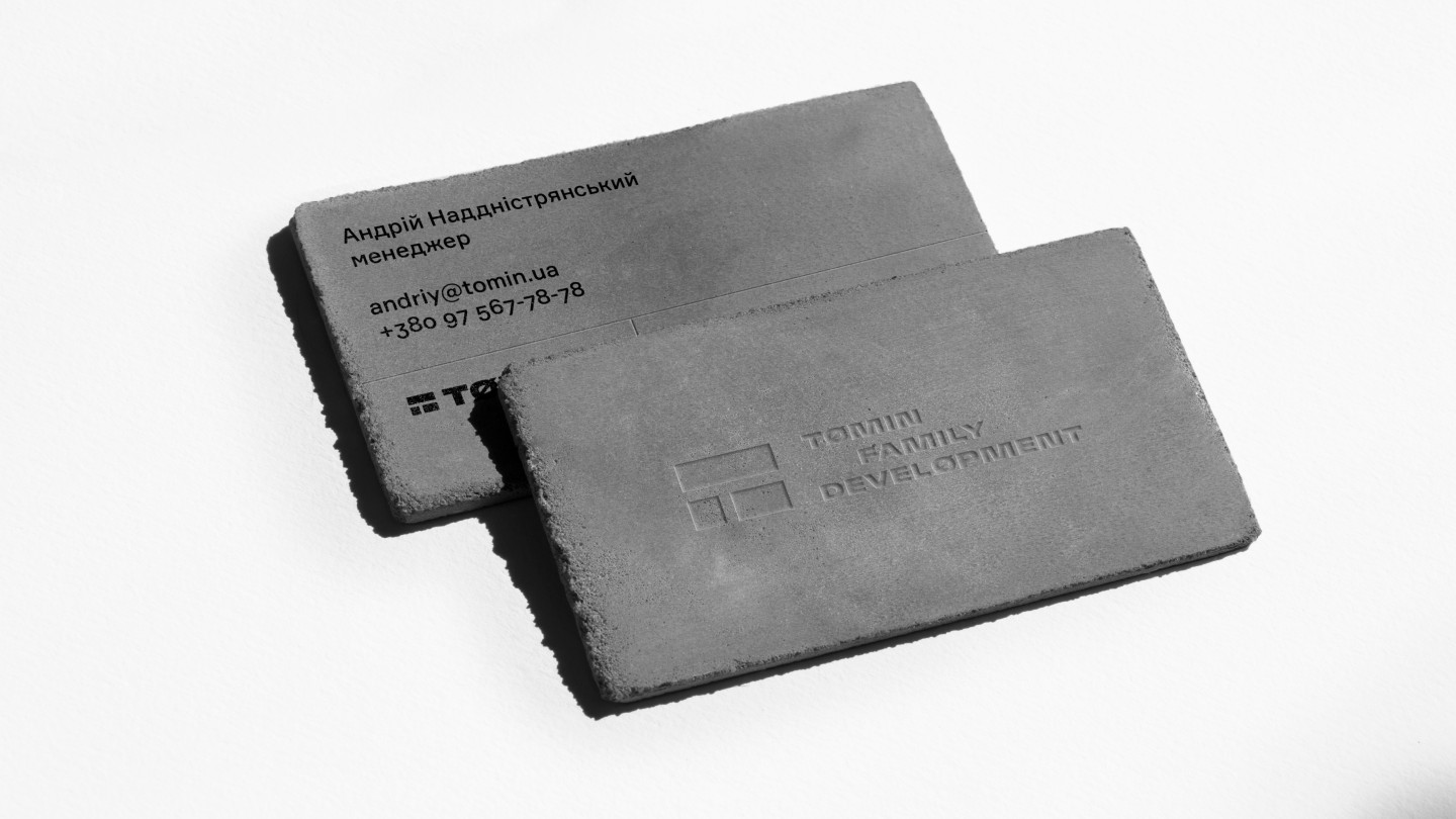
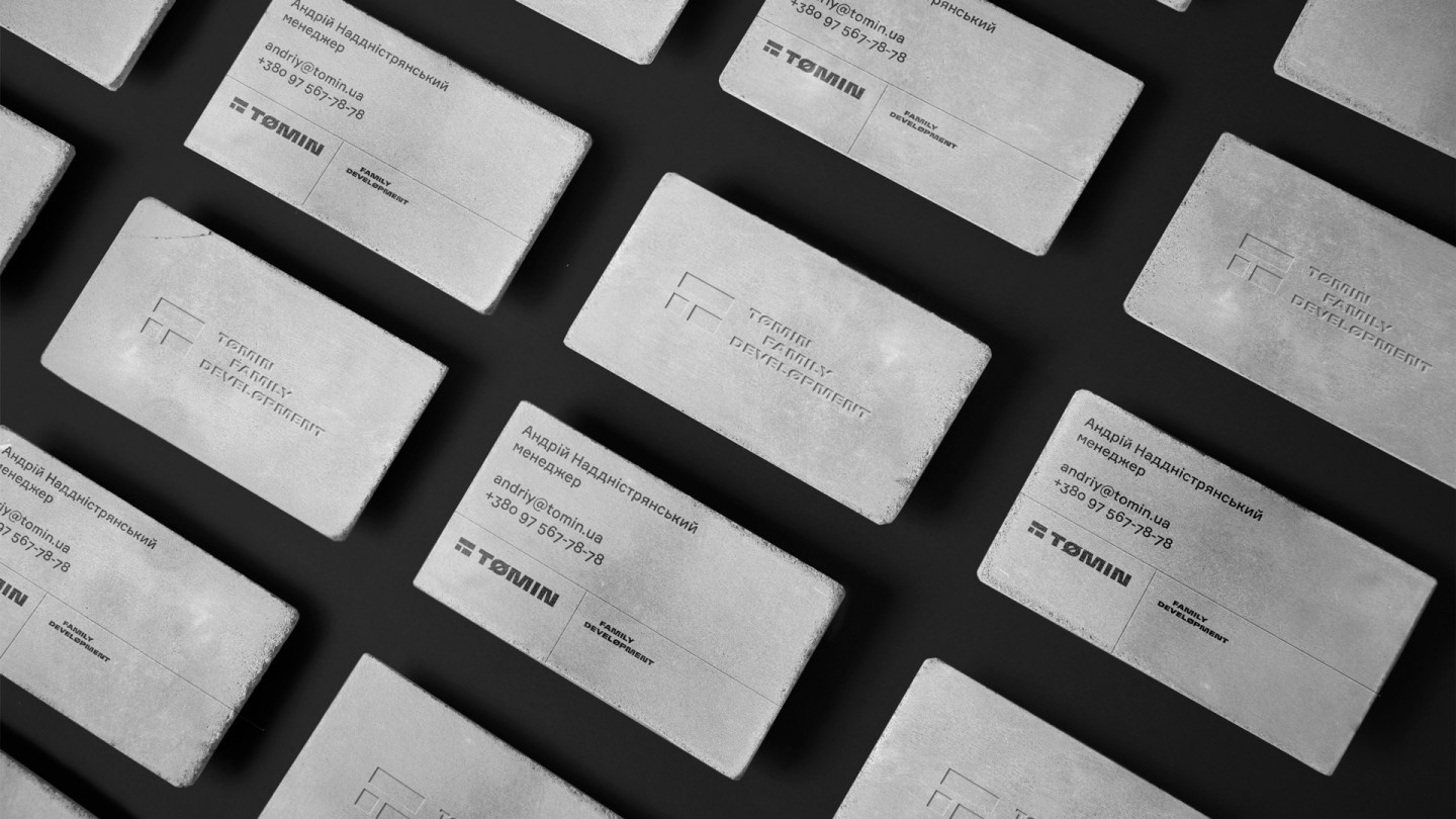
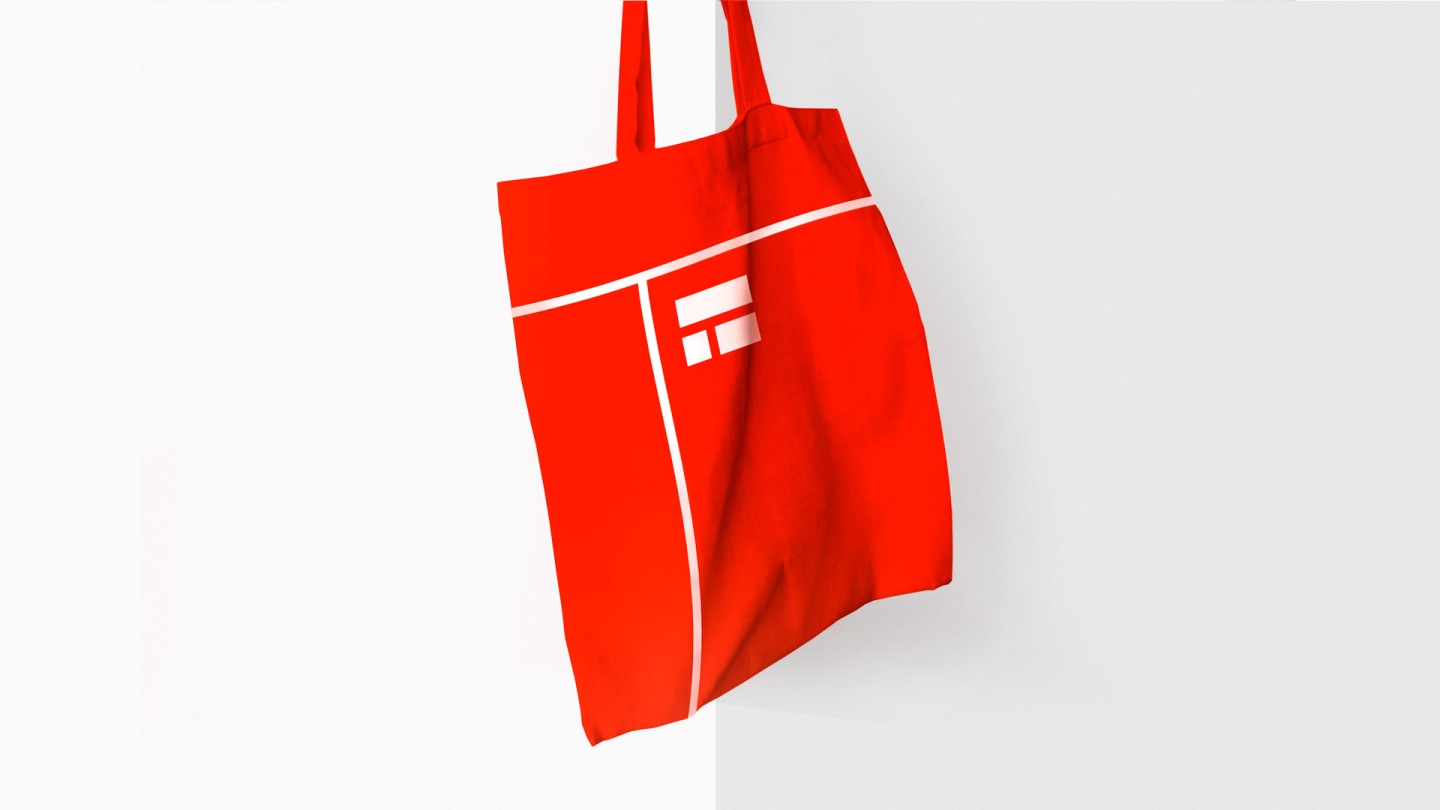
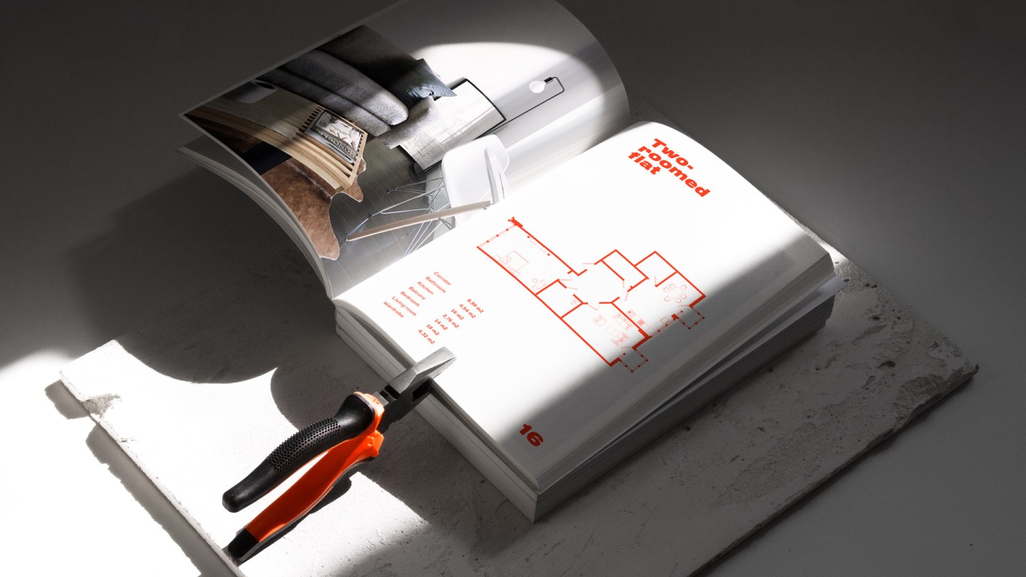
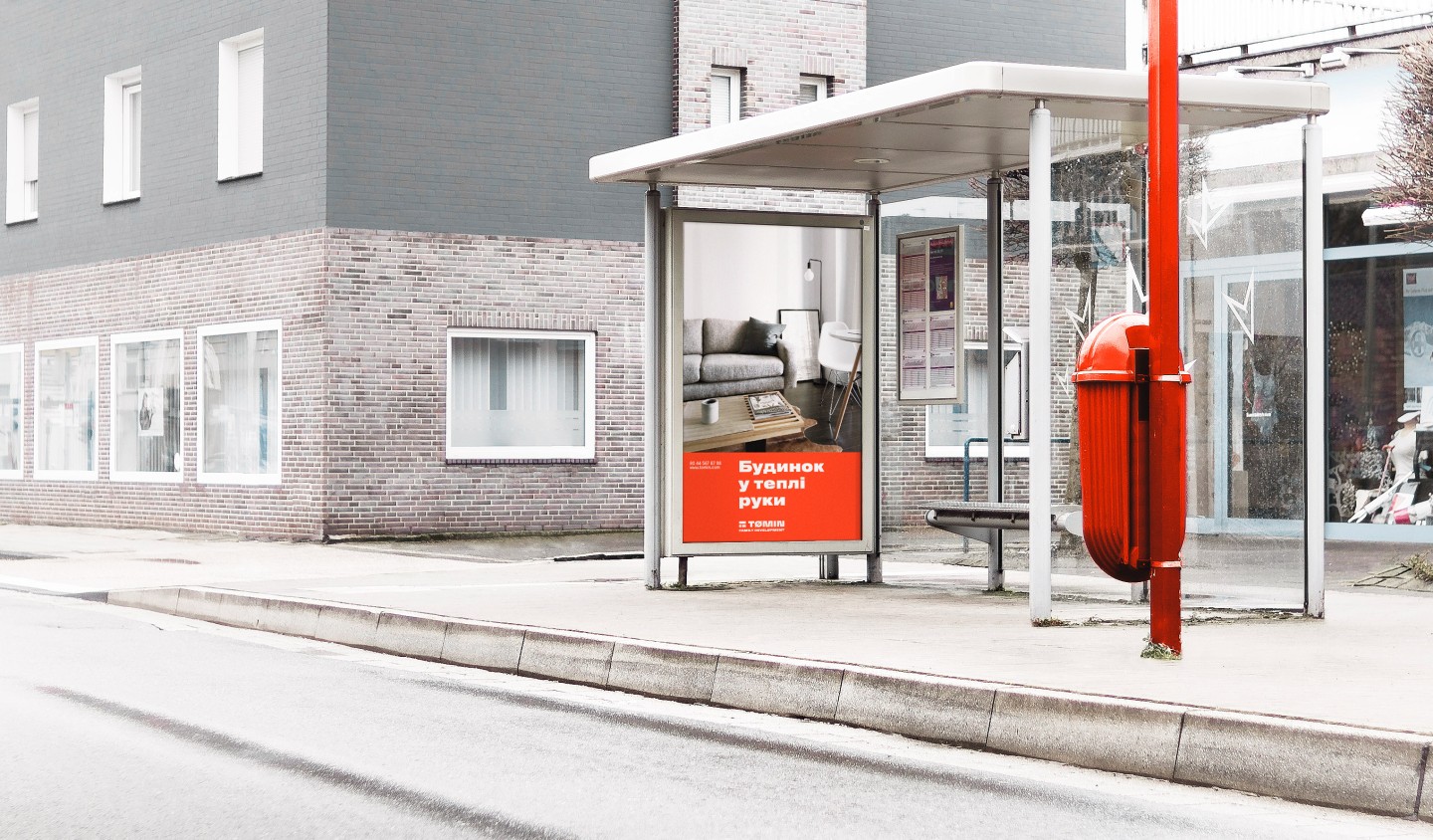
The logo works in two colors – red and black. Moreover, the whole identity is filled with the letter "T" transformation – two perpendicular lines divide the business cards, notepad's, t-shirts, and other branded items space.
It's simple. When designing a style, you don’t have to invent anything. One has only to continue the traits based in the spirit of the company, in its character and even in the personality of the owner. For Tomin, this is comfort, quality and minimalism. All the things Scandinavia is associated with.

Credits
Strategy: Anton Solonko, Artur Redzynets
Art-directing: Vik Vatamanyuk
Design: Veronika Syniavska
Copywriting: Artem Korniyenko, Sergey Vorvikhvost
VFX: Emile Gorodetskiy, Platon Fedorchenko