
ZRUCHNA
Rebranding of online-logistic company: strategy, corporate identity, communication
In 2015, 36% of ukrainians that use the internet make purchases online. Ukrainias make online purchases more frequently than citizens of any other Eastern european countries, Poland or Romania as the example. Zruchna service was created for this "online shoppers" class.
challenge
Considering that ZRUCHNA is a niche kind of service, we realised, that we wouldn't have a possibility to contact the consumer frequently, that's why the corporate identity should be eye-catching on one hand, and easily adapted to any format on the other one.
solution
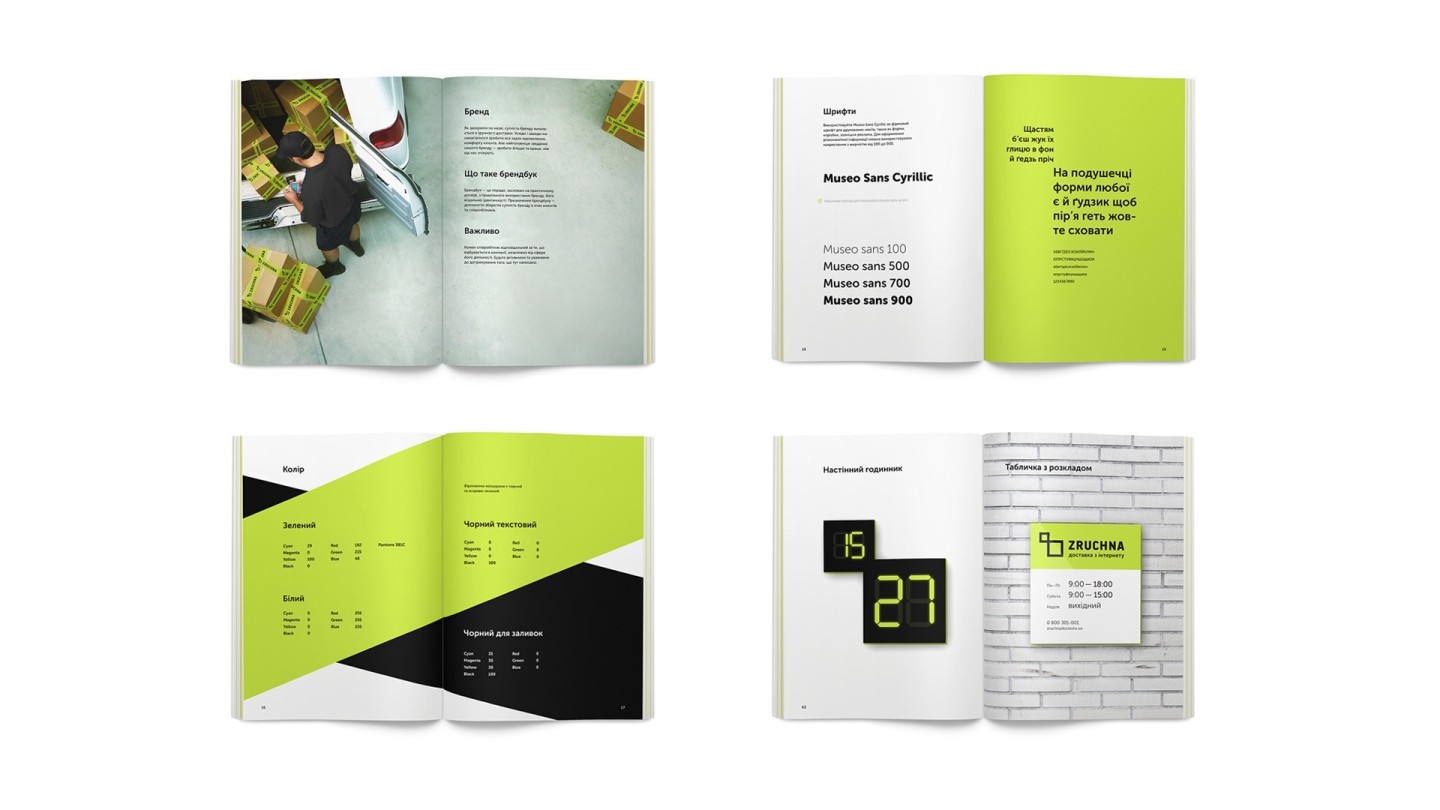
We developed a new strategy of the company, based on the ideas of proactivity and wow-service. Name zruchnadostavka.ua was cumbersome and high-maintenance, so we reduced it by more than half, kept only the laconic ZRUCHNA supplemented with the descriptor "Delivery from Internet". The logo had an excess of details and poor readability. We threw away all unnecessary visual details and kept just simple symbol and consistent lettering
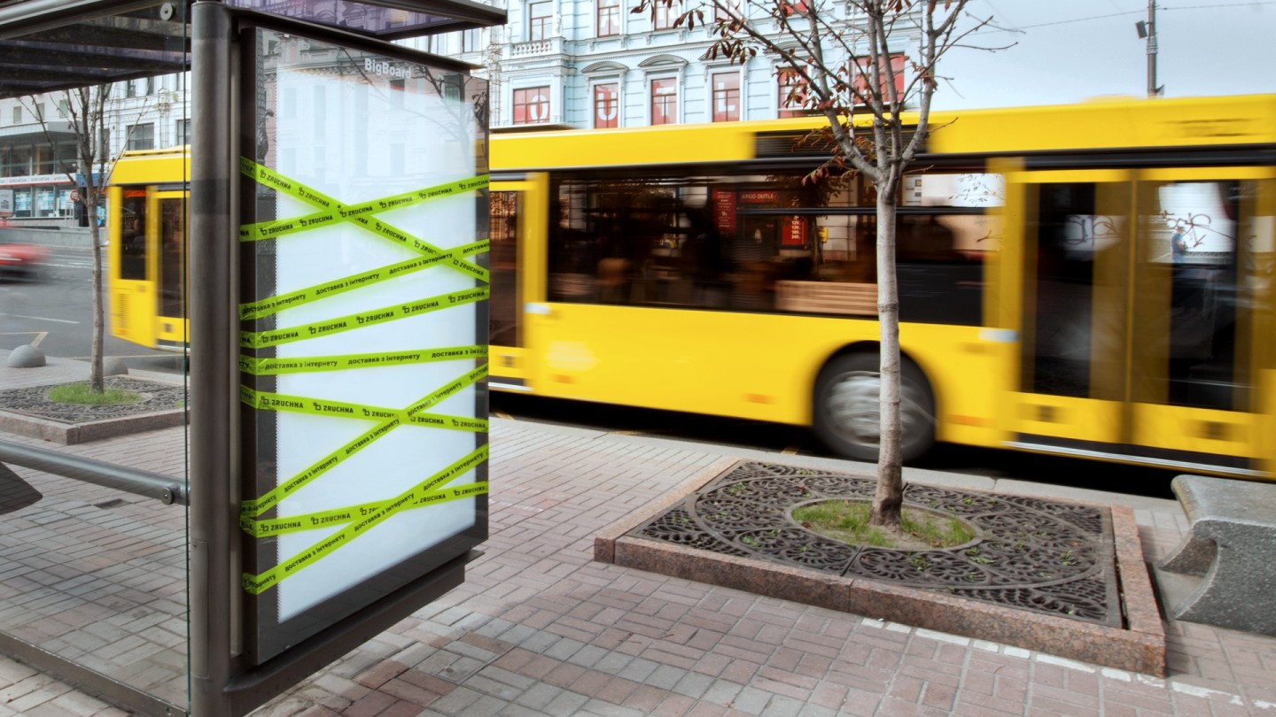

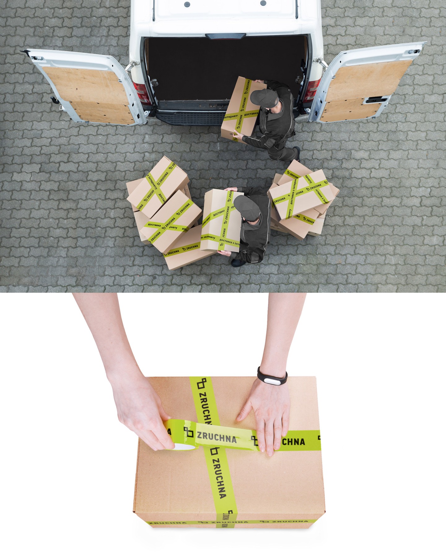
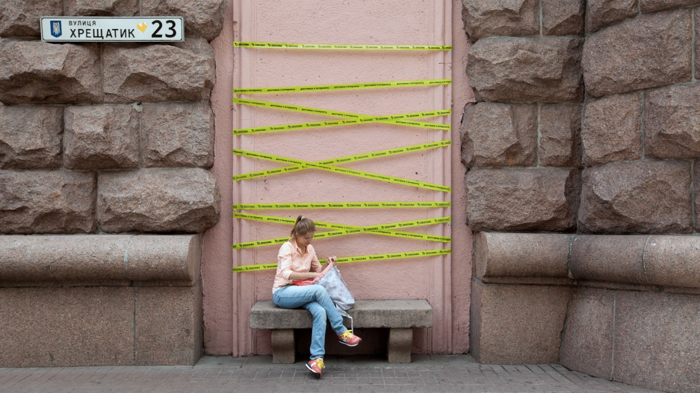
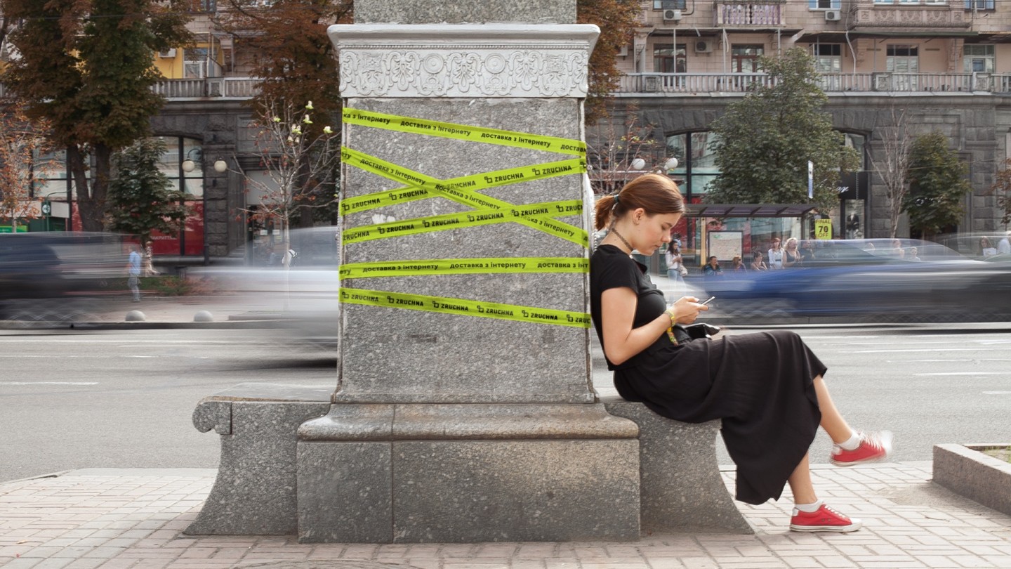
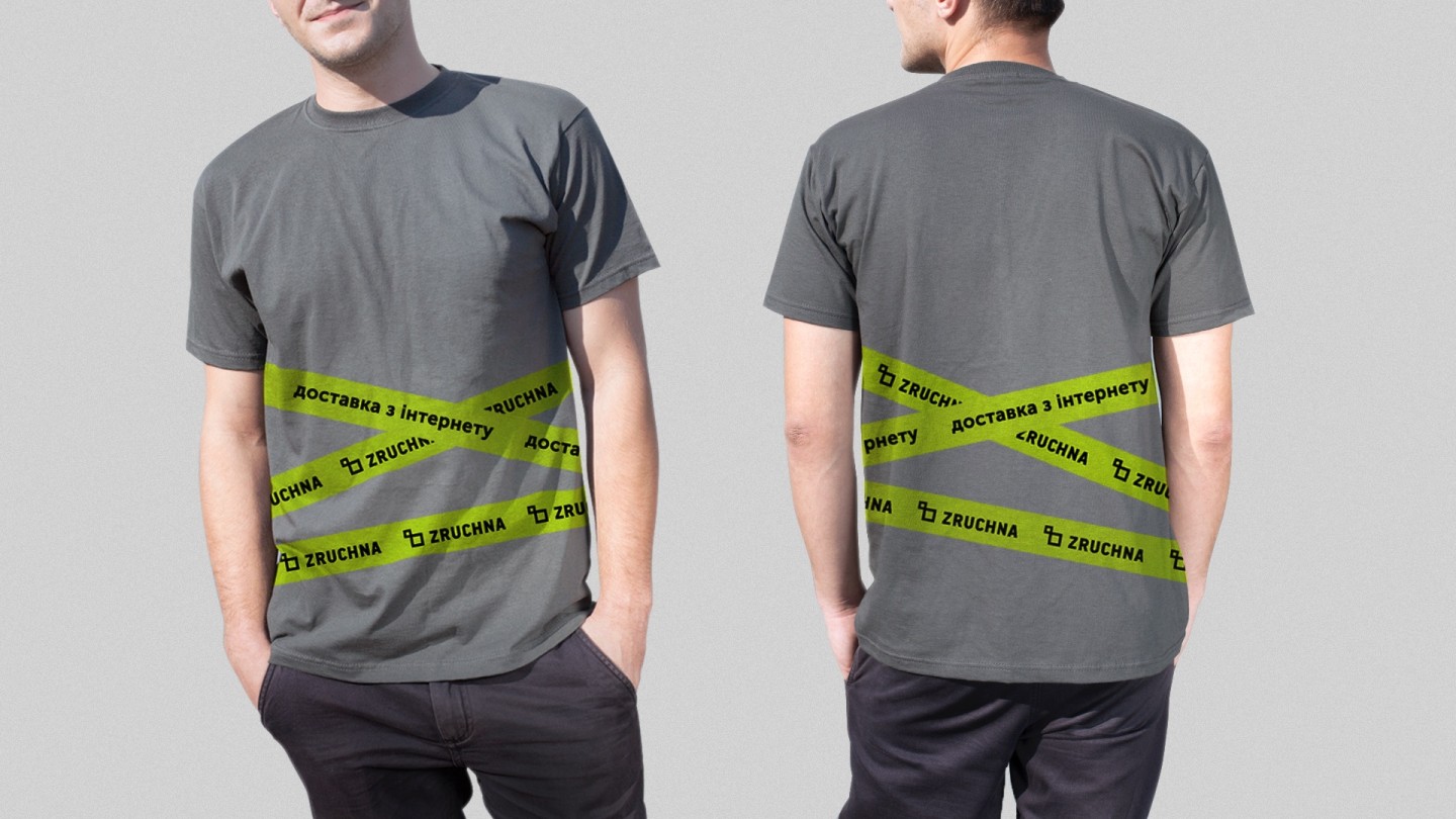
A duct-tape is an unchanging delivery symbol, used by everyone from Amazon to Ebay. Green custom printed duct-tape became the main style-forming element of the company. Any carrier, such as a box, envelope, business card or even car, can be branded, by just being wrapped around by the tape

Credits
Project Management: Anton Solonko
Creative Director: Arkady Pasechnik
Art Direction: Vladimir Strashkov
Design: Maria Kotemako, Tanya Avramenko, Olya Zhavoronkova