CASTA
Eyewear company rebranding: strategy, logo and corporate identity, communication
Casta is a sub-brand of Luxoptica, producing youth spectacle frames and sunglasses. It exists on the eyewear market since 2000 and offers a quality product at a reasonable price. Casta did not stand out among the competitors and its identity needed to be rebuilt
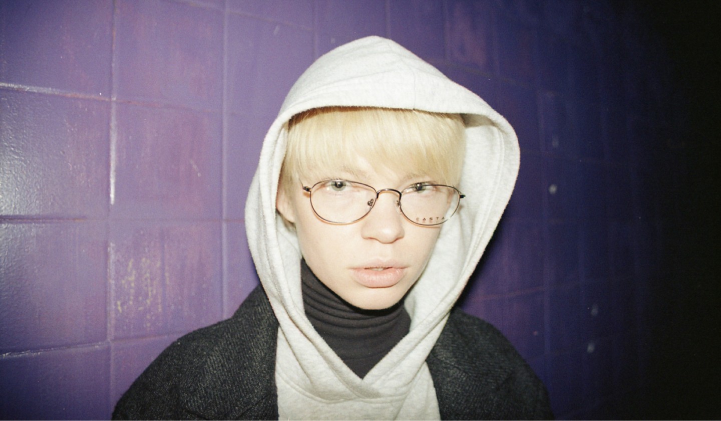
Large Ukrainian brands communication with young audience looks fake. They are afraid to riot; they flirt instead of communicating using "same language". We faced a task of a brand building, that would be interesting to the 20-year-old people
What is interesting for young people today? Raves, hangouts, sex, street culture, extreme sports: they want to express themselves and rebel. All of this has formed a basis of brand’s spirit. Instead of a trivial story about the product, we started talking about people
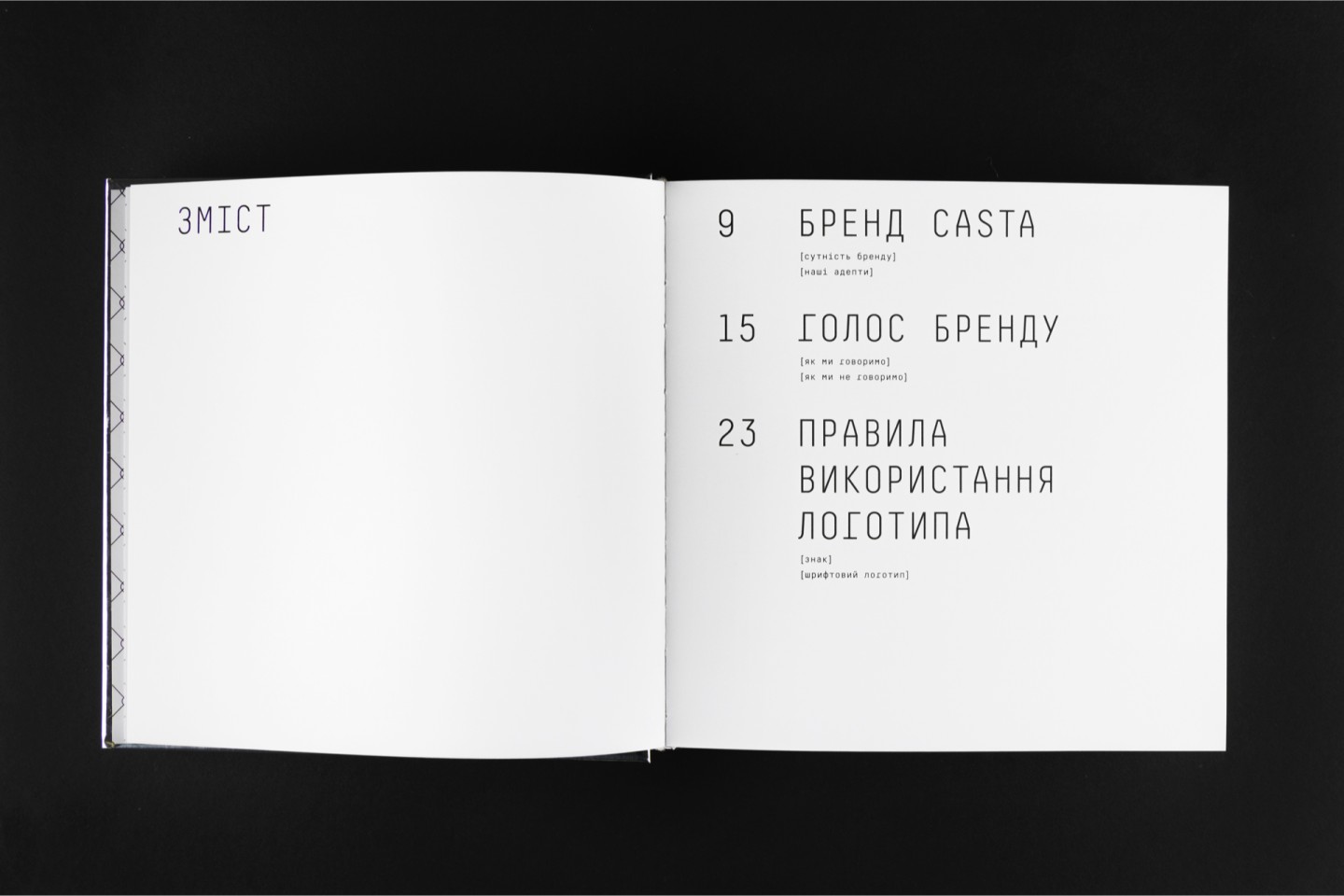
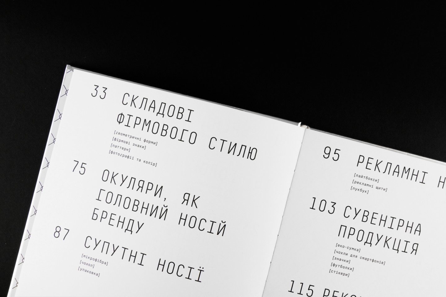
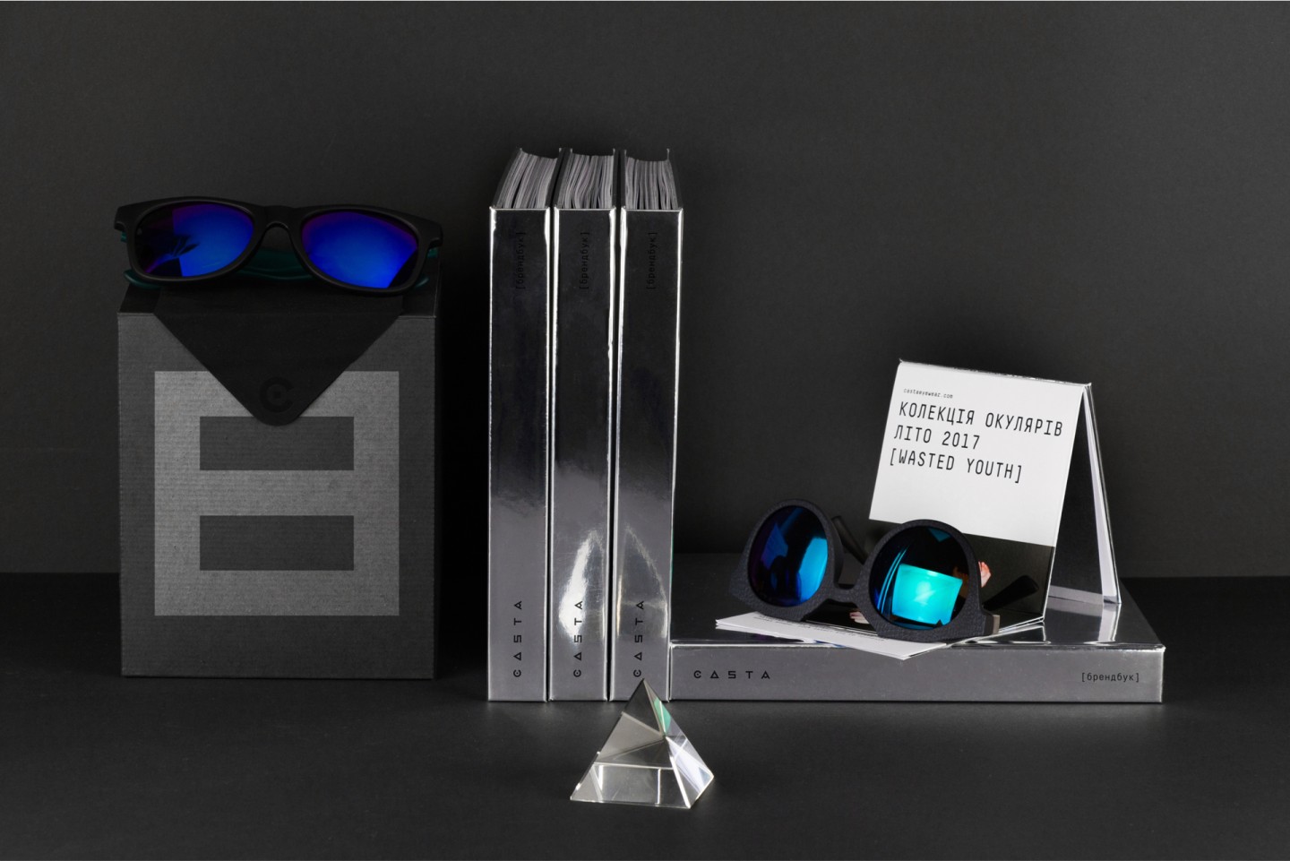
We created a brand book, which is a model of the facade, voice and character of the brand itself and which will inspire people who gonna develop the brand in the future.
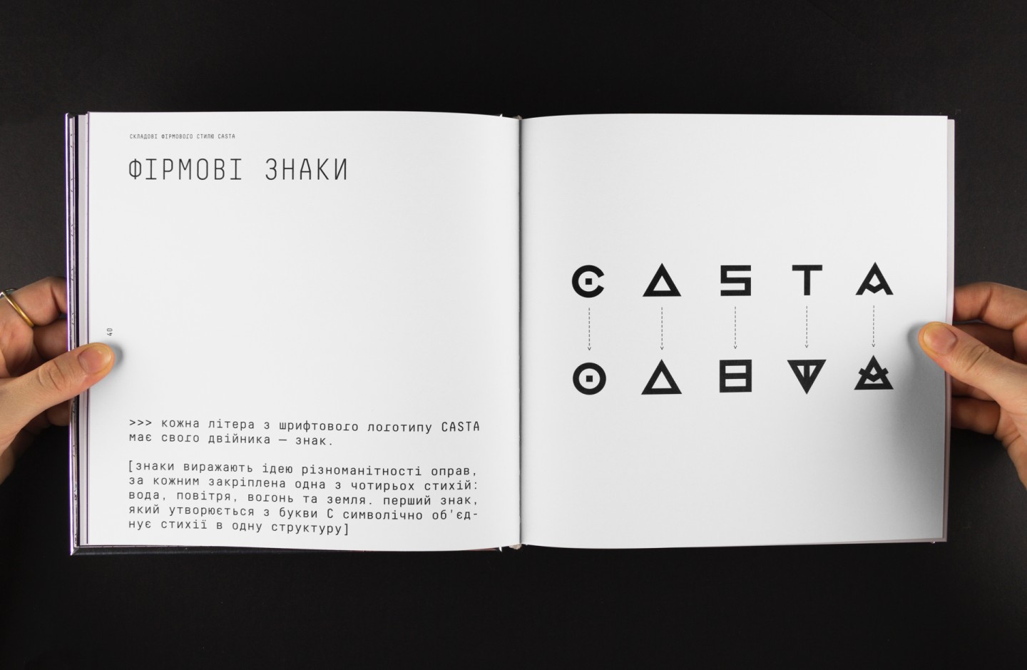
Young people are emotional, so we added abstract symbols to the brand identity, which became a kind of visual slang and a platform for communications.
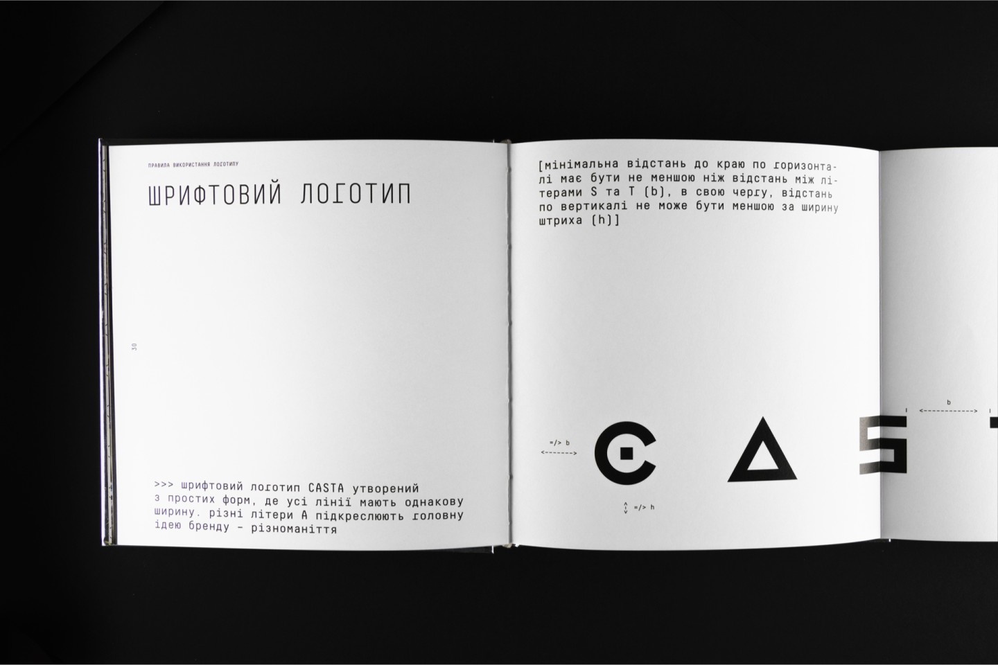
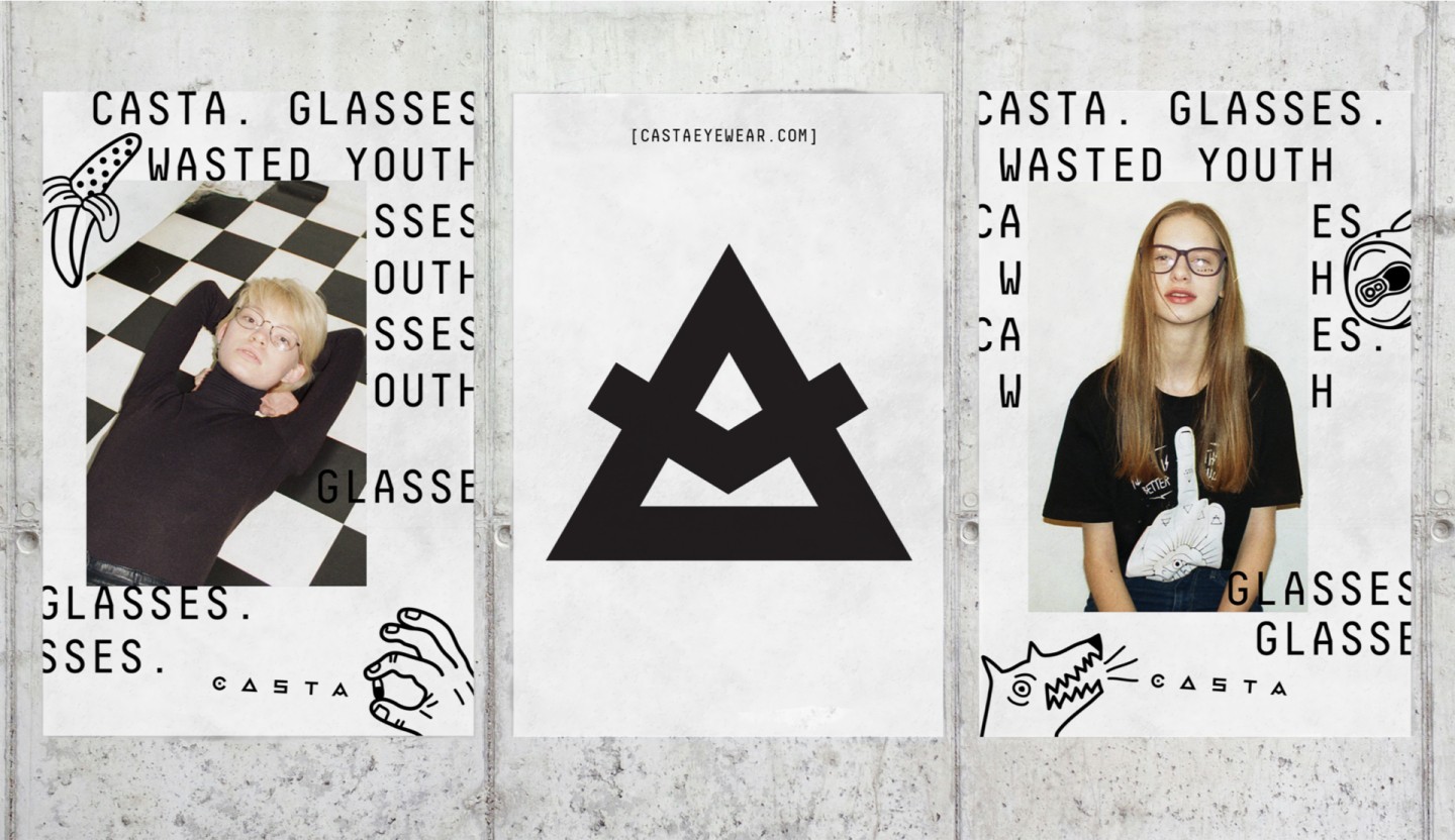
Fashion-brand’s logo constantly has to rub shoulders with bright photos, so we used simple geometric shapes in the brand name.
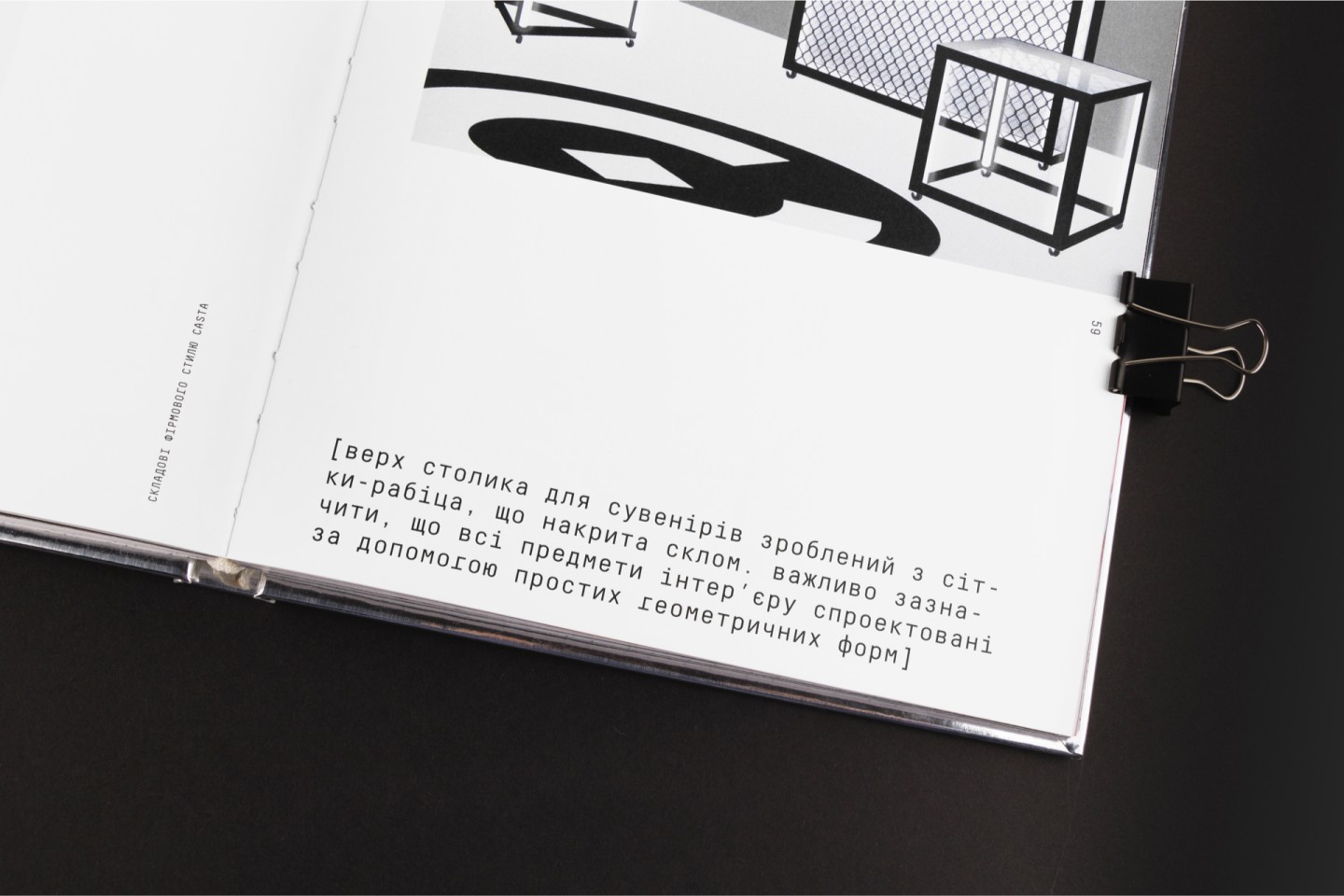
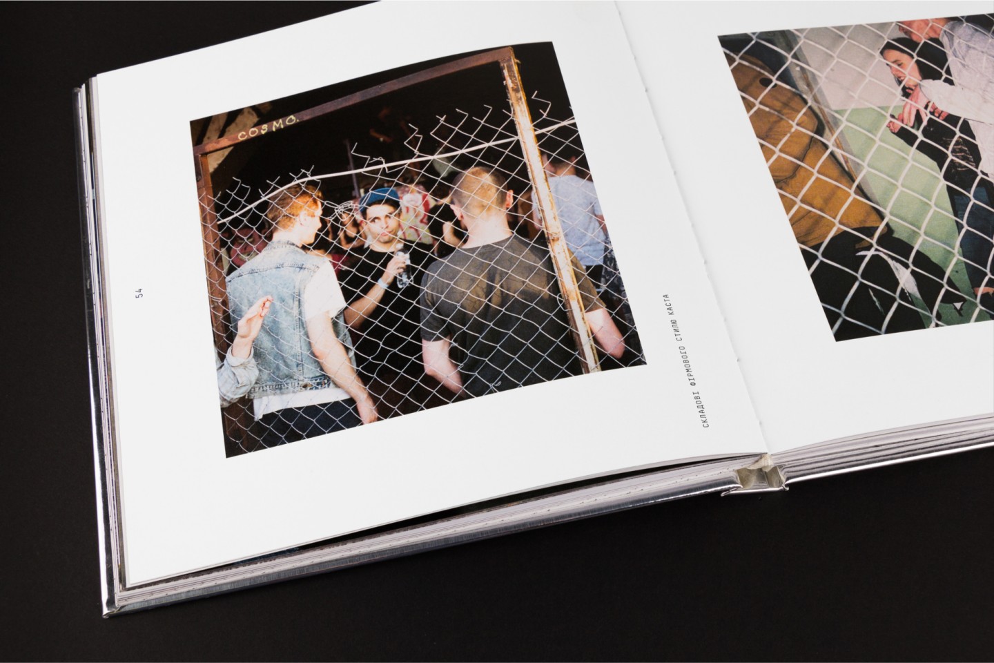
Rabitz type wire mesh became a firm pattern. Aggressive and symmetrical at the same time the wire mash is an ideal example of urban aesthetics.
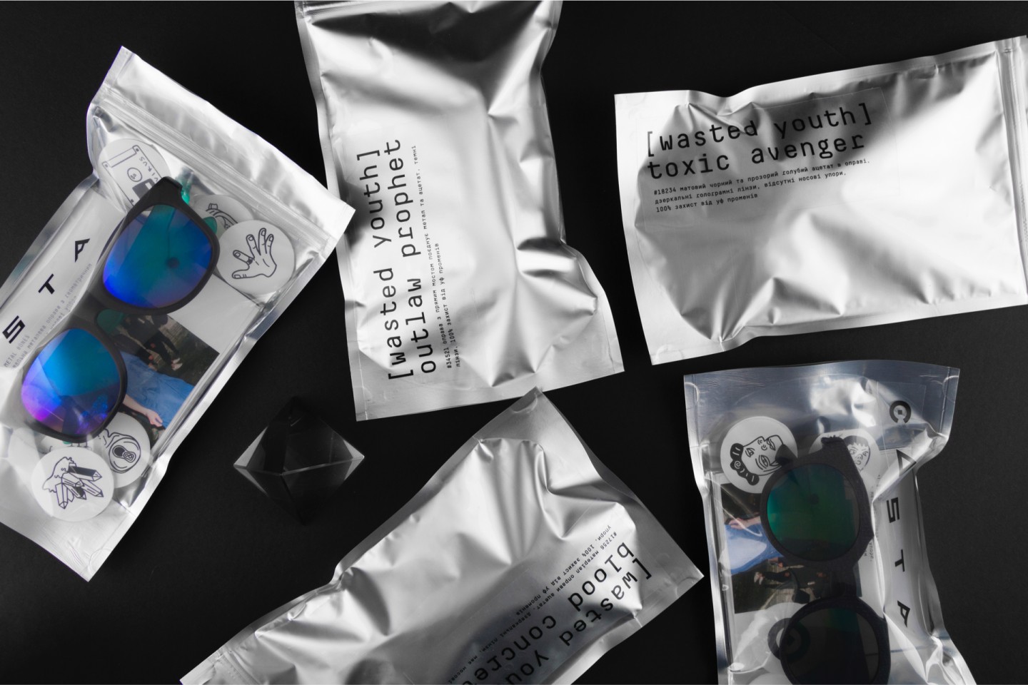
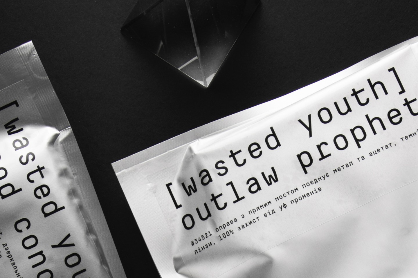
We liked the idea of naming glasses’ models as the titles of movies of the Troma Films that became cult thanks to low-budget trash movies and shocking content.
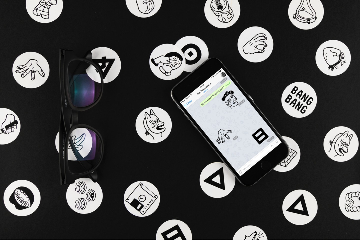
We created more than 50 illustrations that are used as branded stickers and stickers for instant messengers. A pack of stickers for Telegram can be downloaded for free.
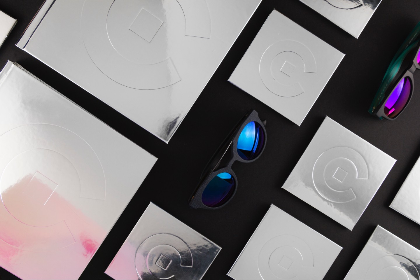
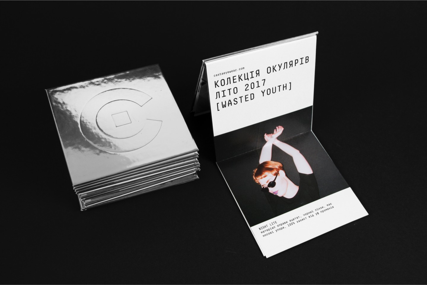
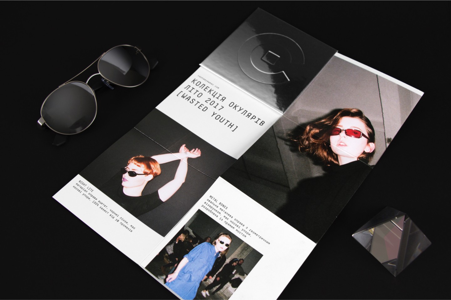
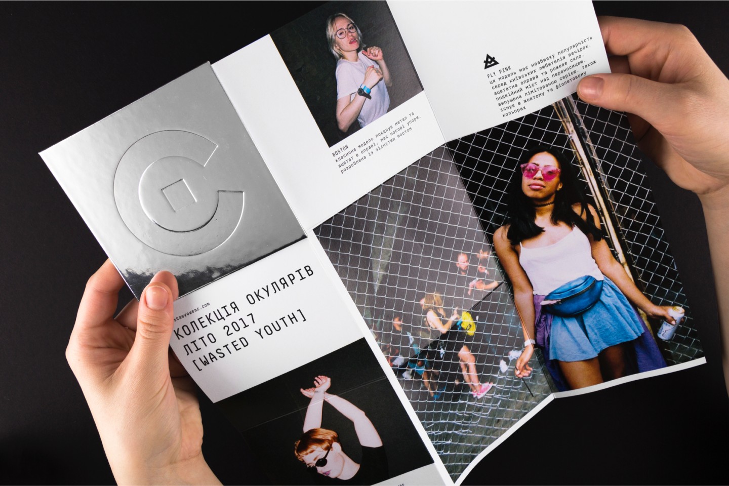
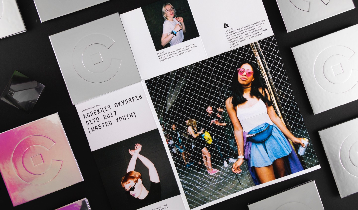
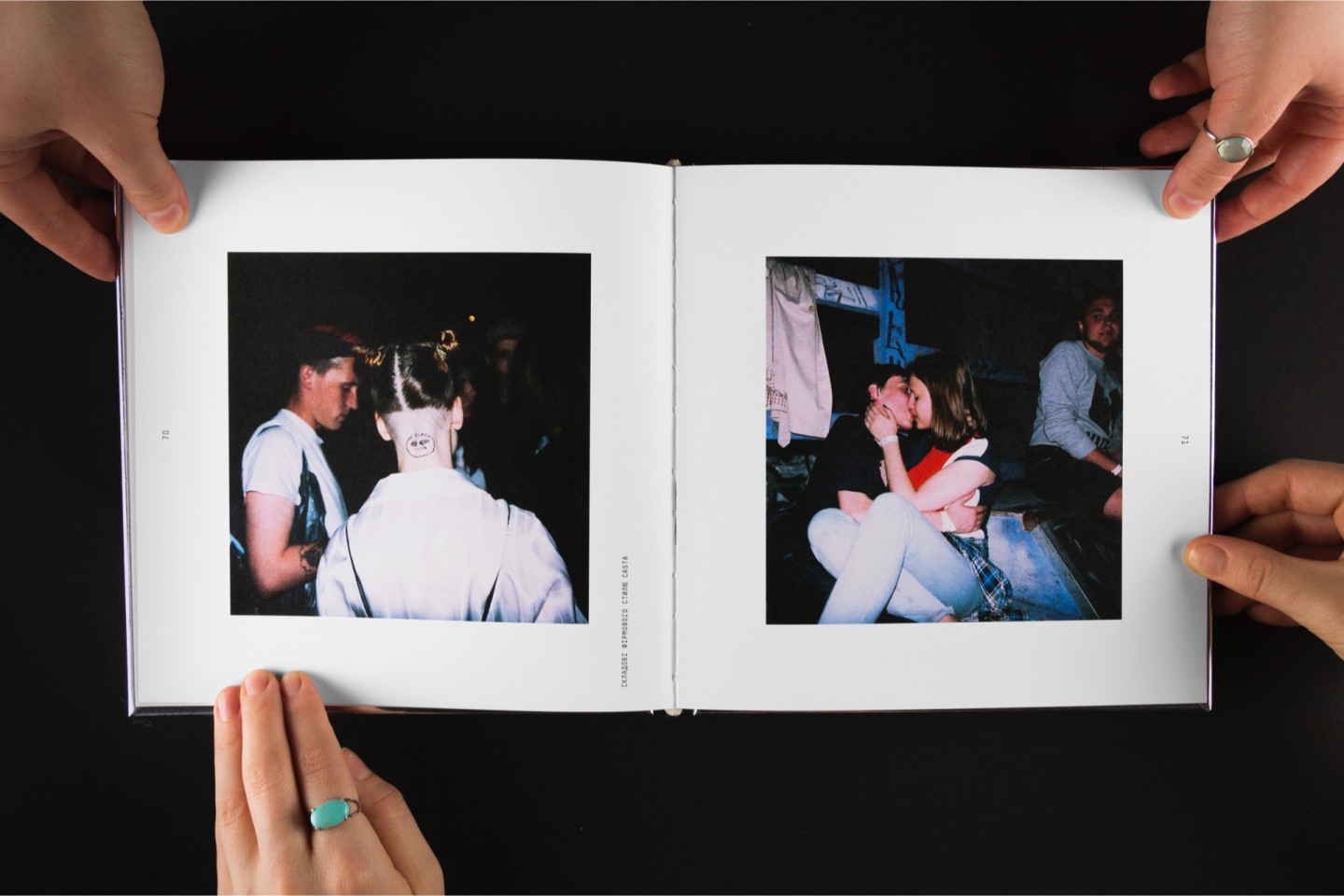
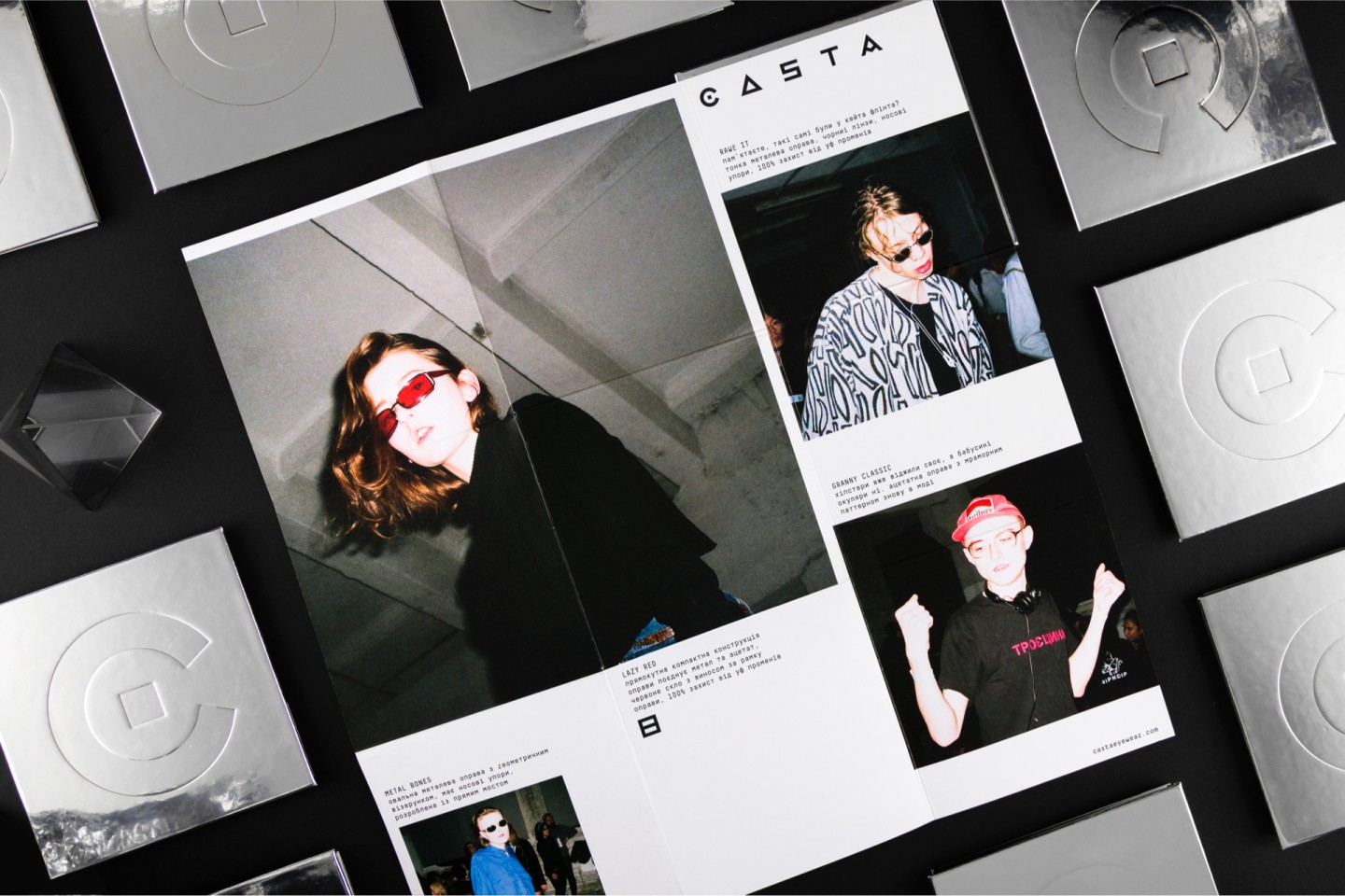
We developed a lookbook concept, where all the photos were taken at real parties and the models are simple Kiev's party people. Minimum information, maximum emotion.
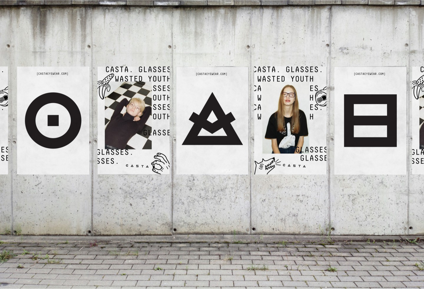
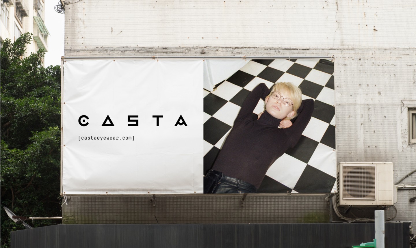
We wanted the outdoor ads to engage the audience in brand's life and to communicate using the same language, that's why posters with glasses ads look similar to party posters and stand out, comparing to other outdoor ads.
Credits
Art direction, design: Vik Vatamaniuk, Tatiana Avramenko
Motion design: Emil Gorodetsky
Photos: Andrei Boyko, Yana Mikhailenko, Alexei Berezovsky
Video: Andrei Boiko