Hugs Fund
Investment fund branding: strategy, visual identity
What shall we do with the odd money? But not with the odd, with accumulated money, doesn’t really matter. So that we can get the dividends and don’t worry about the safety? The answer is plain and simple — invest in HUGS. It’s more reliable than banks, more profitable than a car, and, moreover, way more stable than the real-estate investment. It has never happened to Ukraine before. Because this is America.
Creating a brand for a financial company is like balancing on a rope: lean to the right — you can fall for being not serious enough, lean to the left — you get stuck in boredom. The balance is the key. And interaction.
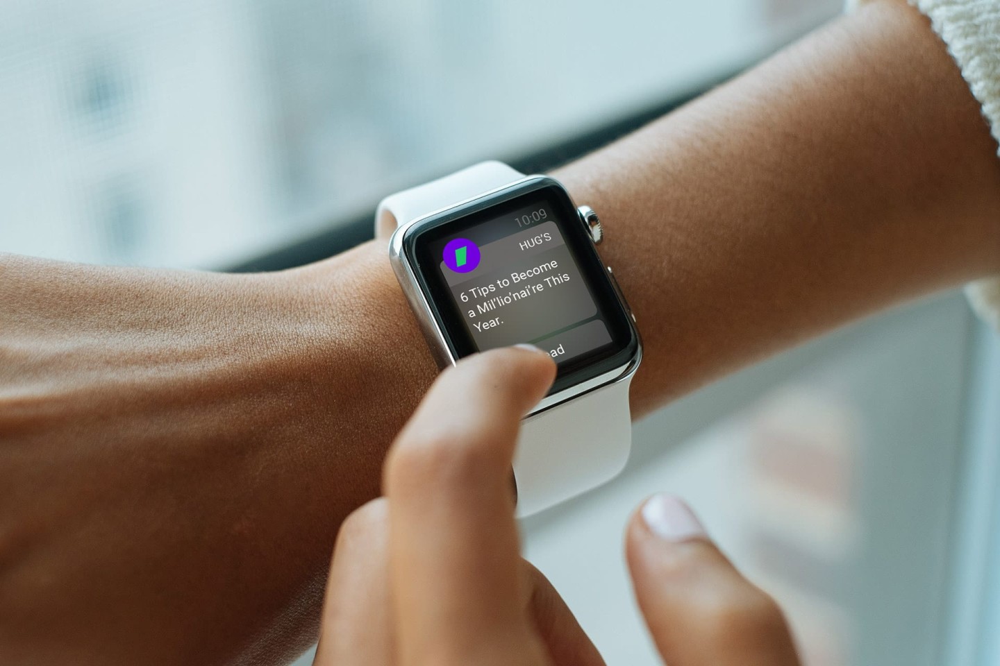
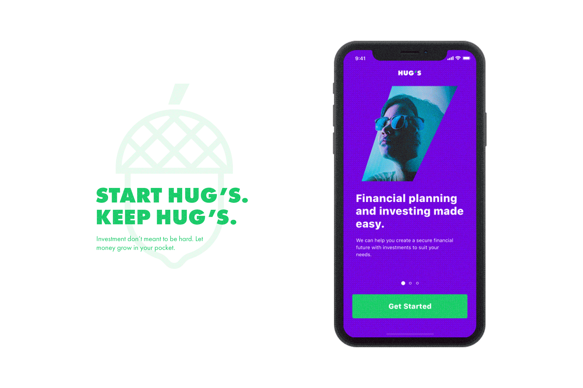
Let’s commence with the strategy. What is HUGS superpower? Among the benefits it offers, the main one is financial freedom. In other words, it is an ability to spend your time doing what you want to do, without checking on your investments. That is the main thing we had to deliver.
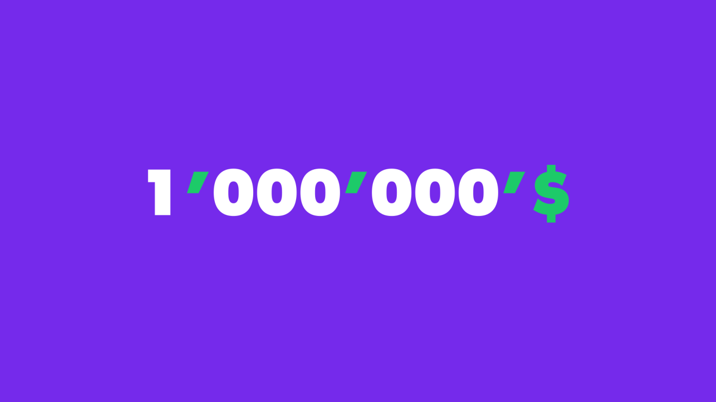
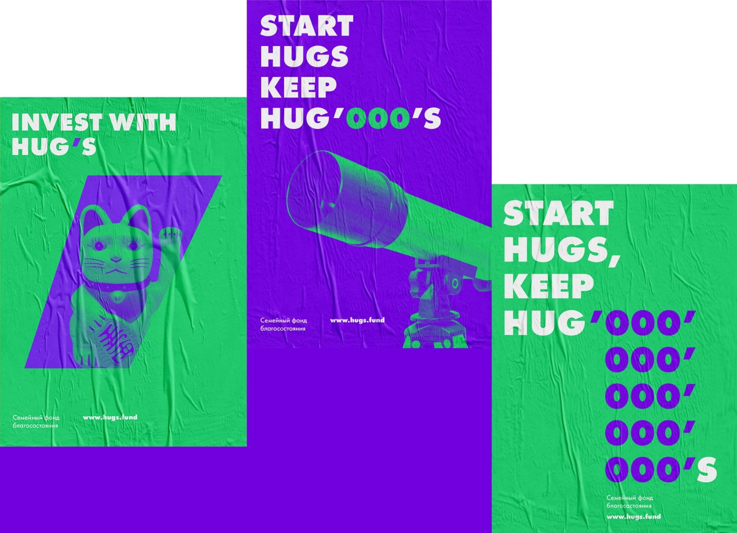
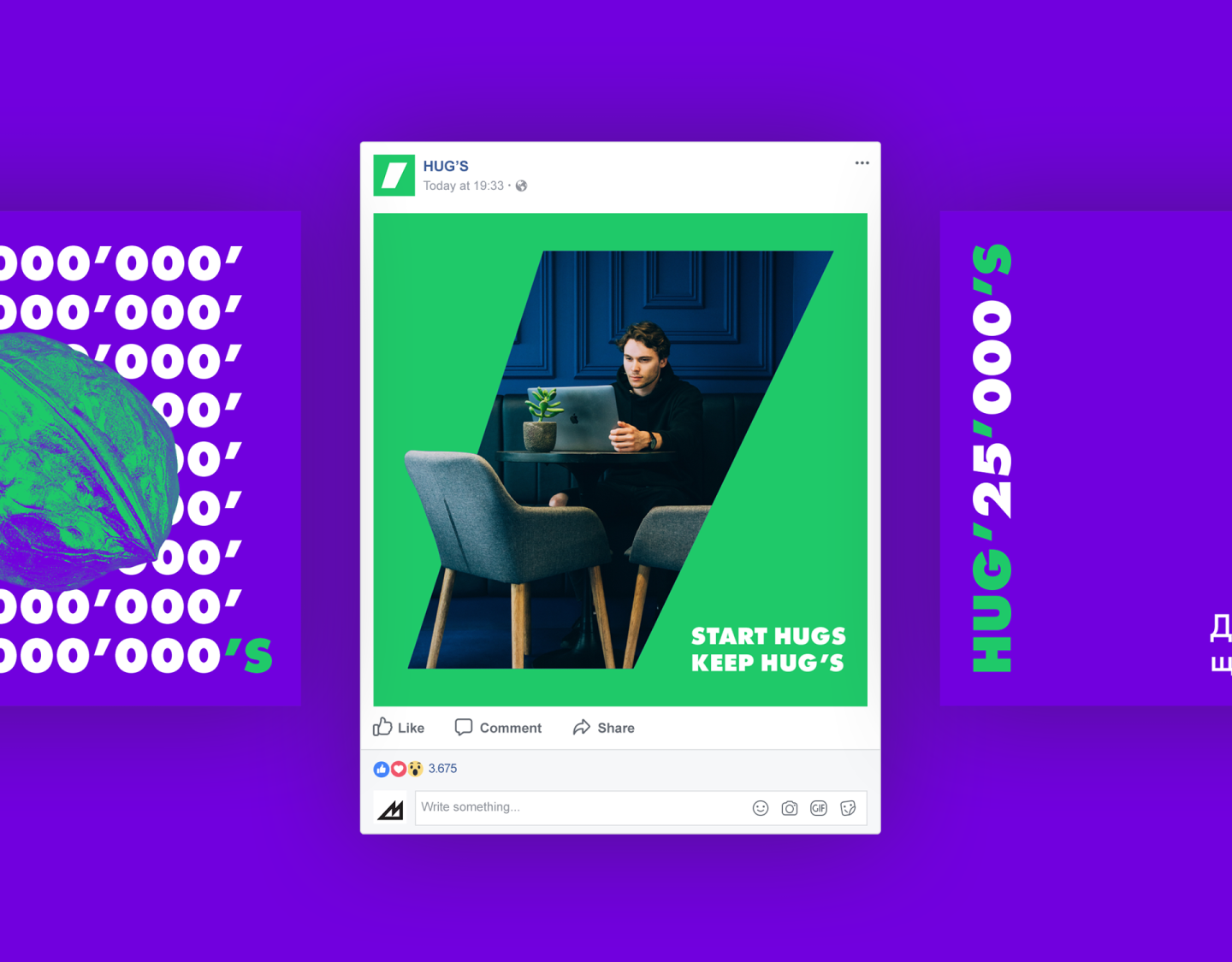
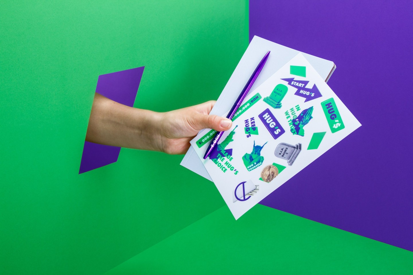
The accumulation of zeros in the pattern reflect the income on HUGS account. Zeros rhythmically combine with each other in groups of three, divided with decimal separator. Every separator is nothing other than a branded symbol. In this way, the logo, symbol and the pattern become the elements of each other, fusing and separating, where it is needed.
It is interesting that all the elements of HUGS identity are simulated right out of the keyboard, even the pattern. What does it mean? Maybe it means that we are able to create the blunt brand with pure and clear energy. Money loves it. And maybe that’s why it loves HUGS.
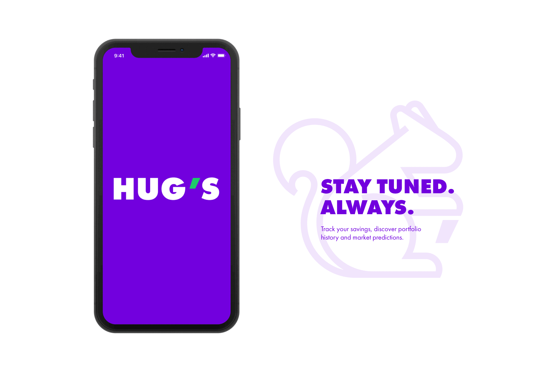
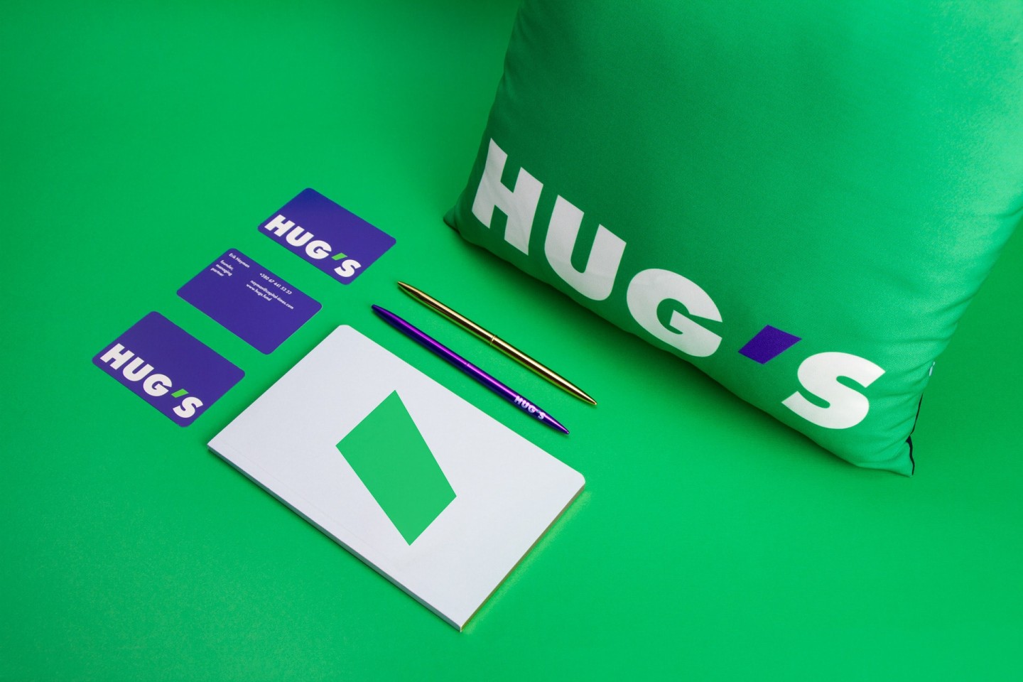
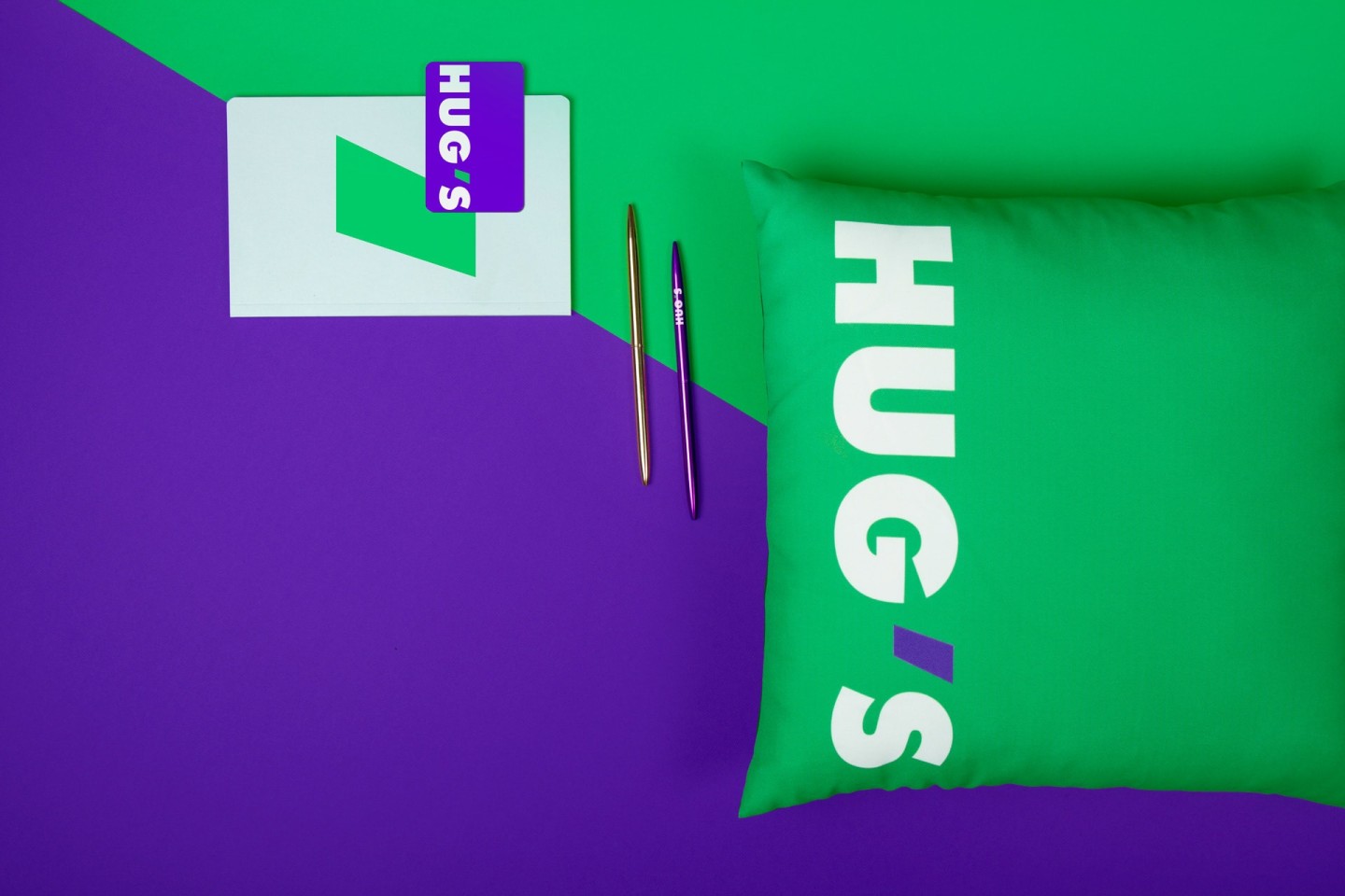
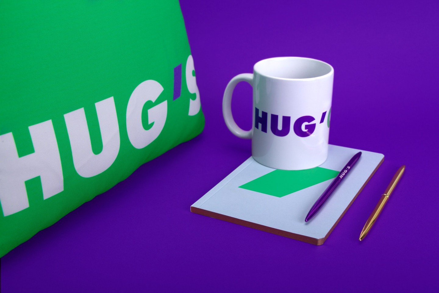
Energy combined with youth is the driving force for any idea. In HUGS branding this idea is reflected in colors: green and violet. They’re backed with minimalistic and forever young Futura, that was chosen as a logo font. Its character is similar to our brand’s one: on one hand it looks classical due to the proportions, taken from roman capital font, on the other hand it is modern due to lettering construction: every letter’s shape is based on simple geometric shapes — triangle, circle and the line. The branded logo organically fits into the font part, basically becoming its element.
It is an apostrophe (if it’s surrounded with letters), or the decimal separator — regarding the numbers. The symbol itself is plain and easy to use for digital activations; in different cases it might be a shape-box or a separate window-box, where elements integrate with each other
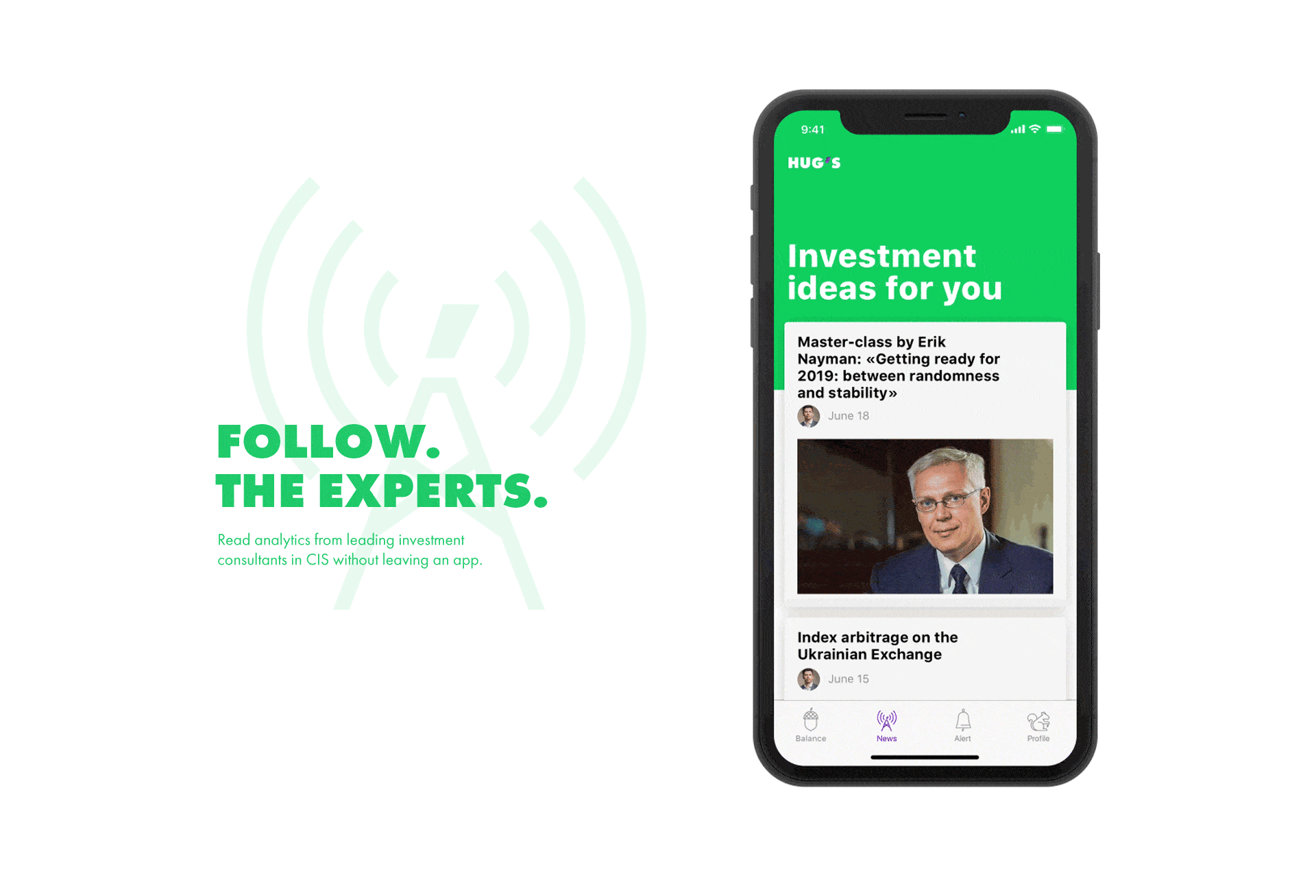
We appreciate the assistance of Erik Nayman throughout the project.
Credits
Strategy: Anton Solonko, Artur Redzynets
Art-directing: Vik Vatamanyuk
Design: Olya Kuzovkina, Veronika Syniavska, Mariya Kotemako
Copywriting: Artem Korniyenko, Sergey Vorvikhvost
VFX: Emile Gorodetskiy, Platon Fedorchenko