"Runa" sauces
Sauces rebranding: strategy, label design, logo and identity
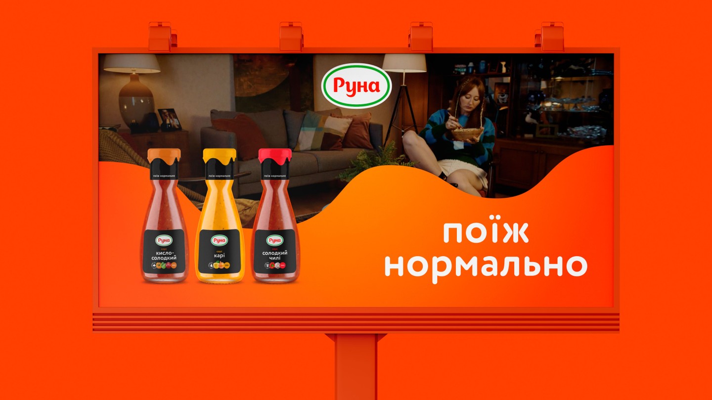
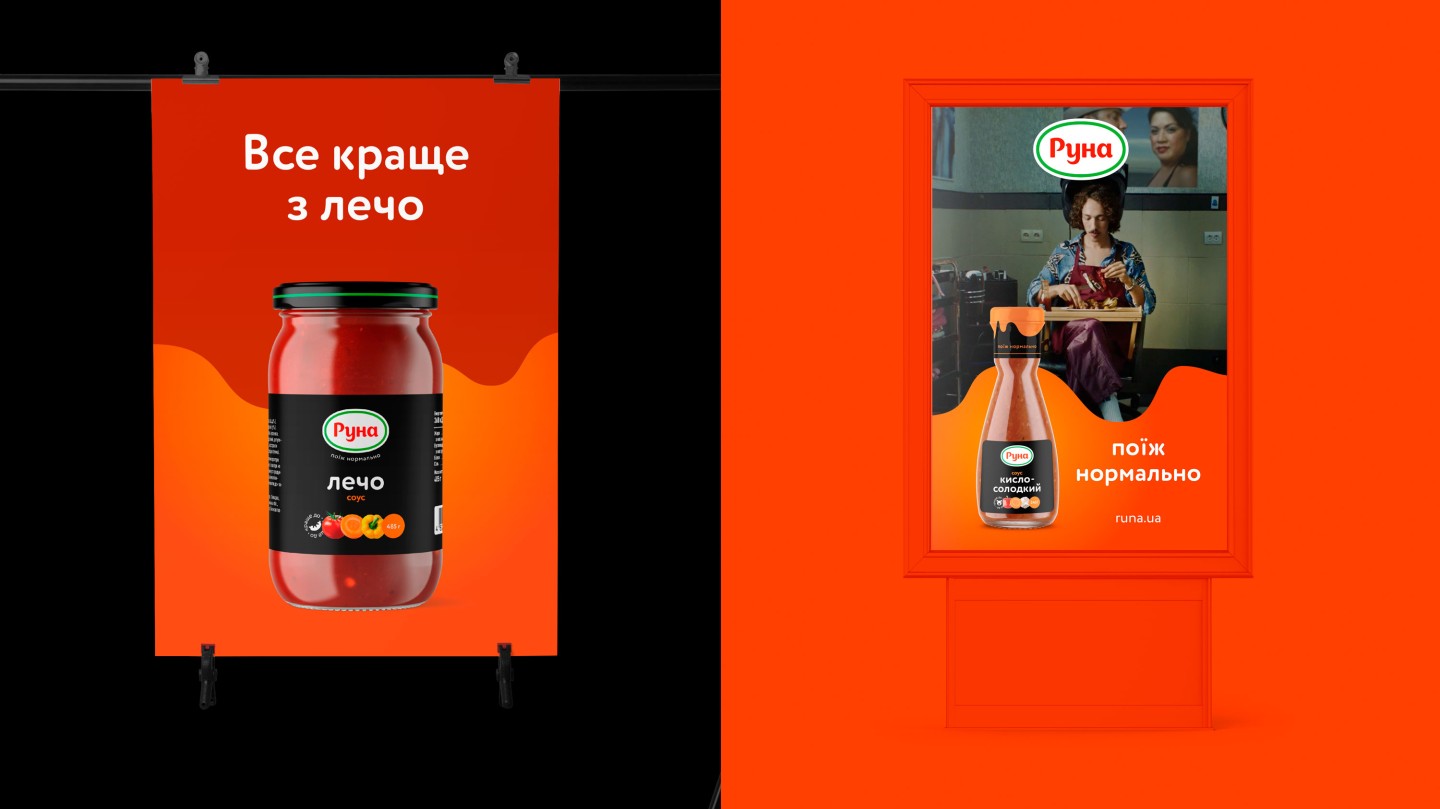
Recently we talked about how we launched new positioning and advertising campaign for "Runa" sauces, "Eat well".
If the brand's main idea is "Eat well," we decided to make the design well, too.
Runa is far from the stereotypical image of an FMCG company. This is not an evil corporation but a charming Ukrainian producer.
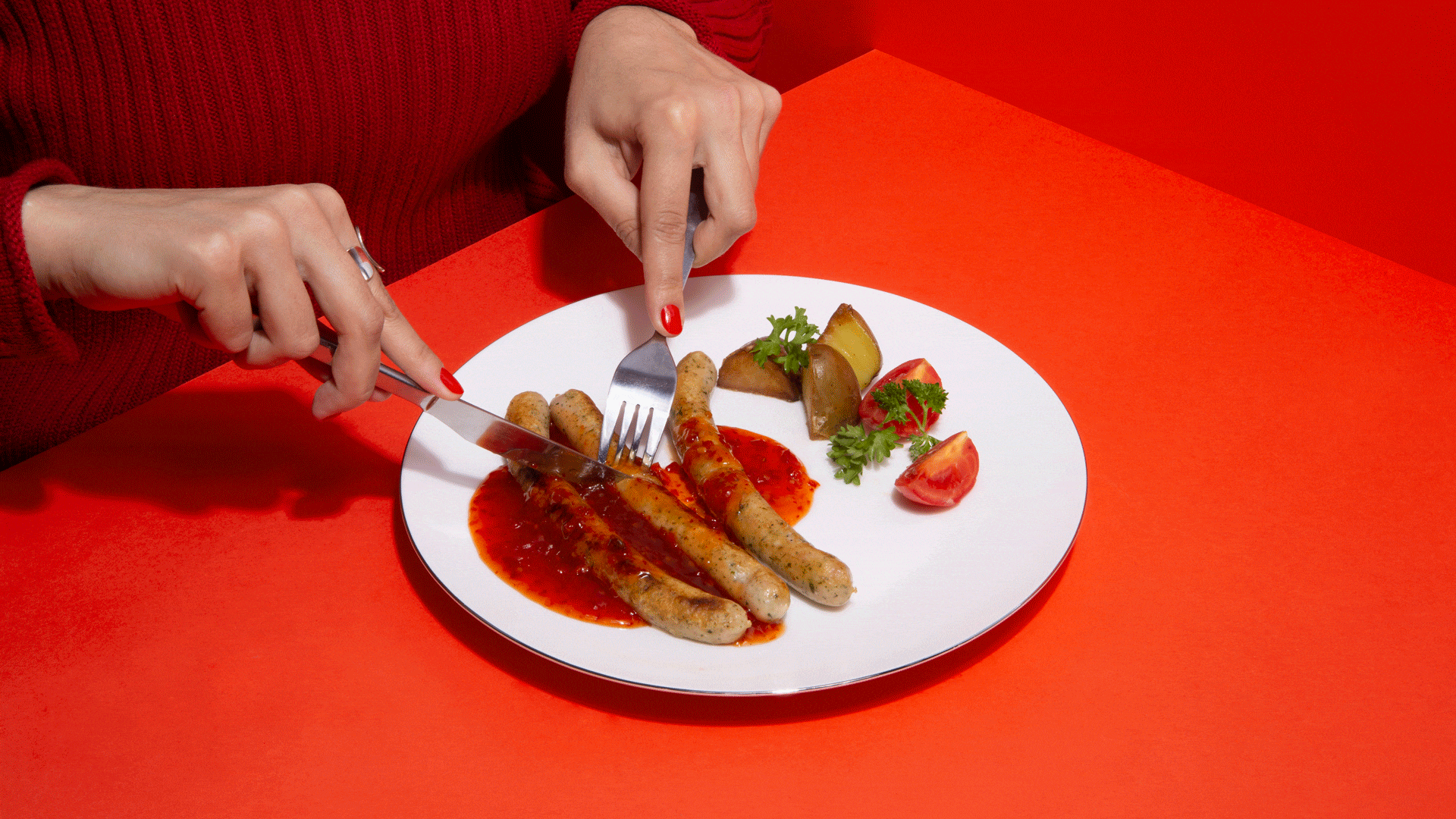
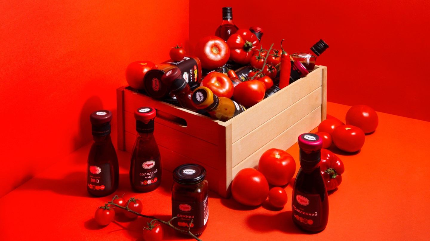
However, that doesn't prevent Runa from making over 8,000 tons of sauce a year. That's enough for nearly 69 million dinners with sauce.
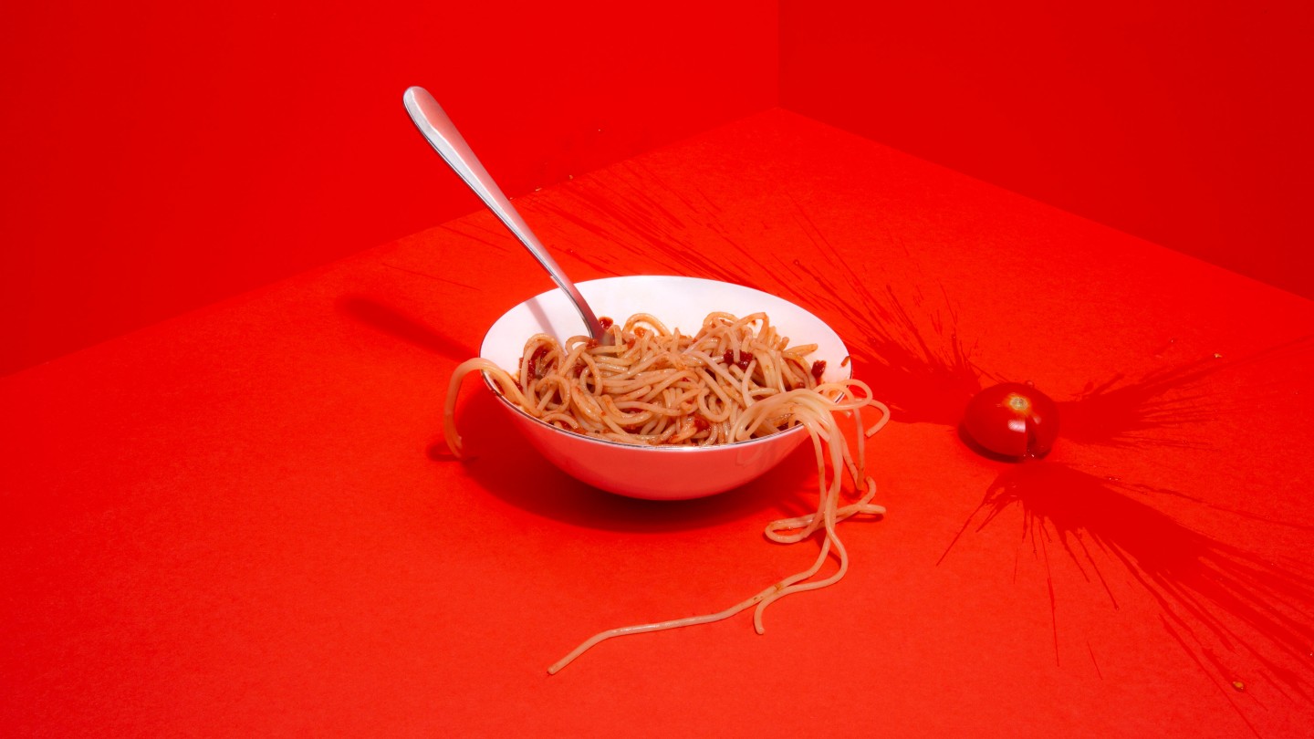
We affectionately love Runa's with pasta, buckwheat, and anything else. But before we started working on this project, we hadn't bought it. Because of the old-fashioned labels, sauces were in the blind spot for us. A focus group revealed that we weren't the only ones. The most common comment was, "this sauce is for my mom." "We wanted to fix it," at this point, we launched our working process on design concepts.
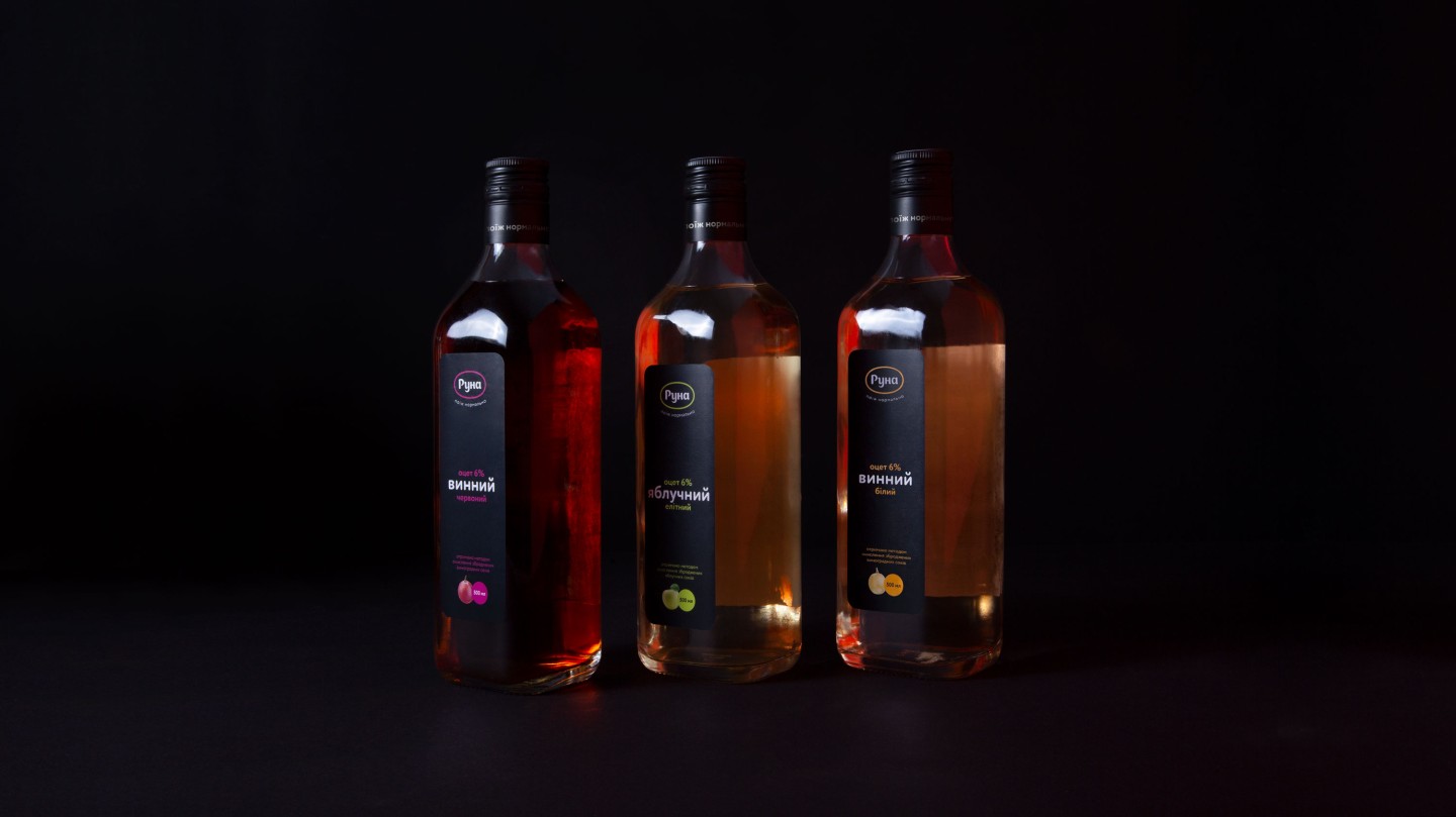
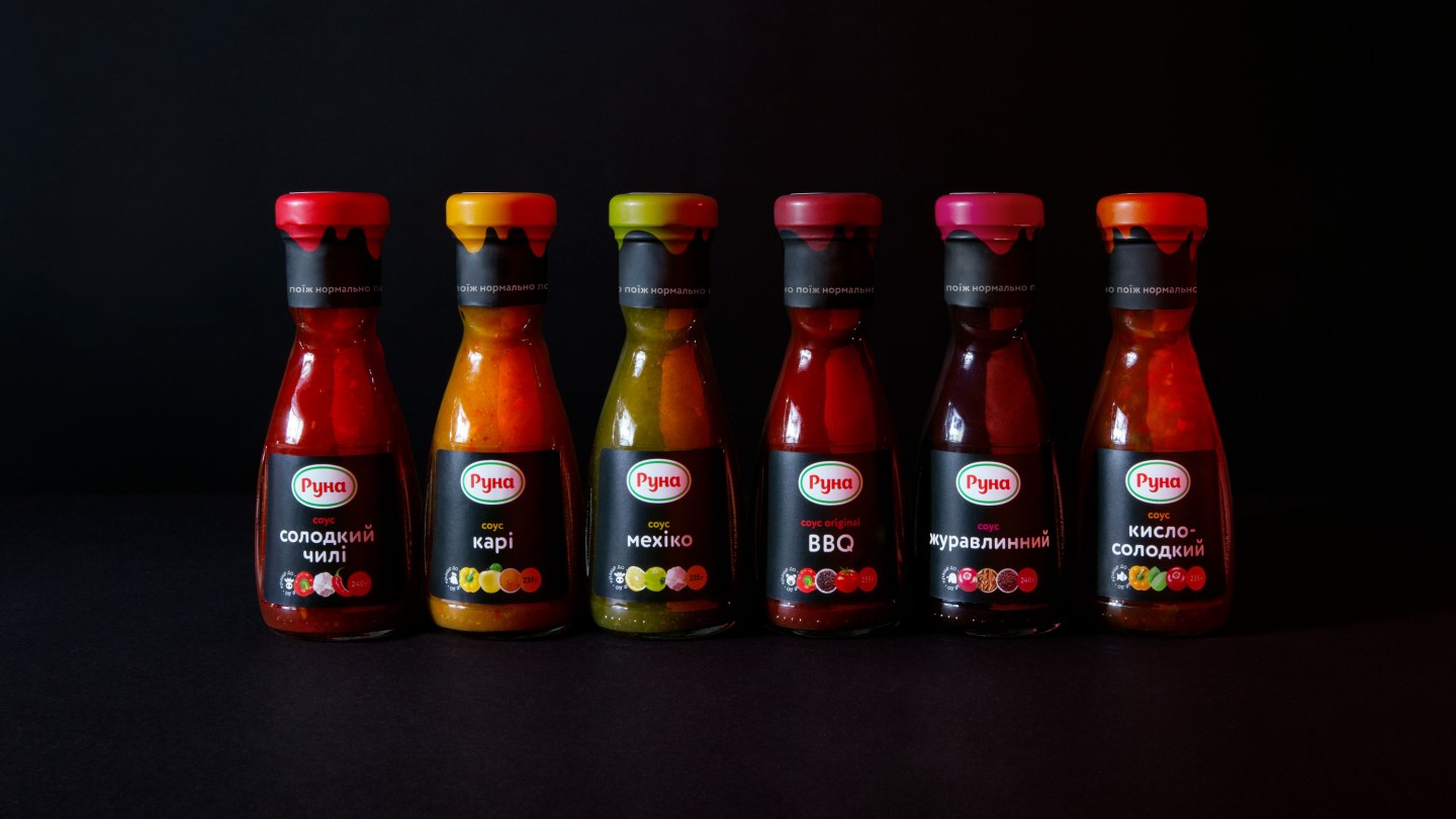
The main task in working with the logo was to change everything, without changing anything, while maintaining its identifiability.
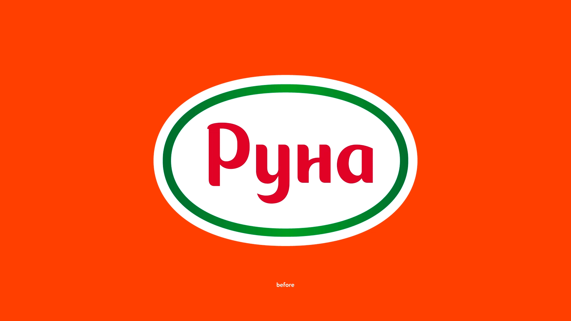
The ones who love "Runa» will find their favorite sauce brand on the shelf, and the designer will not have a nervous tic from the logo: the colors became brighter; we removed the extra details that are not visible in small size; we added the sharp elements in the letters -P- and -u-, and the strokes in -u-, -n- and -a- now have the same tail; counter forms in -P- and -a- made more oval, repeating the shape of the logo.
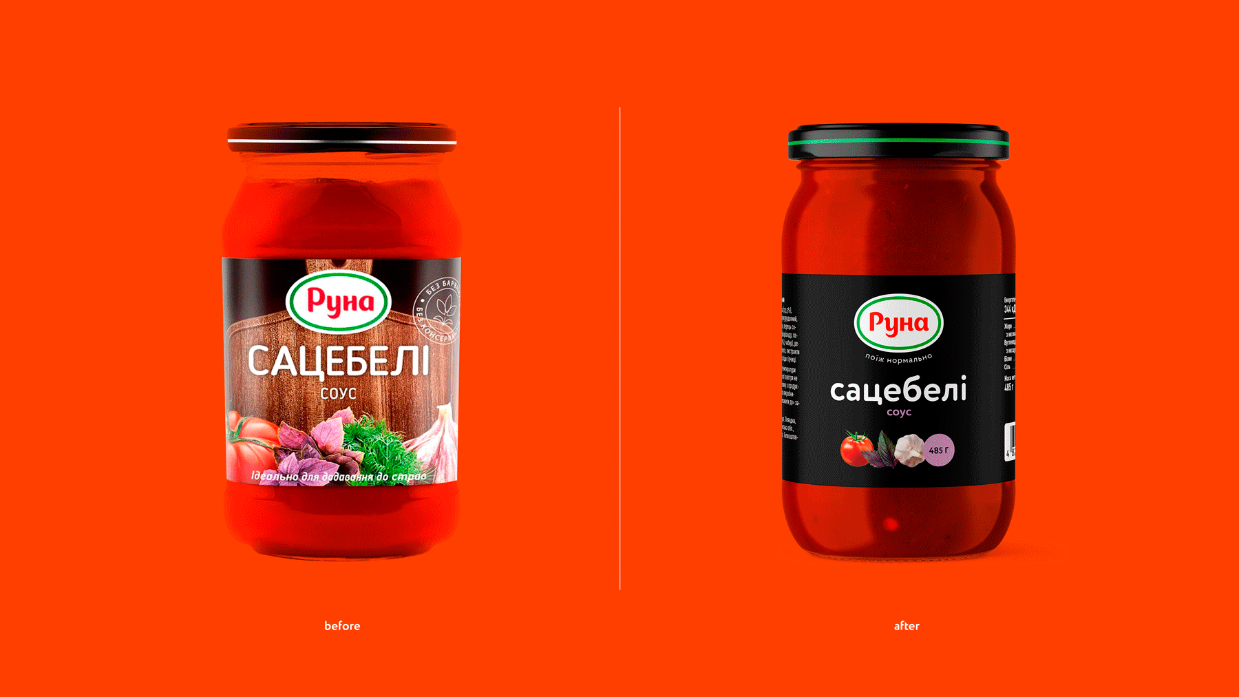
The current packaging had several flaws that we wanted to improve:
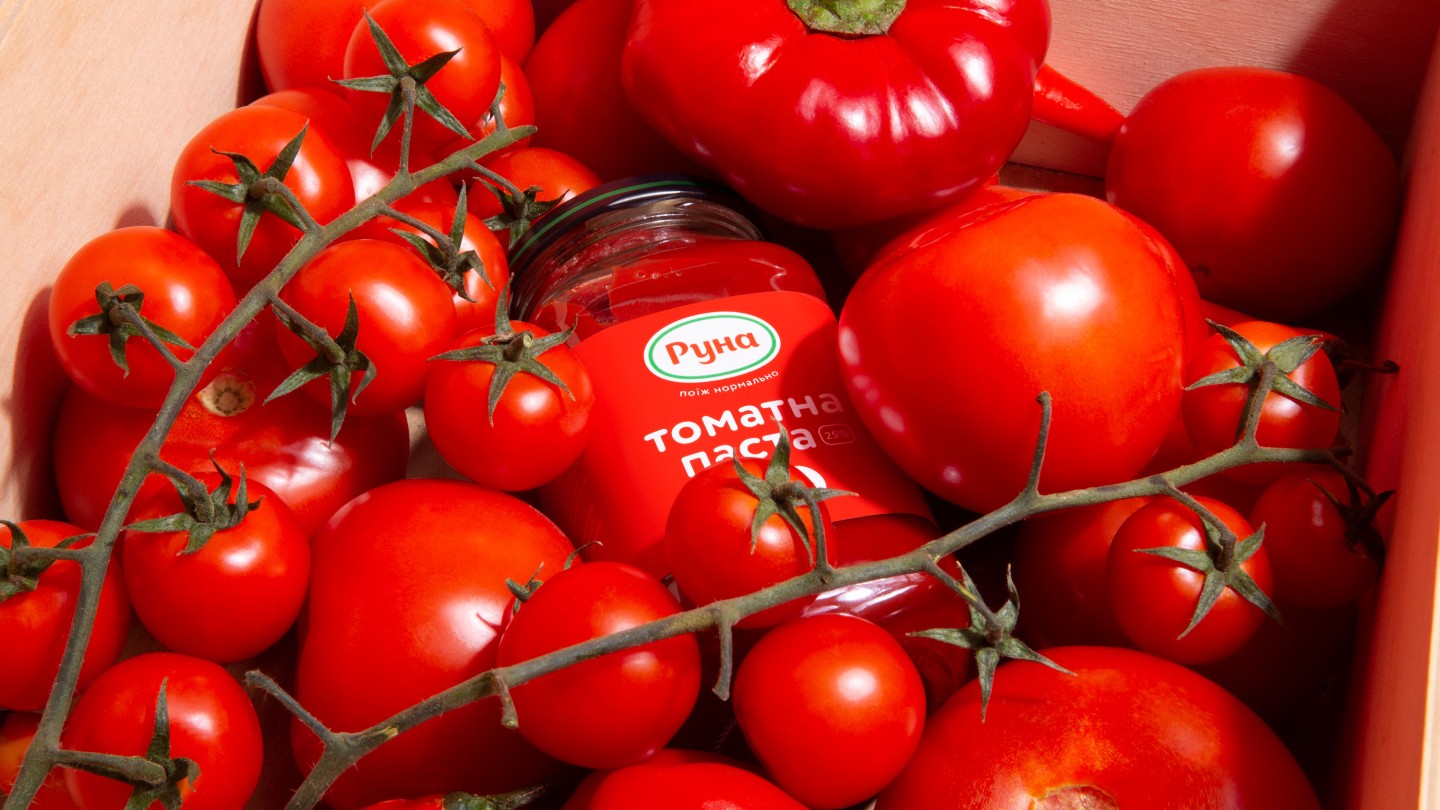
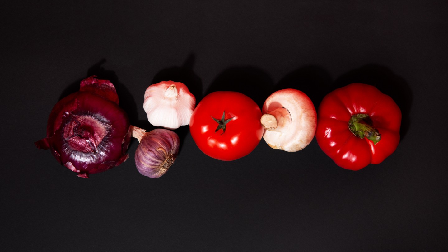
– vegetables photographed "like everyone else's."
– weak contrast;
– dull typography.
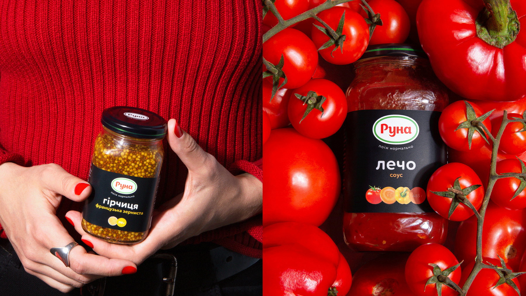
Instead of making an entirely new design concept, we kept what we liked:
– black backgrounds;
– rounded fonts;
– the composition.
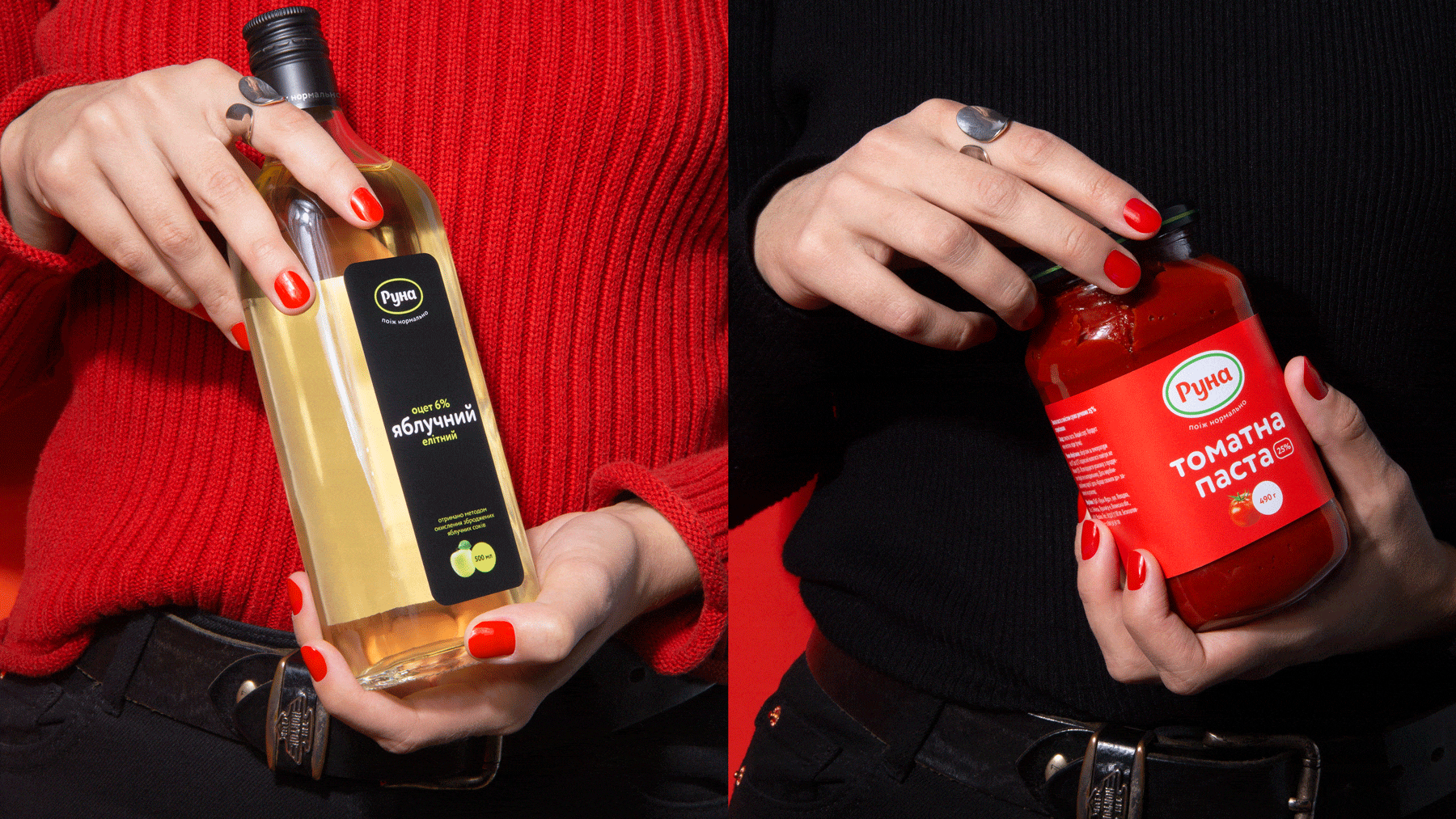
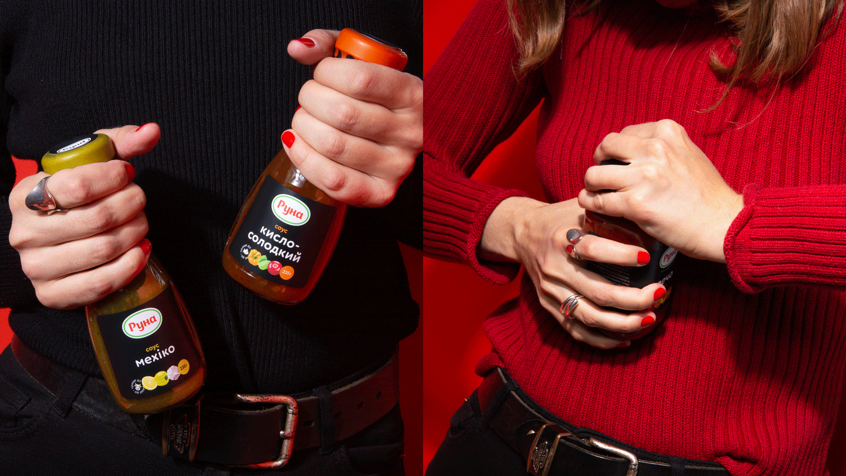
The new label design is more contrasting. The name of the sauce is easier to read. The composition is more clear now. Each of the ingredients has an avatar. And, of course, we removed all unnecessary things. As a result, the label now looks modern.
Soon sauces with the new label will be on the shelves.
You'll be able to "eat well".
Credits
Strategist: Artur Redzynets
CD: Gleb Petrov
Copywriters: Roman Pyskun, Anton Solonko
Design-director: Vik Vatamaniuk
Art-director: Veronika Syniavska
Designers: Olesia Bahrii, Alexandra Romanenko, Veronika Syniavska
Motion designer: Egor Prijma