Ta-Da!
Rebranding a supermarket chain: Strategy, naming, logo & identity, communications
Ta-Da! is a new brand for the supermarket chain, which offers affordable household goods.
The KOOP Poltava trade mark existed for several years and encapsulated two retail stores in Poltava. The stores (at least 700 m²) were similar to wholesale warehouses. A buyer was not always comfortable to do shopping since there was no navigation, merchandising, modern identification but and along with this the stores had a decent level of service and quite attractive prices. Relying on housewives, as the main target audience, the stores offered a wide range of useful household products: from teapots to clothespins. We were faced with the task of breathing a new life into the brand, turning local stores into a modern network, bringing the brand to new regional markets. We had to create people’s household goods store, which is not inferior to European equivalents

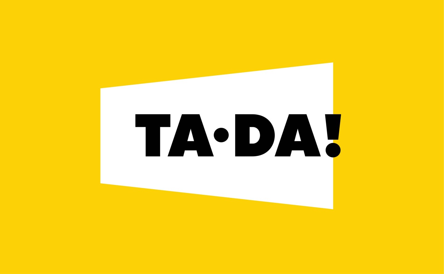
Strategically, it was advantageous for us to remain in the occupied niche of people’s store with democratic prices; such rules dictated by the market and already existing buyers’ loyalty. We developed a strategy whose primary goals were to increase the number of stores and regional expansion. Then we changed the name to a more imposing name Ta-Da!, having released from the binding to the city. We created a new brand identity, whose central symbol became a stylized megaphone, from which sounds: "The goods for the house. Daily"
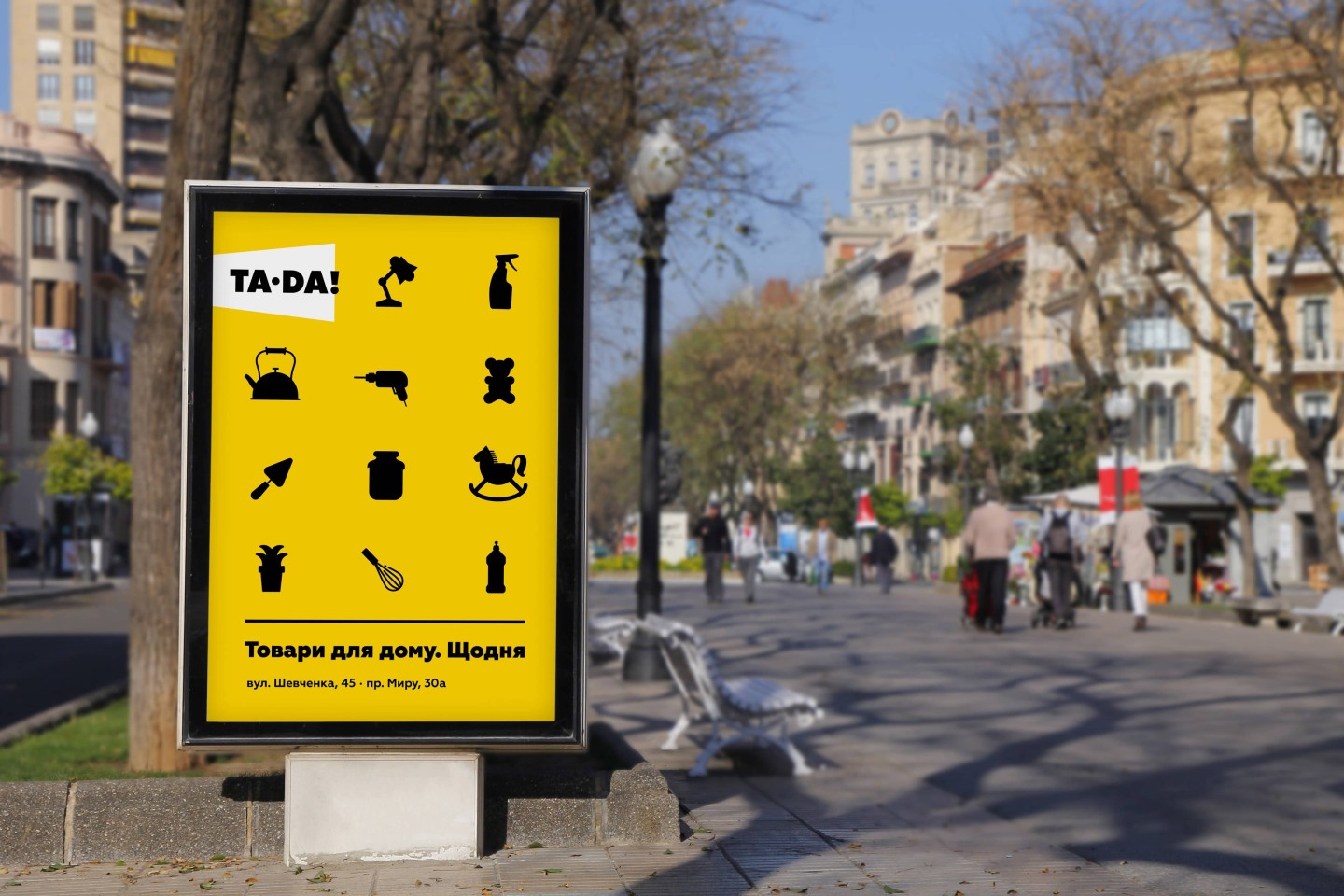
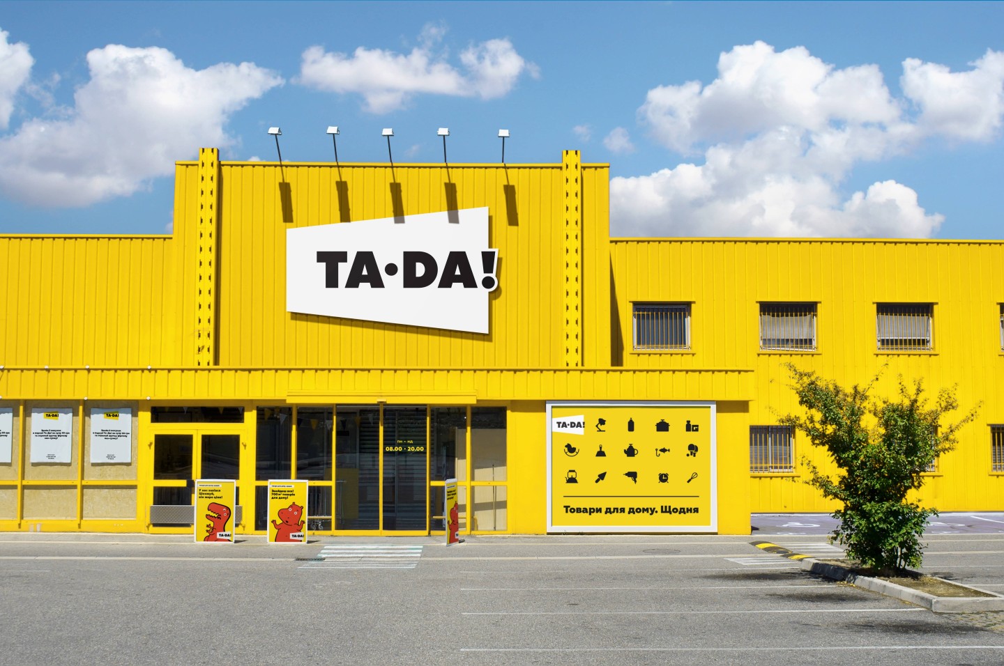
To demonstrate a new, human approach we worked on all points of customer interaction in supermarkets, such as signs, navigation, personnel uniform, layout, shelves, packaging, packages, price tags, bonus cards, site, accounts in social networks


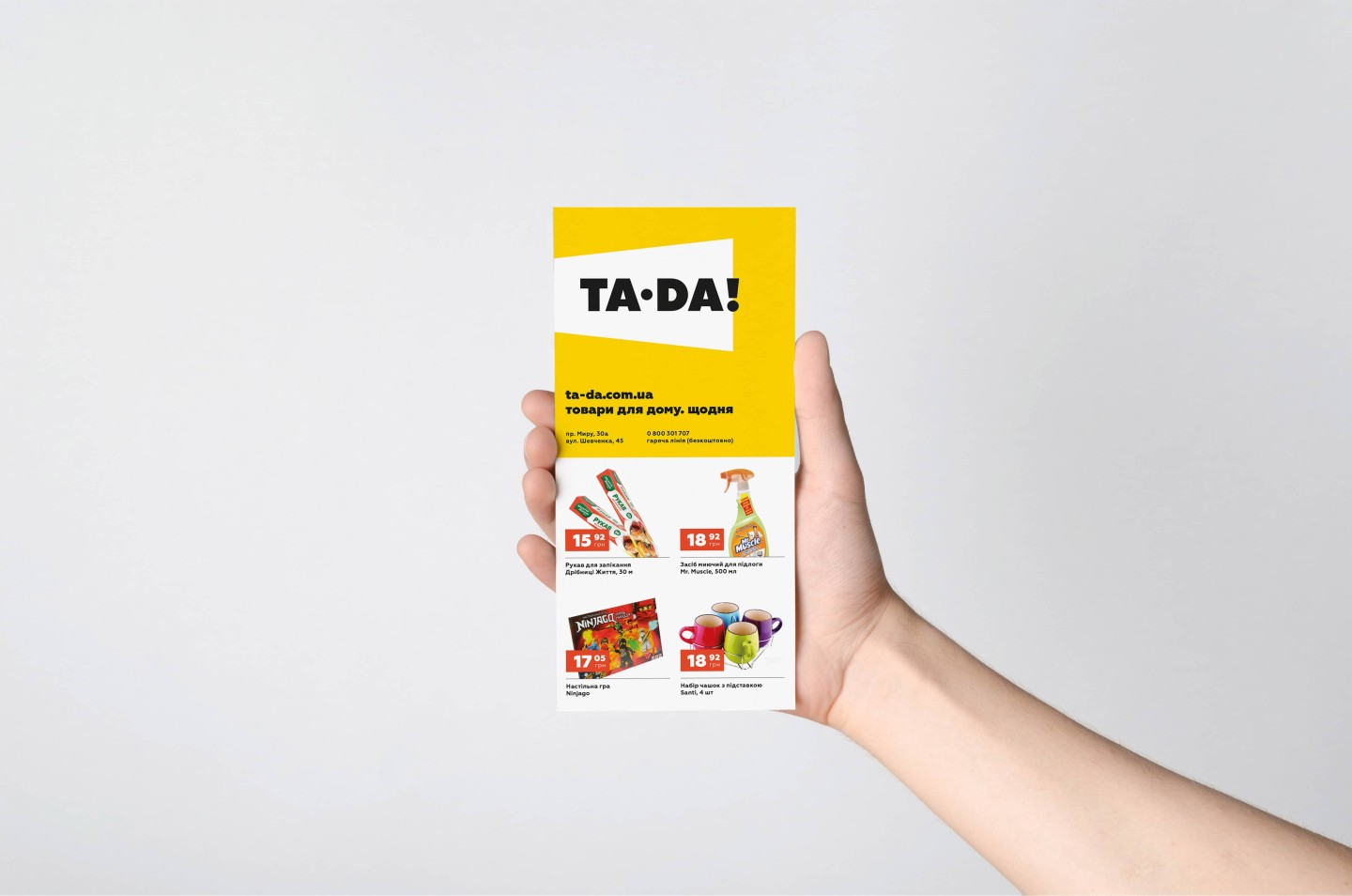
To ensure that a buyer can promptly find the price and name of an item, price tags contain an optimal amount of information. Yellow color helps to easily locate the item on shelves.

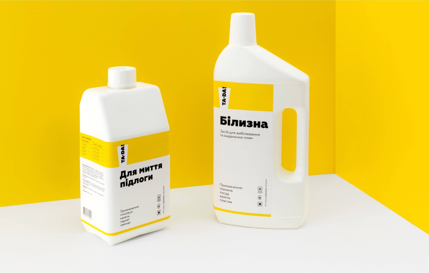
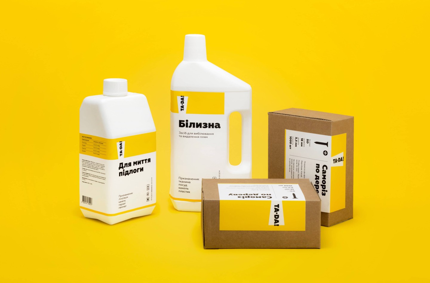
We developed a laconic design of product packaging for the goods selling under store own trade mark. It stands out favorably on shelves, although it uses only two colors, which reduces the costs of its production.
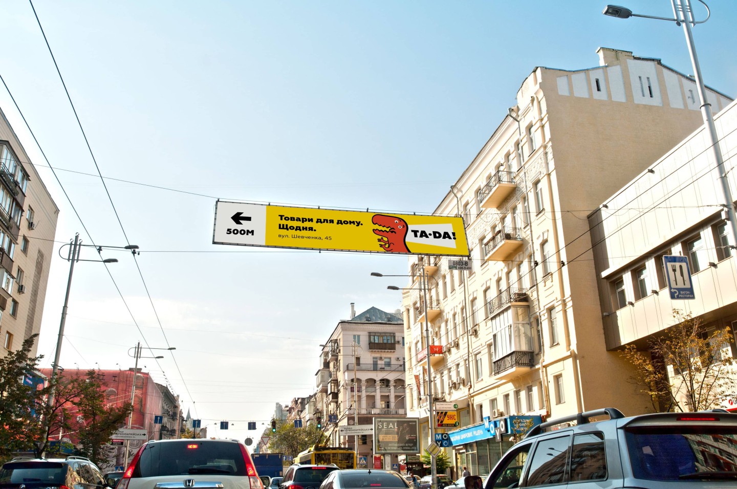
A huge area of shops is one of the main advantages of the Ta-Da! network, in which, literally, you can place a dinosaur or hippopotamus. That’s why for an advertising campaign, we created characters, who bite and tread down prices, making them available in consumer’s perception. The size of the characters hints at the size of the store and profitability of its offers.
We actively worked with social networks, creating an easy and positive image of the new brand.

We created a new online store, which became a full-fledged sales channel and which immediately went beyond the Poltava region.
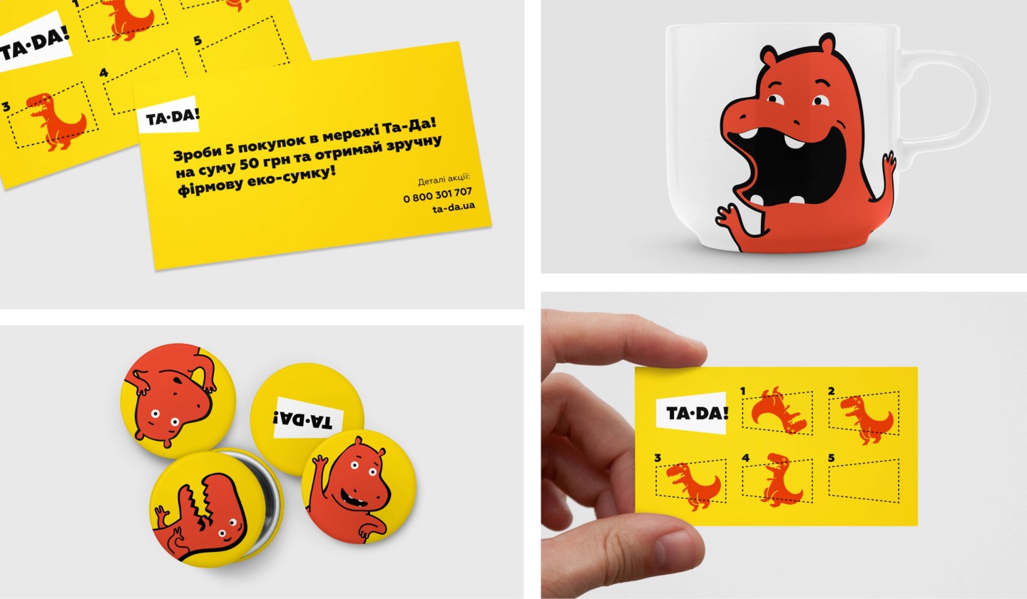
Emotional characters (hippopotamus and dinosaur) are designed to evoke a smile and make communication with customers easy and fun.
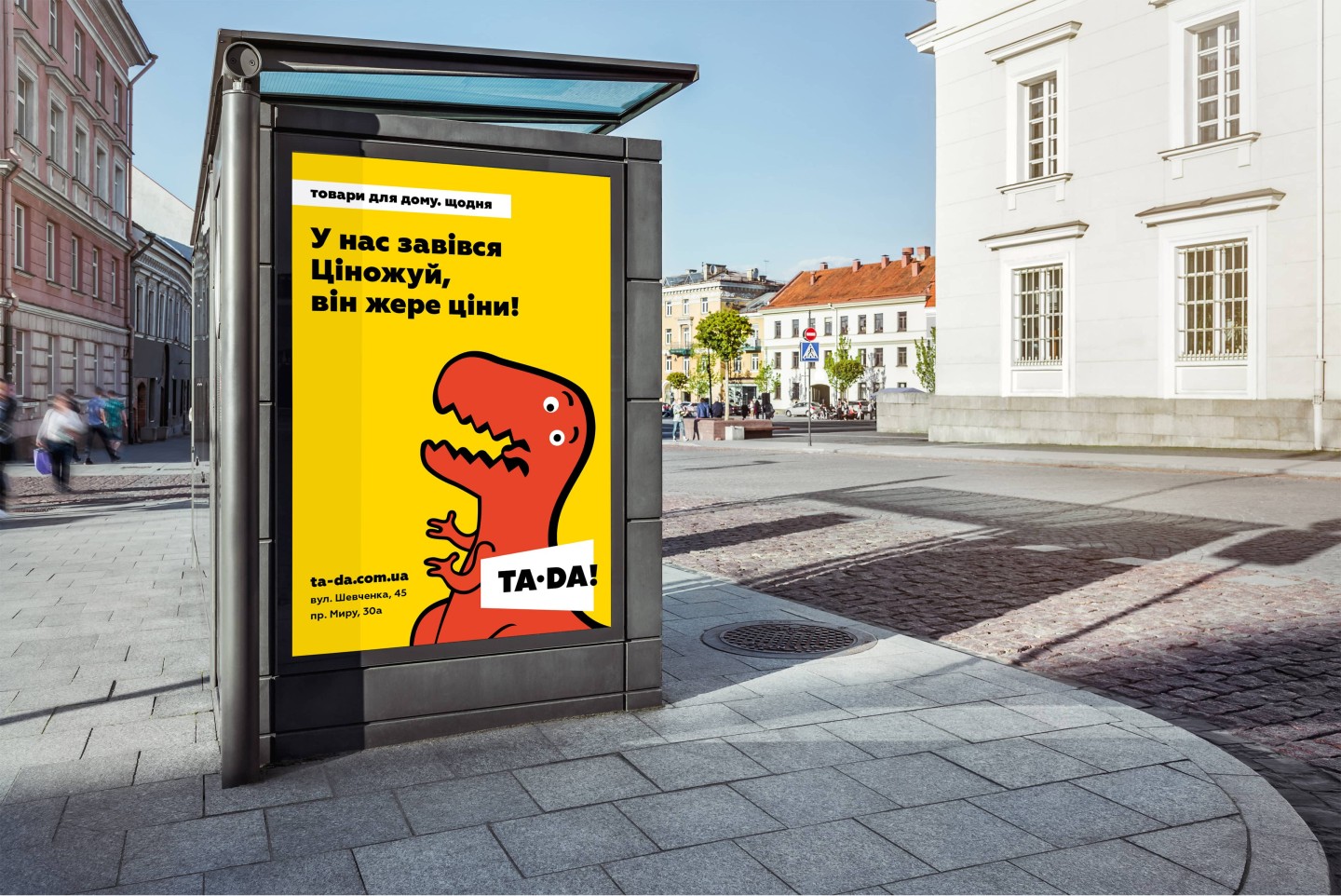
Now supermarkets of the TA-DA network are in Poltava (2 stores), new stores have opened in Kremenchug and Mirgorod; preparing for opening of new stores in other cities is in good progress. The plans are ambitious and there's a lot of good news ahead. The first advertising company of the store chain was conducted in four Ukraine’s cities (radio and outdoor advertising). A constant work on improving company’s website and company’s internal communications vehicle is in progress
Credits
Project Management: Anton Solonko
Art Directing: Vic Vatamanyuk, Arkady Pasechnik
Design: Tatiana Avramenko, Veronika Syniavska, Vladimir Strashkov
Motion Design: Emil Gorodetsky
Consultant: Dima Gavrish
Creative Director: Arkady Pasechnik