Yakaboo
Online bookstore rebranding: strategy, logotype and identity, communication
In 16 years, Yakaboo has become the largest Ukrainian online bookstore. It sells more than 300 000 books in 71 languages.
Yakaboo Publishing is developing its own publishing house. Also, Yakaboo will launch a reading app soon.
But Ukrainians have been reading less in recent years. Only 27% are regular readers, in Europe this number is almost two times higher.
"Any important change in life often begins with an answer to a problem or challenge. At the core of our renewal, there is a challenge that faces the company and the entire country. Ukraine is rapidly losing readers. One in three Ukrainians never read a book, and globally it is an alarming signal of the weakening of the Ukrainian nation and state," said CEO of Yakaboo Ivan Bogdan.
We at Madcats love books with all our hearts. That's why we were happy to help Yakaboo fulfil its mission of making Ukraine the most reading country in Europe. With strategy, design and communication.
Yakaboo already knows how to sell books online better than anyone else. And we wanted to open new horizons for the brand. So the strategy is not about selling books but about popularizing Reading.
Talking to readers about life, books, and not only, we realized that when you spent all the weekend in YouTube trends, you feel ashamed for the time aimlessly spent on Monday. But if you've had time to open a book, that's OK.
It doesn't matter if it's good or bad times. It's always an easy win to read. After all, whatever happened to you in life, someone has already written about it. If your lover left you - recite poems, if you want to get a promotion - get some self-education if aliens attacked - read science fiction!
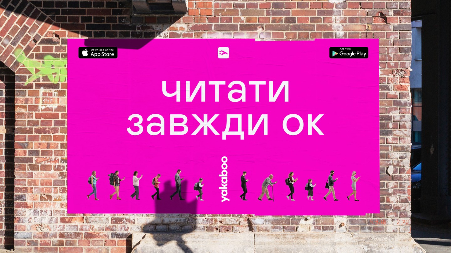
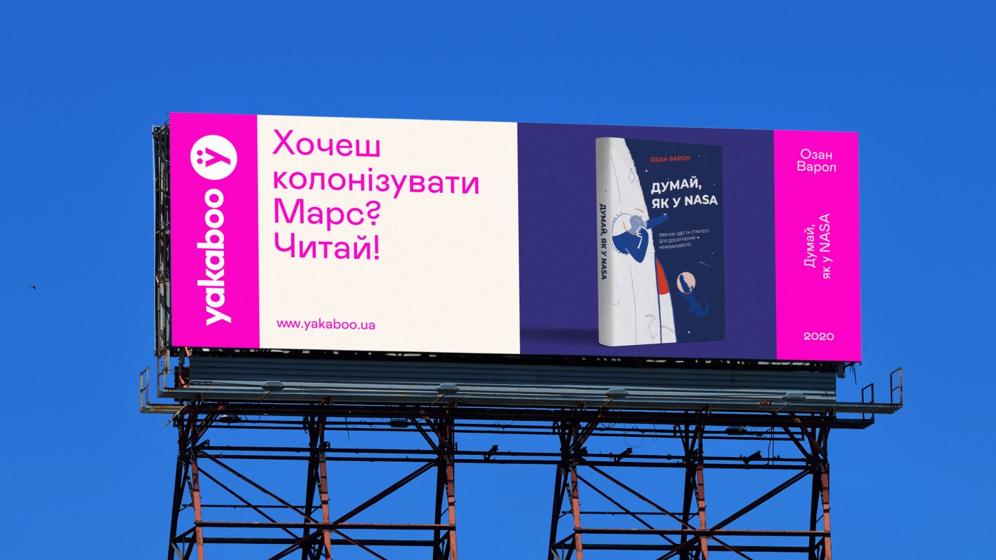
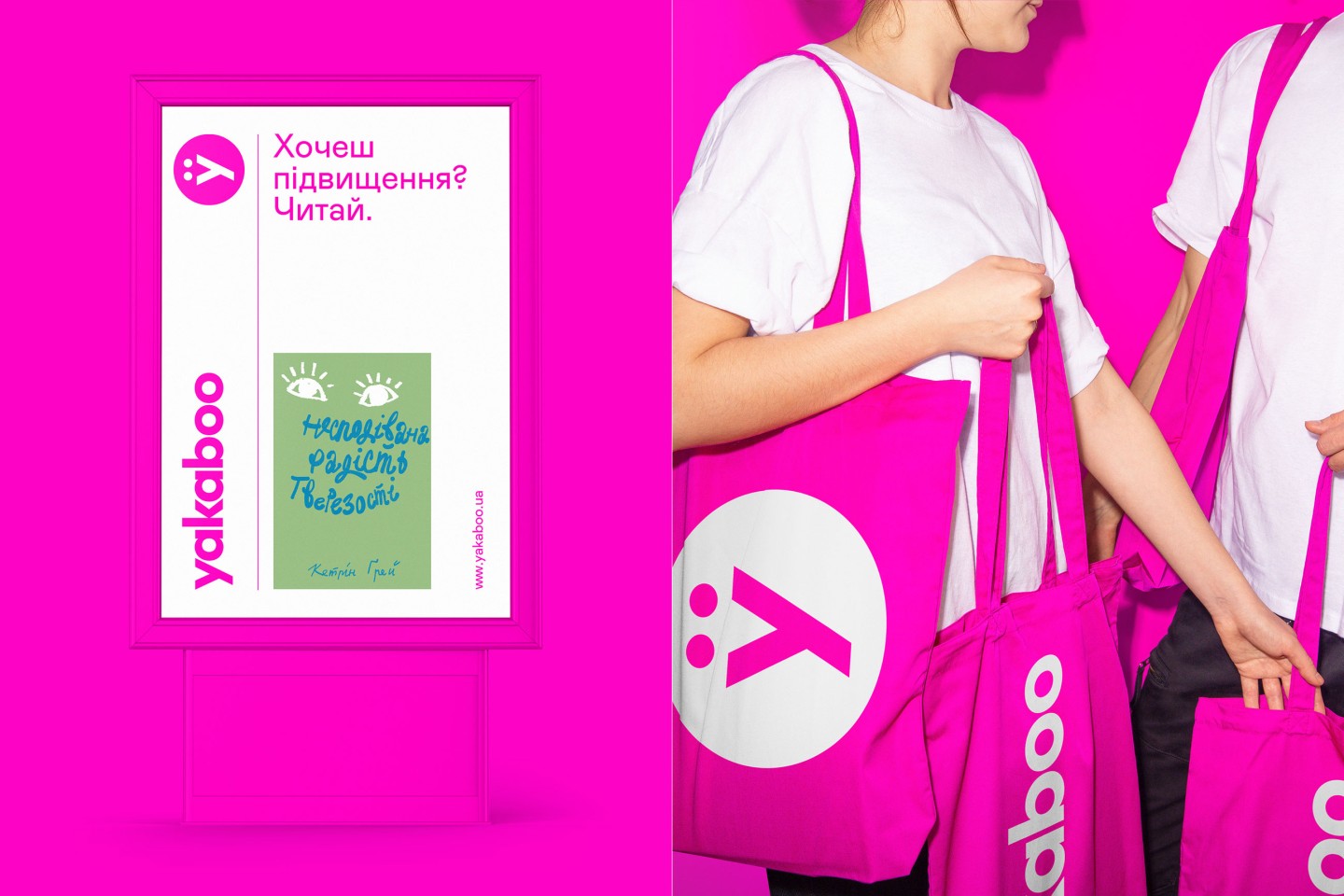
That's why Yakaboo strategy: "Read in any situation".
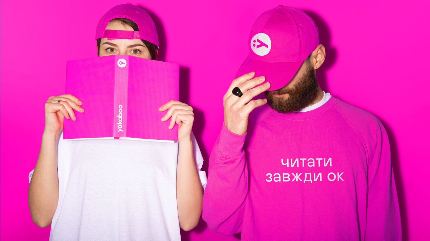
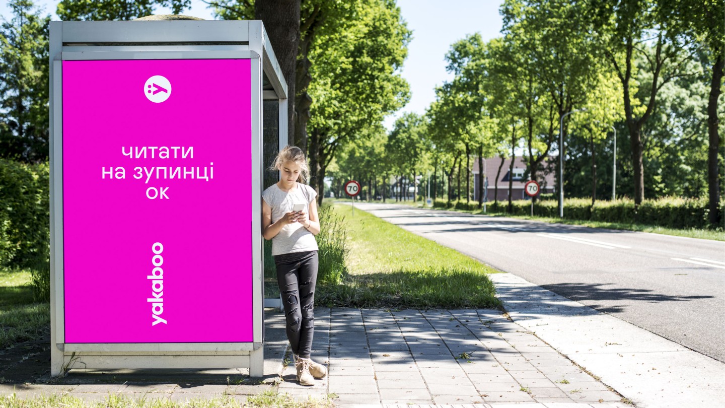
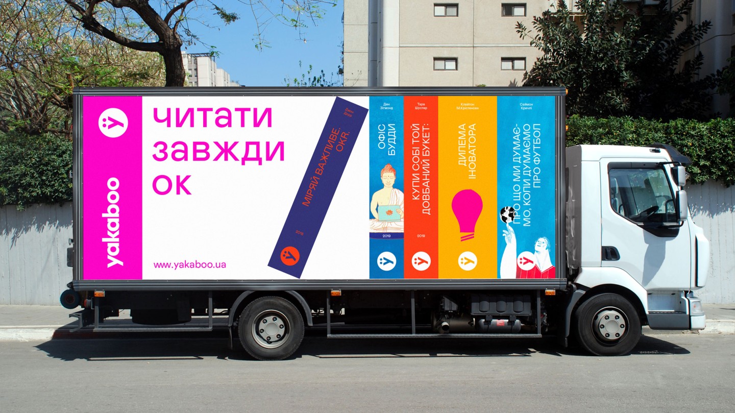
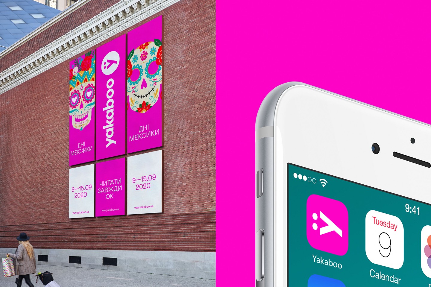
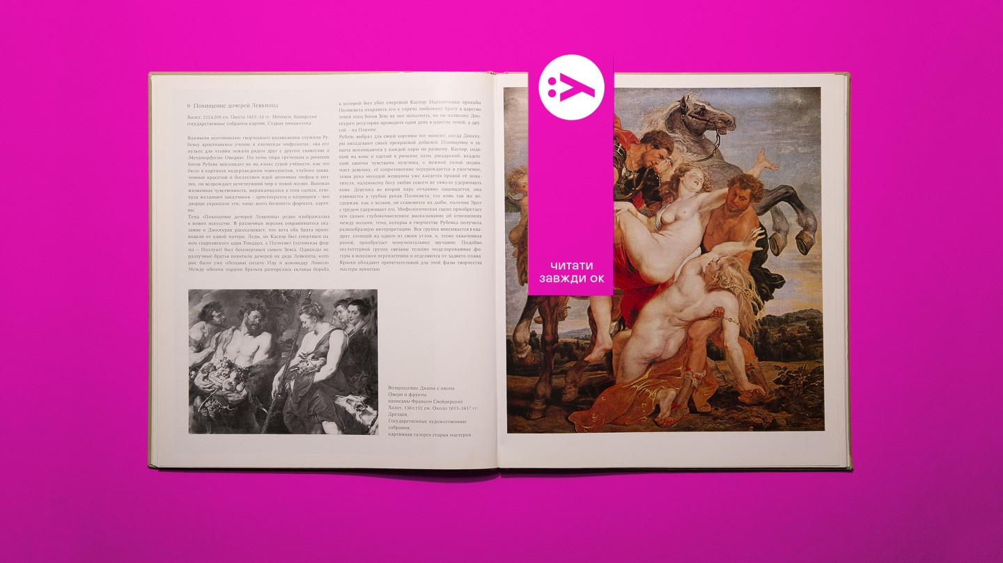
New slogan: "Reading - is always OK!". We have created a constructor that retains the central meaning of "Reading - OK" but allows you to apply it to any context. Reading at the bus stop is OK. Reading until dawn is also OK. Reading rather than scrolling through a feed is very, very OK!
"We dream that books will once again become a source of knowledge, strength, inspiration and confidence for Ukrainians. We want to change the attitude towards reading in Ukraine and bring books back into the lives of Ukrainians," said Yakaboo co-founder Yuriy Krivosheya.
Yakaboo wants to help Ukrainians love books again. To do this, the brand launches cultural and social projects. The first of them, the national initiative "Ya_read", will be launched on May 21.
We wanted to make a design that could convey the love for reading - in a way that is relevant to the digital age.
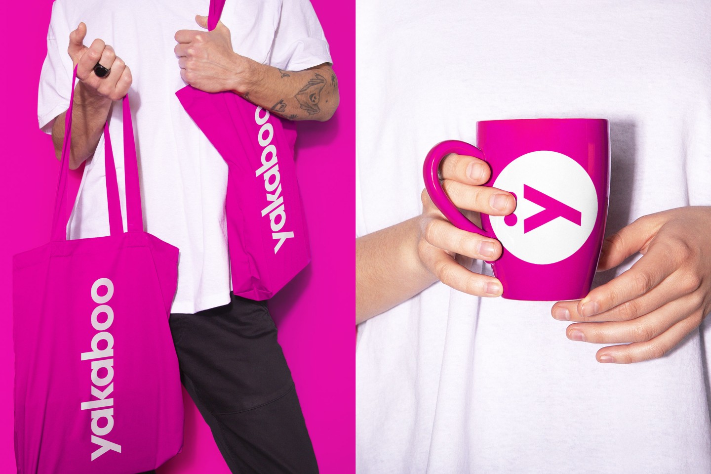
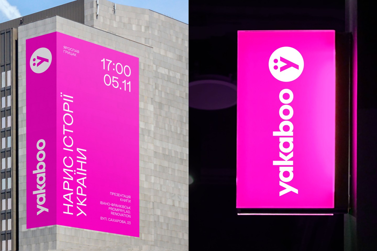
We designed the logo to be deliberately simple, but we added some raisins into it - flipped vertically, like the title of a book on a spine placed on a shelf.
The two dots above the new "U" logo are not a mistake or even a hygge. They are the eyes of a yak, an iconic brand character. In a very modernist interpretation, though.
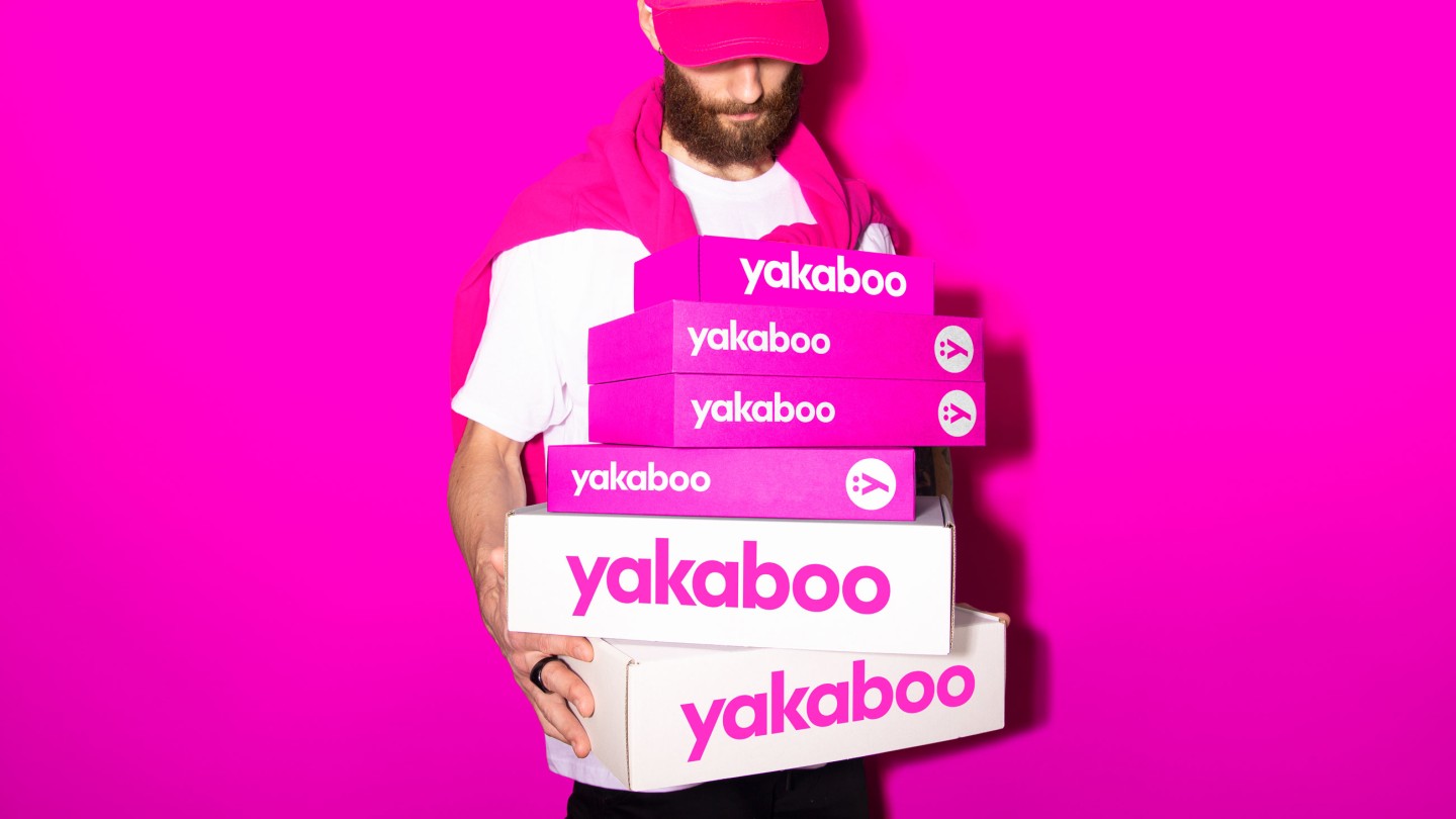
We kept the color from the old identity but transformed it into more energetic and expressive.
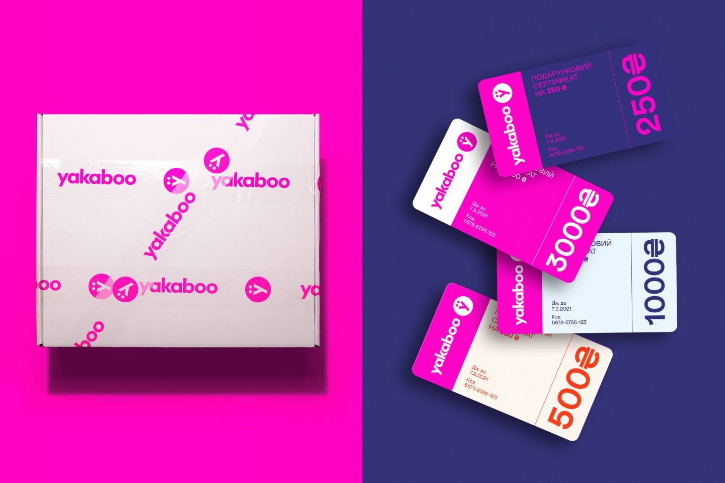
And, of course, we created a flexible design system. It is a container that can structure content within itself because the thoughtful design is also always OK!
Credits
Junior strategists: Alexander Solonko, Gleb Petrov
CD: Gleb Petrov
Creative co-singer: Alexander Solonko
Project manager: Anton Solonko
Copywriter: Roman Pyskun
Design-director: Vik Vatamaniuk
Senior designer: Veronika Syniavska
Designers: Olesia Bahrii, Alexandra Romanenko
Motion designer: Egor Prijma